1. Introduction to "Zhang Qian Monument"
"Stele of Zhang Qian", the full name is "Ode to the Emperor of the Ancient City of Han Dynasty", also known as "Ode to Zhang Qian". Unearthed in the early Ming Dynasty, it was first placed in Leping Zhouxue, at the beginning of the founding of the People's Republic of China, moved to the Dongping County Government House in Shandong, and then moved to Tai'an Dai Temple in 1965, and then moved to the exhibition room of the ancient steles of Donglang in the Bindian. It is a stele inscribed in February of the third year of the Eastern Han Dynasty Ling Emperor Zhongping (186 AD), 317 centimeters in length and 107 centimeters in width. Where there are 15 lines, line 42 characters.
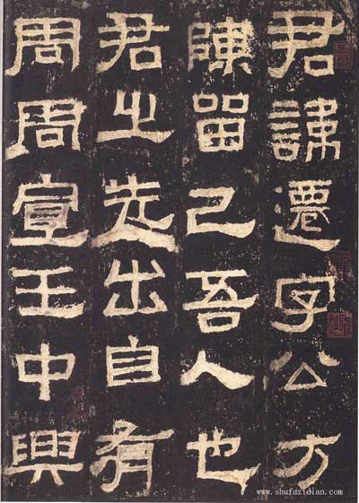
There are 12 characters on the front of the stele: "The Ancient City of Han Dynasty Chang Dang Yin Order Zhang Jun Biao Ode" 12 characters, the script is intended to bend between the seals and scriptures, similar to the Miao seal of the Han seal. The 12 characters are divided into two lines and no columns. The layout is compact and scattered in size, and they are integrated, or they can be changed, or twisted, or long and short, strong and powerful, and they are indeed a wonderful product in the forehead. The owner of the stele is Zhang Qian, whose name is Gongfang, from Chen Liujiwu (now in Ningling, Henan). He was once the mayor of the city (now northwest of Luoyang City, Henan) and the order of Qiandangyin (now Tangyin County, Henan). Therefore, the official Wei Meng et al. published a list of stones in order to remember his merits. There are three columns in the Yin Yin of the stele, the first two columns each have 19 rows, and the following three rows are engraved with the name of the donor and the amount of money. The earliest record of this group is "Jin Xie Lin Lang" by Ming Dumu. Gu Yanwu's "Jin Shi Wen Ji" in the early Qing Dynasty suspected that it was a copy. However, most scholars believe that the inscription on the stele is simple and straightforward and cannot be done by non-Han people. With the traces of natural peeling off, it is even more non-artificial. It is the original inscription. The Xianyuhuang Stele published in 1973 was similar in style to this stele, while the Xianyuhuang Stele was as early as the 21st year of Zhangqian Stele, both of which are typical of Chinese dialects in Han and Li.
There are Ming rubbings, Qing rubbings, photocopies and reprints that are popular in "Stele of Zhang Qian". The Ming Tuo edition is the earliest edition, and it is best called the "Dong Li Elaboration" edition with the intact four-character "East Li Elaboration" in the eighth line of the Palace Museum.
"Zhangqian Stele" mainly uses square pens, which is a typical representative of Chinese square pens in Han Li. Its thick and simple strokes, strong bones, and the use of seal and calligraphy, give it an aura of majesty in its ancient clumsiness. The structure is often seen in a stable state, and in a static state, it is dynamic, intricate and full of change. At first glance, this stele may seem clumsy and chewed carefully, and you will appreciate the clumsiness of its various postures, denseness and decent, patchwork, and both square and round. In particular, the word Yin on the stele seems casual, but the vigorous and ancient spirit of its mentality is particularly obvious. In Ming Dynasty Sun Tuigu's "The Gengzi Selling Summer" commented on his book: "The calligraphy is neat and elegant, and there are few people in the Han stone." Qing Guo Yanxian called this stele "It is a stele for a crown" (Fangjian Pavilion) Postscript").
The following will describe the ancient and simple style characteristics of "Zhang Qian Stele" from the perspective of the use of the house and the structure.
2. The characteristics of writing in "Zhang Qianshi"
"Zhang Qianshi" uses squares as the main house, but its fun of combining circles in squares is beyond the reach of other Han monuments. The house is astringent, full of seal meaning and not failing to be agile.
First, point the pen method
Jiang Kui’s "Book Continuation" said: "If you have one point, you want it to correspond to the painting; if you have two points, you want to correspond; if you have three points, you must start at one point, bring one point, and respond with one point; if you have four points, start from one point, two points. Point with a little, a little response." In addition to the natural reflections and vigorous posture, the dots in "Zhang Qian Stele" also have the beauty of austerity and mellowness, and their shape may be curved, flat, or bowed. Or looking down, it can be described as extremely varied.
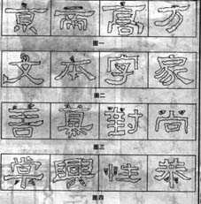
1. vertex.
In "Stele of Zhang Qian", the vertices are different. The apex of the word "京" in Figure 1 is volley, giving a bird's eye view of the world, and it is ready to come out; the apex of the word "di" is made with a small horizontal to strengthen the horizontal position of the word; the words "high" and "fang" have strong vertices When placed on a horizontal surface, there is a sense of fusion; and the apex of the word "文" in Figure 2 is large and sideways, and the feeling of falling a rock is particularly strong (the bottom is crossed, and it is as stable as a rock). The apex of the word "ben" seems to be broken with the horizontal, and the slanting posture, coupled with the combination of the Xiji of Hengjian, shows the closed emotion and fun of Gao Zhanfang Junzhong.
The apex of "Zhang Qianshi" has square and round pens, and square houses are mostly used; there are fronts and sides, and the sides are mostly. Those who use square pens are often supplemented by round pens; those who use round pens. The bottom must be supplemented by a square pen: as shown in Figure 1, the vertex of the word "square" is a square pen, and the horizontal bending hook underneath is a round pen; the vertex of the "word" in Figure 2 is a round pen, and
Square pens are used for both the lower horizontal fold and the sub-division stubborn fold. If the first point is on the side, the lower tip is correct, such as the word "文"; if the first point is correct, the lower side is multiple, such as the word "家":
2. Two points horizontally.
There are several types of horizontal two points in "Zhang Qian Stele". ① Opposite type. There are many such types, and the left and right points are different in size, radius, reflection belt, etc., as shown in Figure 3, the word "good" has two points, the left circle is on the right, the left is small, the right is large, and the distance is large, and the opening and closing changes Smaller; the two points of the word "Men" are left and right, the left is large, the right is small, the upper and lower stages are obvious, simple and heavy, and in harmony with the overall style; the left and right points of the words "right" and "shang" are not only There are changes in size and radius, but at the same time they echo each other, looking forward to the appearance. ②The opposite type. As shown in Figure 4, the lower two points of the words "Tang" and "Xing", one to the left and the other to the right, on both sides of the vertical or horizontally, although they stand opposite to each other, they can also be condensed and condensed. There is a sense of echoing in the distance, and there is a change in the square circle; the right point of the "sexual" character is a short vertical, and it is slightly lower to the left; it is inclined to show the echo. ③The same direction type. At two points, the base wood strikes in the same direction, but the pen is broken, and the level is different. For example, the lower two points of the word "Gong", the left point moves to the upper right, and the right point moves to the lower right, which are connected with each other.
Second, the horizontal pen method
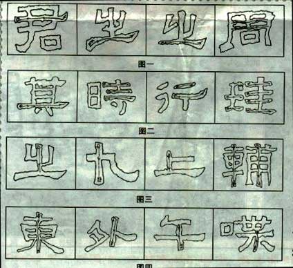
The handling of the horizontal in "Zhangqian Stele" has changed the world. The starting stroke has a radius, the lightness and heaviness, and the closing stroke has the change of the front and the day. Some of the strokes are stable and peaceful, some are light and lively, and the horizontal trend is flat or sloping. In particular, the strokes are rich and varied. As shown in Figure 1, there is a long horizontal line of "Jun", the direction is reversed, and the front is turned (usually the thumb is inward, the index finger is inward, the middle is pointing outward, the pen tube is slightly twisted, and the wrist is turned to the right to fade the pen forward) backward. Go straight to the right, until "Yenni's force is high and the front is struck forward. Although the horizontal position is flat, it is also thick and simple, and the front is chic. The lower part of the previous "Zig" in Figure 1 also rises against the front. Accumulate the momentum to adjust the front to the right, but the tip is light, lifting and pressing, "Yenni" is extremely heavy, firmly holding up-the upper part, and the horizontal position is particularly low, the right is high, and the center shows the trend of change on the side. Sometimes the stroke of the character—the horizontal stroke is lighter, and when the stroke is closed, the front stroke is sharper. The contrast is sharp, as shown in the last “Z” character in Figure 1. , Round up, come forward and close the pen; the three horizontal lines on the right of the word "inch" start from the first horizontal side, close the pen back to the front, showing a downward arc, the second horizontal circle reclaims, showing a flat position, and the third horizontal side. Starting from the stroke, the "Swallowtail" goes forward, showing an upward arc. The two horizontal lines of the word "Xing" are full of changes: the first horizontal circle rises to the upper right of the factory, the strength gradually increases, and then the upper right tip, the strength gradually Light, close the house and return to the front; while the second horizontal line starts from the side and goes down to the right tip, until the tail is harder, try to set the top mountain front to the upper right, breaking the equalization of the two horizontal lines. Some short. The horizontal is either flat or oblique, or thick or thin, such as the horizontal drawing of the character "八".
Third, the vertical pen method
The erection in "Zhang Qianbei", the stroke has a change of radius, more square and less round, the center is awkwardly moving, there is a clever change of lifting and pressing, and the vertical has a straight change. As shown in Figure 3, the "Z" is upright, start the brush against the front, adjust the front (usually the thumb is outward, the index finger and the middle point are twisted on the inner tip of the pen tube, and the tip of the wrist is bowed upwards, so that the tip of the pen is withered) and then straight down and astringent Row. The upright of "nine" (the word "nine" in "Zhang Qianbei" is treated as upright) started against the front side, and after adjusting the front, the house is getting stronger and stronger, returning to the front to close the house. The vertical of the word "up" rounds up the house against the front and moves downward. The two long vertical houses of "auxiliary" have obvious changes in lifting and pressing, which are light and flexible. The middle vertical of the picture four scarf "Dong" Yu is curved without showing weakness; the vertical direction of "wai" is inclined to the lower left; the vertical direction of the word "gan" is inclined to the lower right; the vertical direction of "chat" is downward to the left, with Certain arc potential. There are more short vertical variations, which have greatly enriched the connotation of "Zhang Qian Stele" and displayed unique artistic characteristics. Cunyi in the temporary study carefully observes and experiences, recognizes these changes, and then puts it into the house. In fact, there is no fixed shape for any stroke. Its length, thickness, front side, and radius should be ingeniously changed according to the direction of the word. It should not be the same. Only on this basis, can we enjoy the mystery of its endless changes.
Fourth, the pen method of skimming
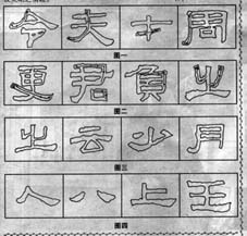
In the "Stele of Zhang Qian", there are changes in radius, length, straightness and slanting. As shown in Figure 1, the length of the word "令"
With a slight arc, start the pen against the forward circular momentum, and adjust the forward (usually with the thumb outward, the middle finger and the index finger inward slightly twist the pen tube, the wrist is facing
Slightly turn down the left, adjust the front of the pen) to the lower left arc, close the pen back to the front. The character "fu" has a long stroke and a larger curve,
Shun Feng moved to the lower left and pressed hard, and Hui Feng closed it. The word "cai" is short, thin and straight, slightly horizontal. "Zhou" is upright and closed
The pen is slightly curved.
Fifth, the way to use the pen
In "Zhang Qianbei", there are big and small, flat and oblique, curved and straight, and square. The strokes are often counter-fronted, and there are squares and rounds. As shown in Figure 2, the word "Geng" is obliquely long and slightly straight. The writing method is to start the pen against the front, and after adjusting the front (usually the thumb is outward, the index finger and the middle finger are slightly twisted inward, and the wrist is slightly bowed to the upper left to adjust the front of the pen). "At the place, the pen accumulates momentum, the thumb is gradually inward, the index and middle fingers are gradually twisting the pen tube outward, the wrist is slightly turned to the upper right, and then the force is used.
Sixth, the pen method of folding
Most of the folding paintings in "Zhangqian Stele" are straight and powerful, with a pen. As shown in Figure 2, the fold of the character "Jun", cross to the fold, gather momentum and turn the pen (thumb slightly outward, index finger and middle finger slightly inward to twist the pen tube) and cut straight down, vigorously and powerfully. The "negative" character folds horizontally to the fold, lifts the pen upwards slightly, and then moves downwards after adjusting the front. It has both squareness and roundness. The vertical fold of "Zhi" is intentionally rounded (also with the finger and wrist) to show the change.
Third, the characteristics of the conclusion of "Zhang Changqian Stele"
The structure of "Zhang Qianbei" is rich in changes, and it seems to be dangerous anyway. Exhibit and play the whole monument, eloquent hundreds of words, honest
Rarely: either the top is dense and the bottom is sparse, it seems that the center of gravity is unstable, and the strong pen and the ingenious strokes are used to reduce the danger; or the left and right are freely and freely, the heights are scattered; ……Now I will give a brief description of the key examples of different structures.
Single characters. The strokes of single type characters are often less, but the length, radius, thickness, oblique and other changes are abundant, and there is no sense of stagnation.
Being lively is the characteristic of "Zhang Qian Stele". As shown in Figure 3, the Chinese character "Zhi" has a square pen in the middle and a vertical direction. The left and right folds are round and square, and the bottom is rich in change. The word "cloud" is thick and heavy, and the shape of "silkworm head and swallow tail" is full and triangular, especially stable and stable. It is also powerful; the word "less" is short and vertical in the middle and full of change, and the dots on both sides echo each other. Although the next hand is inclined, it is also safe and flat; the two verticals of the word "yue" have an inward tendency, but The middle and the horizontal are straight, the left and the vertical are lower, so that the character Yu Douzhong is straight, quite original; Figure 4 "人" is short, thick and slightly straight, and it comes out to the right and downward with a long stroke, one retracts and one releases. The character "eight" is very dynamic; the character "eight" is smooth, and the stroke is slightly lighter, and there is a lively atmosphere in the stability; although the character "shang" is heavier in the downward direction, but the upper and lower sides are not short, making the characters both stable and stable. Appropriate; the vertical curve of the word "king" is slightly right, while the three horizontals have their own changes, especially the third horizontal, which shrinks to the left and stretches out to the right. The quaint character reveals a sense of agility.
Fourth, the upper and lower structure of "Zhang Changqian Stele"
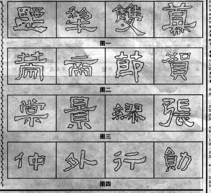
The characters in the upper and lower structure in the "Zhang Qianbei" may be different from the upper and lower density, with a certain degree of retraction, or through the horizontal and vertical changes to seek the cleverness in the ancient clumsy. In Figure 1, the characters "shu" and "plough" are sparsely spread from the bottom to the top, and the horizontal trend is relatively large. The ancient clumsy spirit is vividly on the paper. The word "double" is even more impervious to the wind, and it can be swayed down. The character "curtain" is also unique. The upper half occupies almost the entire space. The long horizontal is stretched out and has an oblique tendency. The "scarf" part is small and oblique, full of movement. In addition to the density of the word "strategy" in Figure 2, the horizontal and vertical changes are also obvious. The character "di" stretches horizontally, and the vertical strokes at the lower part are oblique and jagged, and it leads under the long horizontal to break the stagnant situation. The vertical line at the lower right of the word "Jie" is intentionally inclined, full of dynamic and stable. The treatment of the word "he" is quite meaningful, converging from top to bottom, but as far as the "plus" of the upper part itself is concerned, it stretches horizontally, staggered high and low, with the same structure, which is a clever move. The processing of the word "Tang" in Figure 3 is not obvious, but it is obliquely strong, natural and free and easy. The different handling of the horizontal and vertical positions of the word "Jing" is even more childish and cute, which is applauded.
5. Left and right structure of "Zhang Changqian Stele"
The obvious manifestation of the left and right structure in "Zhang Qianbei" is: free and easy, random, odd and positive. The word "Miao" in Figure 3 converges on the left and puts on the right, and the whole character appears simple and ethereal. The space in the lower left and the left-hand and long-handedness on the right, plus the changes in the vertical trend, all play an important role. The "bow" part of the word "Zhang" is full of dynamics, coupled with the ingenious treatment of the horizontal change, the hook and the shortening of the right part, it gives people a lively and vigorous feeling. In Figure 4, the character "Zhong" is light on the left and heavy on the right, the right vertical is thick and inclined to the lower left, balancing the lightness of the left part and the left thick and vertical of the "middle" part, and the ancient clumsy aura suddenly emerges. The word "wai" is bold and dangerous, yet completely natural. It is clever and clumsy. It is very conspicuous in "Zhang Qianbei". The right part is upright higher than the left part, stubby and sloping down to the left. The right part is stubborn and stubborn. ?Although the right part of the word "Xing" is placed, the upper and lower parts shrink inward than the left part. If there is no stubby vertical support, it is difficult to have life. If the vertical is slightly longer, it will flow into stagnation. and also. The character "Xun" is high on the left and low on the right. The top is wide and the bottom is narrow. The bottom left point and the right horizontal bending hook stabilize the whole character, so that the character does not fall apart.
6. The surrounding structure of "Zhang Changqian Stele"
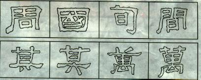
In the treatment of the enclosing structure, in "Zhang Qianbei", besides the change of the frame, the content of the envelop is also flexible, dense and dense. The "Zhou" Yu in Figure 1 is curved and powerful on the right, with a crisp and sharp closing stroke, exaggerated and deformed in the middle and horizontal, and the "mouth" below it is slightly side but stable. The word "guo" is surrounded on all sides, but the two verticals stand opposite each other, and both have an oblique tendency. Although the internal "or" is simple but there are blank spaces, it can be said that there is an empty space in the park. The character "Xun" has a tendency to tilt downward to the right as a whole, but the curved and powerful horizontal hooks make the "bolt" in the middle as eye-catching and moving as a pearl inlaid. The character "jian" is curved and flexible on the left, vertical and austere on the right, forming a sharp contrast between the left and the right, while seeking change in symmetry. The "day" in the middle is purely inclined to echo the momentum of the left and right sides. The whole word is slanted but not down, which is intriguing. The "Zhangqian Stele" "辶" writing also shows the harmony of ethereal and heavy, coupled with the treatment of the denseness and squareness of the enclosed content, the expression of the character is vivid on the paper.
Seven, the same character but different forms of "Zhang Changqian Stele"
There are many identical characters in "Zhangqian Stele", but almost none of them are used in pen, knots-not carefully arranged, or round, or thick, or sideways, or there is a difference between the front and the hidden front, or the same side. The change of the alien, the extreme change, such as "Qi" and "Wan" in Figure 2. This is just like the word "Zhi" in "Lanting Preface", there is unity and coordination in the changes, which is full of heaven and earth, and it is infinitely interesting.
In short, "Zhangqian Stele" is a famous product in the Han Dynasty stele, and its changes in the use of pens and the structure provide a broad space for later generations to create official scripts. Its outwardly simple and vigorous characteristics are, of course, determined by the use of the pen and the rest, but at the same time, the round and the brush blended in makes the powerful force not lose its roundness, and its varied appearance The characteristics are firmly established on the basis of solidity and stability, that is to say, peace and stability can be found in danger. In addition, the use of the seal script is a combination of rigidity and softness, so it is not suitable for those who learn to learn to use the hand directly, and only after having a certain foundation of the Han stele can they dabble in this stele. In the study, if you can earnestly comprehend the law of changes in the use of pens and the formation of the body, you will be rewarded. It is believed that after reading this monument, readers will surely be "in the realm of one day".


