
Lou Jian (1567-1631), courtesy name Zirou, was born in Jiading (now Shanghai) in the Ming Dynasty. He was erudite and highly regarded as a master in his hometown. Later, he was admitted to the Imperial College, but he never became an official in his life. His calligraphy was highly appreciated by Qian Qianyi, a great scholar in the late Ming Dynasty. Qian said in "Biographies of Poetry Collection of Dynasties. Ding Ji": Lou Jian's "calligraphy is wonderful, the wind and sun are beautiful, the pen and ink are excellent, and he can dye his calligraphy happily without being forced."
Although the scrolls of Lou Jian's regular script published here are not necessarily the masterpieces of the author's painstaking efforts, the neatness, beauty and regularity of the calligraphy basically represent the face of Lou's script. Lou Jian learned calligraphy from the Tang Dynasty. From his works we
It is not difficult to find out Yan Zhenqing’s magnanimity, Liu Gongquan’s Duanyan Shuangjun, and Chu Suiliang’s gracefulness. However, generally speaking, it is very different from Tang Kaihua, which has clear and meticulous stipples. This function is adapted to the situation
Xing, full of fun and fun, often goes beyond the rules, and is obviously influenced by the ideological regular script after the Tang Dynasty.
This function of writing is easy and familiar, but sometimes there are casual strokes, or regular script written by official officials, which has a special interest. For example, horizontal paintings often use silkworm heads to start the pen, which borrows the technique of official script. The horizontal strokes of the characters such as "you", "tai", "ying" and "xiu" are all started with silkworm heads. When finishing the pen, there is often no reply, just let it happen naturally, "there",
The horizontal stroke of "Tai" is like this. Within a stroke, the thickness is often the same, and there is no lifting or shooting in the strokes, such as the long horizontal stroke of the character "Sleeve", the horizontal hook of the character "zero", and the back throw of the characters such as "花", "Luan" and "Ye". Hooks, etc., thus making the brushwork appear thick and simple. However, it is not without changes. For example, in the word "Luan", the strokes on the left part are light and deft, and the lifting and pressing are clear, so that the complicated structure can be resolved without being blocked. The content on the right side is thin, so it is equipped with a heavy back throwing hook, making the male and female on the left and right Xiangde: Another example is the word "骁". The left part and the word "Yi" in the lower right part are thick and heavy, while the word "林" in the upper right part is light and flexible, with clear lifting and pressing. The whole word appears to be light and heavy, with Zhang and Zhang. Relaxation. The structure of this work is oblique yet upright, clumsy yet clever, and flexible yet regular. Generally speaking, the structure is mainly square and neat, such as "zhou", "liu", "title", "awake", "man", "jin", etc., all of which are square and full, forming the keynote of this work. However, It is not strictly strict and rigid. Some characters are slightly slanted, such as "mountain", "you", "tai", "night", "shadow", "bing", "pot", etc. These characters are embellished. In the meantime, the whole article shows a lively and lively momentum. Not only that, in a word, it is often a combination of order and agility, such as the word "zero", the upper part of the "rain" head is written clearly and meticulously, and The word "Ling" in the lower part suddenly changes to the cursive method, which forms a great contrast with the upper part. It is rich in changes and randomly transformed, making it difficult for people to see it as a family.
The composition of this work is sparse and elegant, unique and similar to that of Dong Qichang. Lou Jian and Dong Qichang are basically contemporaries and have a common background in the aesthetics and fashion of the times, so they will naturally show some similarities. The sparse layout style originally originated from Youjun, showing a handsome, free and aloof elegance. Later calligraphy tended to adopt a more condensed style in composition, which cannot but be said to be related to the increasing tendency of calligraphy to be utilitarian. There is also a kind of calligraphy with tight organization and structure, which reflects the author's sorrow, anger and depression. It can be said that the closeness of the composition is probably related to the utilitarian psychological background, while the sparseness of the cloth is related to the aesthetic psychological background. Although we don’t know much about Lou Jian’s life and personality, we can tell from the limited records that he was indifferent to fame and wealth and devoted himself to art. According to Qian Qianyi, when he was creating, he must wait for “sunny weather, fine pen and ink, Fang Xinran dyes Han without any pressure." This shows that he is a person who pays great attention to the aesthetic environment and aesthetic emotions. This sparse and elegant style of white cloth just reflects his leisurely and elegant personality.
However, this work also has shortcomings, mainly because the relationship between reality and reality is not handled appropriately. Looking at the whole text, there is more reality and less virtuality. Although the fonts are slightly different in size, it is difficult to distinguish the guest from the host in terms of pen usage, rhythm, etc. For example, the first seven or eight characters in the first line are all open but not closed. The full flow of energy seems to lack the aftertaste, and there is also a lack of connection between the characters. However, despite all the flaws, the whole story is still a successful work.
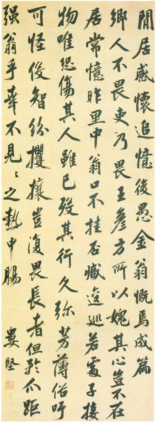
Lou Jian's "Poem Scroll of Reflections on Leisurely Living"


