
1. Mi Fu and his "Shu Su Tie"
Mi Fu (1051-1107), originally named Fu, also named Yuanzhang, also known as Xiangyang Manshi, Haiyue Waishi, and Lumen Jushi, lived in Taiyuan for a long time, then moved to Xiangyang (now part of Hubei), and later lived in Runzhou (now Zhenjiang, Jiangsu Province). ). Huizong Zhao was awarded a doctorate in calligraphy and painting, and he once served as a member of the Ministry of Rites, Wailang, and was known as "Minangong". Because of his talent and wildness, he is also called "Mi Dian". "Xuanhe Shupu" said that he: "Most of his calligraphy is imitated by Xi's, his poetry is after Li Bai, his seal script is Shi, and he is a legal official. He said that 'those who are good at calligraphy only have one stroke, and I only have four sides', and those who know it will understand." When Fu was writing the book, people were vying to sell it with figures on the inch-inch paper as a treasure."
Mi Fu has worked hard to inherit the calligraphy tradition of the two kings, and it can be said that he has entered the royal family. He is good at both Zhen, Cao, Li, Zhuan and Xing, but is especially good at Xing cursive. He calls himself "brush character", which means that he uses the pen quickly and vigorously, and he tries his best to pursue the meaning, vigor and power of "brush" and pursue nature. His calligraphy works, whether they are poems, rulers, or inscriptions and postscripts, all have the characteristics of joyful, dynamic, dynamic, and fresh. They are like sharp swords, quick, innocent, and unexpected. Mi Fu used the past to open up the present, pushing Chinese calligraphy to a new stage of development. Later generations almost praised him as the same as the two kings. Mi Fu's book can be said to be a good textbook for today's understanding of the two kings. He created a large number of cursive calligraphy works throughout his life. His representative works include "Hongxian Poems", "Duojinglou Poems", "Yanshan Inscriptions", "Tiaoxi Poems" and "Shu Su Tie". Among them, "Shu Su Tie" most influential.
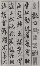
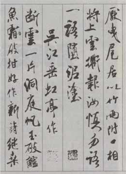
Shusu is a kind of fine-quality natural silk produced in Shu during the Northern Song Dynasty. It is woven with black silk bars and is exquisitely made. This volume has been kept by the Shaw family for more than 20 years. I only wrote a few sentences at the end of the volume and wanted to leave the beginning of the volume for famous people to write poems. However, it has been passed down for three generations, but no one dared to write it. Because the texture of this kind of fabric is rough and astringent, it is difficult to write on it, so people who are not very skilled in it dare not care about it. It was not until the third year of Yuanhu in the Northern Song Dynasty (AD 1088) that the 38-year-old Mi Fu inscribed eight five- and seven-character poems on it, which is called "Shu Su Tie" (the picture on the right is a part of the work). This calligraphy is 29.6 centimeters long and 284.2 centimeters wide. It was collected by famous collectors such as Xiang Yuanbian, Dong Qichang and Wu Ting in the Ming Dynasty. Dong Qichang wrote in the postscript of "Shu Su Tie": "This scroll is like a lion catching an elephant. It should be done with all one's strength. It should be a lifelong cooperation." This post fell into the hands of Gao Shiqi, Wang Hongxu and Fu Wei in the Qing Dynasty, and later entered the Qing Dynasty. The inner palace is now the "National Palace Museum" in Taipei. It and the "Tiaoxi Poems" of the same period both represent the highest achievement of Mi Fu's running script.
2. Characteristics of strokes in "Shu Su Tie"
Mi Fu claimed to have studied Chu for the longest time, so he was deeply influenced by Chu's books. The strokes of "Shu Su Tie" tend to be richer in general. Because it is written on silk, the strokes are thick and slightly strong. The strokes are mixed with side and center strokes. There are many changes in the starting and finishing of the strokes, such as "the clouds and smoke are rolling and flying." state". The writing style of this post is varied, with vertical and horizontal swaying, penetrating and jumping, both square and round, and a balance of hardness and softness. The hidden edge is slightly sharp, and the exposed edge is also subtle; the hanging point ends abruptly, like a sharp knife; the hanging needle and the closing point are upright or sideways, either curved or straight; the lifting and pressing are clear, and the thread is strong. Stiff; thick and slender, neither perverse nor aggressive; medium and sideways, dry and moist. The post has various font styles, which fully reflects Mi Fu's unique style of "brushing words" and "attacking from all directions".
(1) Horizontal
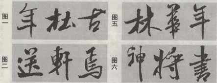
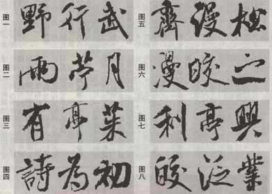
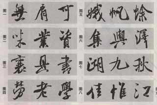
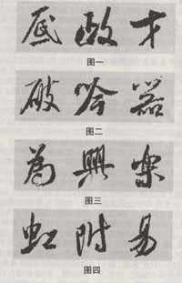
The most common horizontal paintings in "Shu Su Tie" are horizontal strokes with vertical or oblique strokes. The sharp tip may be long or short, round or straight, giving people a sense of agility, variety and high spirits. As shown in Figure 1, there are three characters: "Nian", "Du" and "Gu". Flat fronts and horizontal strokes also appear occasionally, and are brisk and sharp, but generally shorter, as shown in Figure 2 with the three characters "send", "xuan" and "yan". There is another kind of vertical and horizontal strokes, although there are not many of them, it is a characteristic, as shown in Figure 3 with the characters "Qing", "Yan" and "Yan", the person starts writing towards the upper right. As for Zangfengheng, there are not only many of them in this post, but also various styles of writing. The wrapped heads may be round, upturned, or drooped, and so on. In actual application, especially when there are multiple horizontal strokes in a word, the above-mentioned horizontal strokes often appear mixed, as shown in Figure 4 with the words "scold", "ghost" and "ci". In the final analysis, the change in horizontal painting is mainly a change in the direction of starting the stroke. During practice, Mi Fu's superb skill of "attacking from all directions" must be reflected during practice. Of course, changes in thickness and length must also be combined at the same time.
(2) Vertical
The changes in vertical strokes in "Shu Su Tie" are similar to those in horizontal strokes. They are generally divided into two types: exposed front and wrapped front, as shown in the word "Lin" in Figure 5. There are two types of exposed front: first pause and then stroke, and direct insertion of the line. There are two types of pens, the latter one has the two characters "华" and "年" in Figure 5. The strokes of vertical paintings are sometimes very different in weight from front to back, such as the three characters "神", "general" and "书" in Figure 6; more changes are reflected in the vertical and left-curved strokes of the entire stroke (such as "Bao" in Figure 7). ", "zuo"), right-bent (as in Figure 7 with the word "Shang") or front and back S-shaped (as in Figure 8 with the characters "South", "Lake", and "Duan"), it can be said to be the best. Variety. Er Wang and Chu Suiliang, whom Mi Fu admired, both had circuitous brushwork. The S-shaped strokes should have been used from ancient times to today.
(3) Skip
Sketching is slightly vertical, so the starting point of scribbling in "Shu Su Tie" is similar to that of vertical painting. To talk about the uniqueness of the painting in this post, I think there are three main forms: First, it is a short and triangular short painting, such as "Gong", "He" and "Tao" in Figure 1. The characters are short, full of energy and far-reaching meaning; secondly, they are a kind of sudden break (like the three characters "hui", "tai" and "an" in Figure 2), sometimes with a hook (like in Figure 3) The three characters "Nai", "Fa" and "Wei" are vertical strokes; thirdly, it is a kind of bald-tailed stroke. When writing, the pen is pushed downwards, which means that it is intended to be closed but has not been reached (the bottom stroke in Figure 4). ", "Bian", "fake" three words). The strokes in this post are slightly irregular, as shown in Figure 5. The strokes in the three characters "Zhan", "Chen" and "Qu" are originally in the same position, but they have different styles in Mi Fu's strokes. This shows the talent of "Mi Dian" - spot.
(4) suppress
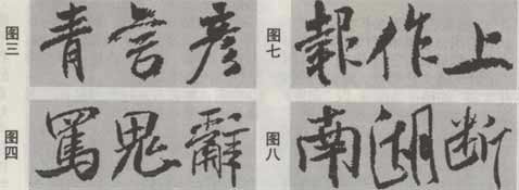
一般书家的捺画,无非顺、反两种,《蜀素帖》中固然也常用。但除此之外,最多、最具个性的一类是以“插入抽出”法写成的笔直(由图六中“袂”、“漫”、“献”三字)或拱起的捺,由于粗重处的靠前、居中或靠后等变化及弯曲度的不一,实在是风情万种,与撇画连用时,尤见利剑斫阵之痛快(如图七中“舍”、“人”、“支”三字)!另有尖头曲尾捺(如图八中“波”字),同样可窥《兰亭序》中“欣”字或褚遂良的迂回笔法。在走之底中,平直如横(如图八中“连”字),或重笔插入再抽出、头重尾轻(如图八中“逢”字)的平捺,更是米芾行书的一个记号了—』口便出尾如常人的平捺,起头也总归是重的。
(五)钩、提
米芾在该帖中的钩,谓之穷极变化是并非夸张的。有不出钩(如图一中“野”、“行”、“武”三字)、圆钩(如图二中“雨”、“苎”二字)、折钩几类。折钩有时斜翘,往往竖到底时须调换笔锋(如图二中“月”字),有时下垂(如图三中“有”、“亭”二字),而以先折出再钩起的“鹰嘴钩(提)”最独到、最常用。如图三中“茱”及图四中“诗”、“为”、“初”三字,由于折出或钩出的方向、粗细、长短不一,所以形态纷呈。可以说在历代书家中,米芾的钩是用得最活的了。
(六)点
《蜀素帖》中点的灵活变化,丰富得简直难以归类。有的浑实粗重(如图五中“齐”、“漫”、“松”三字),有的尖巧跳跃(如图六中“漫”、“皎”、“之”三字),或仰(如图七中“利”字)、或俯(如图七中“亭”字)、或倚(如图七中“与”字)……同一字中的各点,更无一雷同(如图八中“皎”、“泛”、“业”三字)。这些变化,说到底是源于米芾能集古人笔法之大成与他自我的大胆开拓;而运用起来又是那么的协调,这关键靠的是气息的同“质”。
三、《蜀素帖》的偏旁部首
偏旁部首是复合字中相对独立的部分,它已经具有结字的意味。可以说,《蜀素帖》中所有偏旁部首的变化都很丰富。当然,这些变化是有—定规律可循的,我们无论读帖还是临写,都应悉心对照、分析、归纳。
(一)三点水旁
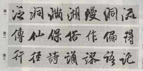
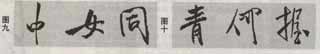
《蜀素帖》中三点水的变化很多:有时参照楷书写法,将三点分别写出,而三点的笔意、紧松不同,或作带有牵丝写法,如图一中“泛”字和紧接着的“洞”字;有时第二点和第三点连写,或三点同时连写,各点的轻重、笔姿却有变化,如图一中“满”、“湖”、“漫”和紧接着的“洞”字;挑画先平出然后再挑起的一种,在帖中与“鹰嘴钩”等形成呼应;第二点和第三点有时近似于一笔短竖,如图一中“流”字。
(二)单人旁、双人旁
《蜀素帖》中单人旁普遍紧凑,而且较强调撇。但竖画还是有长短之别。如图二中“传”字之竖相对较长,两笔断开,靠气脉连通,显得虚灵;而图二中“仙”、“保”二字的竖画就很短了,整个偏旁感觉紧实;其次在于两笔搭配的交接点并不固定,时高(如图二中“俗”字)时低(如图二中“作”字);而撇画的笔势有的方尖、有的圆浑(如图二中“偏”字)、有的凹曲得很明显(如图二中“作”字),竖画也仪态万方(如图二中“传”、“仙”、“保”三字),更增加了书写的丰富性。
双人旁的式样似乎更活,如图二中“得”字和图三中“行”、“径”二字,各成佳构,或许是因为多了一个可变的撇画的缘故。
(三)言字旁
言字旁在此帖里出现了三种写法。图三中,“诗”字是属于类同楷书的写法;“诵”、“谬”二字中以点替代了两横和“口”;“语”、“托”(旧时作言字旁,与“托”是两个字义)二字则一如简化字——其实是草书写法,因为汉字简十七时有一条思路就是将许多草书写法楷化。言字旁的头点和首横,在笔姿、疏密上也时作变化。
(四)木字旁、提手旁、禾字旁
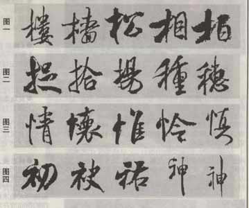
《蜀素帖》中木字旁通常的写法分有点和以挑代点两种。米芾睿智地靠调节横画、撇画的高低和竖画的居中或右挪、头重脚轻或头轻脚重来获取不同的情态,如图一中“楼”、“樯”、“松”三字。“相”、“柏”字的木字旁,竖画的右移与下段的弱化最是胆大,实在令人叫绝。这些艺术处理,在提手旁、禾字旁中也明显展现。如图二中“捉”字的提手旁左倾,笔画萦带紧实,“拾”字在竖底先退一步再出钩,“扬”字的起笔水平,从容却新颖;禾字旁因为多一撇,撇势与撇、竖的开合使它的变化较木字旁又多一层,如“种”、“穗”两字。
(五)竖心旁
竖心旁两点时紧时松、时高时低,起点锋芒的藏露、方向的欹正均有不同。中竖尤其多姿,或束腰、或丰腰,或挺直、或微微流转,或一端粗重、或竖尾挑起,不一而足。如图三中“情”、“怀”、“惟”、“怜”、“慎”五字。
(六)衣字旁、示字旁
这两个偏旁在《蜀素帖》中是一样的,既可以作楷书写法,如图四中“初”、“袂”二字,虽然竖画的正欹、长短有变,但都往往粗厚、紧实,似谦恭貌;又可以作草书写法,简洁而意态轩昂。图四中“祜”字强调头点,身躯束缩;而两个“神”字,前者简而紧,后者虽然松疏,却笔松意紧,耐人回味。
(七)宝盖头、党字头
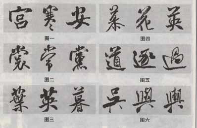
宝盖头与党字头依照其横笔的直或圆,可以分两类。其横画本身时长时短,弧度也不同,加以上点、左点与钩笔的方向、粗细、长短之变化,所以形态实则是不少了。如图一宝盖头“宫”、“寒”、“安”三字(“安”字古人即便在楷书中,一般也都不把点单写,行书则更会并入下部了);又如图二党字头的“裳”、“常”、“党”三字,头上的三点时放时缩,忽而又像风吹草帽似地悬浮着。
(八)草字头
《蜀素帖》中草字头也有两类:一种如楷书样式,如图三中“叶”、“英”二字,末笔常有变化;另一种为横向对应的两点下面书一横画,如“暮”字。由于点比横、竖相对灵活,因此情形就更是变化多姿了。如图四中“慕”字两点似乎在欢舞雀跃,趣味盎然;“花”字的横画略微拱起,也较别致;“英”字的两点似姐妹相挽而行。
(九)走之底
前文已经述及走之底中平直如横或重笔插入再抽出、头重尾轻的平捺,是米芾行书的一个特征。其实,《蜀素帖》中走之底的头部也是千姿百态的,如在图五中,“道”字像一只鸬鹚立于船头;在“逐”字那里,整个“鸬鹚”写成连绵在头点下的一笔弧线状;在“过”字中,“鸬鹚”索性就变成—竖。
(十)两点底
《蜀素帖》中两点底的字也有好几个,读来均很有味。如图六中,“吴”字细挺,如闹钟的脚;而第一个“舆”字一重一轻斜扬,像在蹦跳,又似探出一条腿,笔断意连,第二个“舆”字下两点一长一短,像在“稍息”,却都厚实稳重。
四、《蜀素帖》的结字特点
(一)掌握字形结构是初学者临帖的主要目标
点画与点画的组合是书法学习的两大课题。二者何为重点,我们要具体情况具体分析。线条的品位是作品艺术品位的关键,线条是书法的生命。点画美不仅要求点画的形状(俗称笔锋)美,还要求点画的“质”、“韵”、“力”均达到一定品位。广大初学者对线质的理解往往缺乏,而郁艮的精力与实用的需求又不容许在这方面专事攻克,所以初学者起初不必苛求线质,而应重在考察笔锋与字形(下文以此为前提)。
笔者一直认为在品评初学者(而非书法家)的临摹习作时,应将字形置于首位指标而将笔锋放在其次。这正如人的长相,体形、脸蛋起决定作用,穿戴服饰与发型只能是锦上添花。—个汉字是否美观主要取决于点画组合成的框架,笔画形状的美丑对整个字来说影响相对次要。以楷书为例,不妨先写一个只有字形结构匀称美观而点画本身稚拙的字,再写另一个只有点画的笔锋美而字形结构奇丑的字,虽然都不美,但它们依然可以比较,显然前一个要美观得多,这就是因为它具备了单字美的最主要因素——组合美。
(二)《蜀素帖》的结字规律
1.收放对比
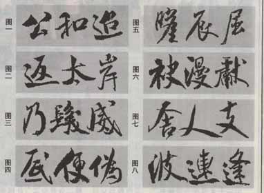
初习者往往易于均匀地安排笔画,不敢或不知道如何使笔画组合有疏有密,所以字形不生动,流于平庸。清代刘熙载在《艺既·书概》中说:“结字疏密须彼此互相乘除,故疏处不嫌疏,密处不嫌密。”“彼此互相乘除”意指疏处不妨加倍地收紧,密处不妨加倍地放逸,彼此形成强烈的对比。结字中的收和放是相反相成的辩证关系,“大抵实处之妙,皆因虚处而生”,收放类似于此。《蜀素帖》中的收放对比,可谓极尽其能事,最臻佳妙,艺术感染力非常强。总体而言,该贴结字中宫紧束、外围放逸展拓。具体考察,其收放又可分以下几种情况:上收下放,如图一中“无”、“肩”、“可”三字;下收上放,如图二中“味”、“业”、“资”三字;中收上下放,如图三中“襄”、“具”、“书”三字;上下收中间放,如图四中“劳”、“老”、“学”三字;左收右放,如图五中“娥”、“帆”、“蜍”三字;右收左放,如图六中“集”、“舆”、“泽”三字;中收左右放,如图七中“湖”、“九”、“秋”三字;中放左右收,如图八中“佳”、“惟”、“江”三字。另有两种特殊的收放方式:长笔放,即将原本并无紧密处的字中某一笔画写得较通常时长,如图九中“中”字的竖画起点明显很高,“女”字的横画向左舒展,“同”字则拖长了右下角,相应的其,他部位就有了收的意味;多维收放,如图十中“青”字,从横向来看是上放下收,但从上面的竖画出头很短来看,上面又是收的;“何”字的单人旁上放下收,而右旁是上收下放;“握”字的右部横向收缩,在纵向上又是放的了。
2.轻重对比
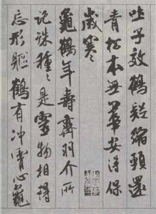
用笔的轻重(体现为笔画的粗细)对比并非每—件作品所必需,有些作品也可以不强调用笔的轻重,但在《蜀素帖》里,米芾的很多结字中不同程度地运用了这一艺术手法。如图一中“岁”、“子”、“溪”、“多”、“云”、“清”六字的轻重对比,就较一般行书来得明显。从这些例字可以看出,用笔何处轻、何处重并没有一个固定模式——有的上部重,有的下部重,有的左部重,有的右部重;有的笔画多数粗重,只在一二笔处轻细些,如“岁”、“子”、“多”、“云”四字;有的却正好相反,只有少数重笔,如“溪”、“清”二字。 当然也不乏轻、重笔画数相伯仲的。
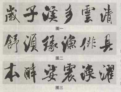
该帖中不少字用笔的轻重对比是很强烈的,可以谓之大粗大细。如图二中“舒”、“须”、“缘”、“渔”、“俳”、“具”六字,其轻细处实在只有粗重笔画的十分之一了,可见米芾书写时用笔是何等的“提得起”与“压得下”。如此大轻大重已属不易把握,但米芾更可贵的是能使这些笔画和谐地共处一字之中。究其原因,首先在于线质、力感的统一,粗而不肿、细而不软,都健拔遒劲;其次是笔画搭配时,细笔画往往都注意了紧凑,俗话说“团结就是力量”,系统大于各部分之和,四五个细笔画紧凑在一起的分量是可以等于七八画的,所以这就相对地调节了粗细的失衡。对立与统一,是—切艺术最根本的规律。 在粗重笔画中,还有一类“结块”的。如图三中“本”、“醉”、“娑”、“震”、“涣”、“濯”六字,都有—处数个笔画纠结交融,形成一个“块”。显然这不是失误,而是米芾在结字中营构重笔的另—手法。明末王铎最喜欢用的涨墨法,或许是受到了米芾的启发。
3.参差、险夷处理
《蜀素帖》是米芾中年时期的代表作品。此时他的书法技巧已经炉火纯青,因而天性的狂放不羁必然体现在他的书法中。
该帖中有众多的字结构参差,如图一中“劲”、“物”、“蟾”、“夷”四字普遍左边的重心高出很多,而图二中“地”、“仕”、“遗”、“对”四字却正好相反;又有部分上下结构的字,如图三中“灵”、“亭”、“光”、“学”四字,上下错位,往往下部右移,或上部右倾。这些奇诡的结体,变幻灵动,似乎随意布势、不衫不履,实则富于情趣,嵌布在一般字列中,使节奏更加丰富。
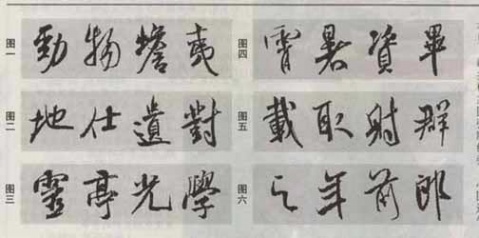
还有的结字,各偏旁部首的俯仰斜正并不一致,并以欹侧为主,奇险率意,表现了动态的美感。这些偏旁部首又并非各自为阵,而往往是巧妙地组合在一起,欹正相生,有机统一。比如图四中“霄”、“暑”、“资”、“毕”四字,字态很像杂技演员在走钢丝,悠悠晃荡,但又终归均衡。又如图五中“载”、“取”、“射”三字,都像在伸懒腰,字势上张,但同时底下的长笔画、重笔画或下垂画稳住了“字脚”。而“群”字左右各趋所向,似乎要分离,但因为左右轴线在下方彼此撑住了,如同两小儿勾手抵脚后仰,显得既开张又紧密。
当然,《蜀素帖》里的字并非都如上述那样终能稳住重心。即便稳住了,绝大多数仍微微左倾,少数则微微右斜。像图六中“之”、“年”、“前”、“郎”四字,更明显是倾向一边。书法毕竟主要是作为整体来着眼的,这类字正是该帖行气跌宕多姿的重要因素。
4.增减笔画
增减笔画是行书中常用的手段,它有助于书家能动地调节字态与疏密、轻重,如图一中“底”字所加的点。但在米氏《蜀素帖》中,增减笔画主要体现为钩、挑的增附或减约。前文已经提到的“鹰嘴钩(挑)”就是属于笔画的增附,是米芾行书的一个独特标记,其例又如图一中“政”字的挑。而有时为了避免雷同,或需要空透一些,钩起的部分又可以被简略掉,如图一中“才”字。口字旁写作两点、两口字写作三点(如图二中“破”、“吟”、“器”三字)在该帖中也司空见惯。还有很多以点或短横、短竖取代若干笔画的‘隋况,如图三中“为”、“兴”、“乐”三字。有时,一些短小笔画很自然地在萦带中被省略,如图四中“虹”字的点、“附”字的撇、“易”字的短横等等。增减笔画并不是很随便的,它是出于美化的需要,并且要以不至于让人无法认读或错读为前提。
5.同字异态
在米芾的行书中,即便一字中反复出现的笔画也都形态不同,就更不要说同一件作品中反复出现的字了。《蜀素帖》的结字虽然有规律,但并没有走向程式化,同样的字在此、在彼的面目一定是不雷同、甚至是迥异的。为了领会书家的意图,我们可以试着将某两个“同字异态”的字互换位置,看看有何不妥。此外,在该帖里还有一些部首成对出现的字,也同样注意到了变化。
(三)间架结构把握好后,应将注重点放在起、转、收的精微笔法上
一位书法家在营构字的间架结构时展露的个性特点,是他独到笔法的重要方面。但,更为精微的笔法往往体现在笔画的起、转、收等地方。间架结构把握好后,应将注重点放在这些地方,临写、对比、找出误差,再重新临写,反复推敲,力求准确。 就楷书而言,字的间架结构与精微的起、转、收都吃透了,则所临的范帖也就基本学到家了。但,对于行书,尤其《蜀素帖》这样行气极尽变化的字帖来说,还有一个章法问题。
五、《蜀素帖》的章法特色
从总体看,《蜀素帖》通篇的若干空格处调节着作品的块面节奏,众多“粗重点”(实际是字)与“虚弱点”此起彼伏,似满天繁星,形成了“有意味的形式”。但由于《蜀素帖》是画有竖格的,所以在行距上的变化显然无法施展,因此,对该贴章法的分析,就得主要着眼在“行气”上。
(一)行气轴线多变
这里指的轴线在字中本无,是为了便于分析每个字的动态而采取的一种手法。《蜀素帖》中的行气总的来讲是从容流转、跌宕多变的。就具体的轴线连缀分析图来看,可大致分为两类:
1、左欹平行式连缀
As shown in Figure 1, the upper part of each character is slightly tilted to the left. Obviously, the axes of the segments are not connected, but the overall row does seem to be coherent. What is the reason? It turns out that although each character is tilted The angles are not exactly the same, but they are generally parallel, so this common tendency becomes an implicit cohesion. In addition, by examining the commonalities of each row, we can also find that although the single characters are all slanted, if the entire row is regarded as a block, the axis of this block is actually straight through or grouped straight through - this is what Zuo Jian There is another hidden cohesion in the parallel connection.
2. swing chain
Relatively speaking, this posture is the main movement of Qi in "Shu Su Tie". As shown in Figure 2, the axes of each character are rarely in the same direction, but there are many line segments that connect up and down, and there are fewer that are not connected. The overall row looks like a long wine flag swaying slightly in the breeze. Although it is not "straight", the Qi pulse is indeed "connected" - those occasional breaks whose misalignment is not obvious are like commas in sentences. Not only do they not really stop the Qi, but they regulate it. The rhythm of Qi movement. If we examine the connections between the rows, we can see that the axes of the rows are not the same, and they all have their own charm.
The axis of Qi in "Shu Su Tie" is changeable. Throughout the whole text, the above two consecutive sequences appear alternately, thus forming a subtle rhythm of "writing style".
(2) Rhythmic changes in size, length, weight, and tightness
In the rhythm of Qi in "Shu Su Tie", in addition to the subtle coherence of the axes mentioned above, there are also various contrasting changes in the combination of words.
1. Changes in size.This can also be said to be the collection and release of Qi. As shown in Figure 1, most of the numbers in the first line are larger, while the left parts of the characters "PIA", "Jade" and "Sail" are smaller; the characters "SHUANG", "Xin" and "Ji" in the second line are smaller. Big, the words "hao", "zuo" and "poetry" are much smaller. The two lines are adjacent, and care has been taken to avoid synchronization in size. In the other row, most of the numbers are smaller, while the characters "深" and "Zhan" and the characters "GU" and "地" are larger.
2. Changes in length and flatness.As shown in Figure 2, in the right row, the characters such as "column", "和" and "DU" are relatively long, while the characters "Xian", "Qian" and "Jiu" are much flatter than usual; in the other row, the characters " The two characters "Jin" and "Bi" and the three characters "Yi", "zhou" and "Yu" are also processed upwards and upwards respectively, forming interweaving and contrast.
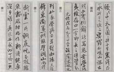
3. Changes in severity.This refers to the arrangement of thick and thin strokes from the perspective of the entire line. As shown in Figure 3, the character "cubit" at the beginning of the first line is moderately heavy, the characters "shao" and "hai" are heavier, the characters in the lower group are much lighter and thinner, and the characters "老" and "学" are thick and heavy. Get up; in the second line, the two characters "yi" and "man" are very heavy and gradually become lighter below. The character "官" is the lightest and thinnest, and then becomes thicker again, but the character "三" is greatly narrowed, making both sides ethereal. Relax in the middle of the character to make the moving Qi relaxed here. When it comes to the bottom of the character "Zi", it becomes tight, and the character "Qi" becomes relaxed again. In the other line, it's first light - then heavy - then light - then heavy - then light.
4. Changes in tightness.This refers to the density adjustment of the character spacing within the line. As shown in Figure 4, the two key points and the words "中" and "泽" in the first line are loose in some places, but tight in other places, and the words "月" and "TUAN" are even more integrated with each other; in the second line The characters "Zhan" and "Ji" and the characters "Xian" and "山" are dense in two places, but looser in other places. In addition, a multi-angle rhythm analysis of the movement of these two lines will reveal that in addition to the subtlety of the continuity of the axes mentioned above, the combination of characters actually also involves big and small, long and flat, light and A variety of changing methods such as heavy, loose and tight are used at the same time. ——The flow of "Shu Su Tie" is mostly like this, so the rhythm is particularly flexible, and the visual aesthetic effect is of course very good.
6. Several issues that should be paid attention to when studying "Shu Su Tie"
(1) Reading posts is very important
"Studying books is especially important if you read more, and if you read more, you will be more elegant in writing" (Li Ruiqing's "Jade Plum Blossom Box·Book Break"). This is a correct conclusion that focuses on the external skills of books. And reading the calligraphy, that is, the study of the calligraphy, does not mean "reading" its textual meaning, but refers to repeatedly examining and figuring out the subtleties of the brushwork, calligraphy, and composition that are visible and perceptible in the calligraphy. Reading calligraphy is not only an internal skill in calligraphy, but its importance has been emphasized by many calligraphers as exceeding that of writing calligraphy. The "kan" in the famous calligrapher Wu Zhangshu's poem "Two points for brush and inkstone and three points for reading" refers to reading calligraphy.
In the final analysis, writing is mainly an activity controlled by the command center of the brain. The stroke of the pen line is actually the process and expression of thoughts. Of course, it also includes subconsciousness derived from familiarity. However, for beginners, no matter which style of calligraphy they write, their thoughts control the use of the pen from beginning to end - correct pen movements are the prerequisite for writing correct handwriting, correct thoughts are the prerequisite for correct pen movements, and Reading Tie is the first prerequisite to fully perceive and correctly understand the style of writing, calligraphy and composition of Fan Tie. Reading posts can strengthen our memory of fan characters and improve our ability to analyze and appreciate art. As Huang Tingjian said in "On Calligraphy": "The ancients did not copy all the books they studied. If they read the ancient people's books on the wall and looked at them in a trance, they would write according to their wishes." People often say "handy", "handy" means "handy" " is the premise, and "success" can only come from being diligent in reading posts and being good at reading posts. So how to read the post? The author will briefly describe the following four points in my personal study book:
1. Based on analyzing momentum
对《蜀素帖》进行整体气息的感知,具体形态的分析、揣摩,对于学书者来说,具有直接的指导作用。但气息由形态透出,形态又根本取决于动势。孙过庭说“察之者尚精”,学习者应对《蜀素帖》中一点一画的形态、单字的结体、整行的行气、整体的布局反复揣摩、领会,而尤应以解析动势为核心。依笔画顺序,想像作者创作过程中用笔的节奏、力度以及作者情绪的不同变化,将静止的形象还原为运动的过程,也就是以“意念”去模拟米芾的创作过程,这样可以把握《蜀素帖》的精髓、风貌、神采,正如黄庭坚所谓“细看令人神,乃到妙处”。我们还应尽可能去将《蜀素帖》与米芾的其他书迹,或与其他书家的经典行书范本作对比,分析其动势的异同之处,这样有利于理解该帖独具的特征及其来龙去脉。
2:读帖与临写的结合——心摹手追
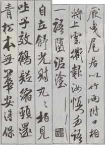
读帖过程应与临帖实践结合起来才会奏效。读帖的目的是为了能更好地临帖与脱帖。要以读帖为主、读与临结合,以读帖形成的认识指导临写,以临写的结果来检验读帖中尚未深入或理解错误的地方。如此反复,才能相互促进。《蜀素帖》的动势、行气变化无穷,尤其需要心摹、手追双管齐下。(图为《蜀素帖》局部)
(二)局部与整体的结合
从整体到局部,再由局部到整体,这是绘画写生中十分注重的法则,碑帖的临习也是这样。学习《蜀素帖》时,应首先统观全帖,把握住其既潇洒痛快又沉雄厚实的总体气息,进而注意前文分析的用笔、结字、章法、墨韵等局部的具体形态。局部揣摩、分析后,再打开视野统观全局,重新从理性的高度对整体予以更正确的把握。
1.成组对临、背临
临写时,起初当然是应该着 眼于单字。然而,一旦基本掌握了结字规律并能熟练摹写,就要关注行气。这一阶段里,成组对临是十分必要的。《蜀素帖》因为写在格子中,所以最微妙、最容易被忽视的正是字与字的组缀。局部与整体的分析、感知、临写,并非是彼此孤立的,而是应当彼此结合、反复交替又相互交织。只有对《蜀素帖》反复、充分地进行从整体到局部、从局部到整体的分析、感知、临写,我们对范帖的理解才能不断深入。这样长期不懈、日积月累,就—定能做到笔随人意。
2.正确支配视觉注意
初学者临帖进入结字阶段后,普遍把握不好范字的间架结构,其根源是在读帖或力求以笔墨再现范字的书写过程中,没有掌握正确支配视觉注意的方法。有很多初学者全神贯注地读帖或书写,结果写出的临作一笔笔细察还都不错,而字架子的误差连他们自己都不忍再看。针对初学者常见的错误,笔者要强调:在书写活动中,每一笔画自身无法决定自身,其粗细、长短、位置都必须由它所处的环境来决定,这就要求必须强化周围注意能力。至于笔画的一招一式,我们不是忽视,而是因为它是简单的程序,所以完全可以较少注视,而主要交给手指的“感觉”去完成——这种感觉不是视觉,而是类似于以“盲打”操作电脑键盘时的一种头脑对动作的有效支配。 为了使初学者能加深理解,笔者找到了一个贴切的比拟说法:假如将视觉注意比拟成光的话,则我们要像打手电筒那样将光辐射出去,投射在一个面上,而不能像在太阳下放一块放大镜,将光聚在一个焦点上,并用这个视觉的焦点去煨烫每一个笔画。如果将错误观察方法称为散点或线型观察,那么笔者所要强调的便是在书写环节同样必须加以面型观察。《蜀素帖》中的笔画变化太丰富、太微妙,初学者往往最容易把注意力集中在线条上而忽视了结字(行气就更难以兼顾),所以正确支配视觉注意显得特别必要。(图为《蜀素帖》局部)
七、以《蜀素帖》为基础的创作
(一)“集古字”与背临是从临摹走向创作的桥梁。
初学书法者以正确的方法临摹某一碑帖,相当一段时间后能写得与范帖基本相似的大有人在。此时可以试着学以致用,写些创作作品。可是由临摹一跃而进入创作,势必会有一定的困难。而面对的新问题一多,就连原帖中有的范字,写在作品中往往也不再那么顺手了。所以,由临摹走向创作最好能有一个过渡。 米芾在《海岳名言》中说:“少壮未能成家,人谓吾书为集古字,盖取诸长处总而成之。至老,始自成家,人见之不知以何为祖也。”37岁时的米芾,已不是对诸家作简单的生搬硬套,而是在进行有机的结合。所以《蜀素帖》中所蕴涵的信息量是很丰富的,不但有二王、颜鲁公、褚河南等诸家痕迹,而且又呈现出米芾自家的多种色彩。 “集古字”是米芾从临摹晋人走向自我风格的过渡阶段,我们不妨也以此作为桥梁。可以找些诗词联句,尽量追从《蜀素帖》的体格来营构。首先选较多字都为《蜀素帖》原本中出现过的,这就可以保证在书写时能得心应手,并逐渐培养、增强自己“拟创”该体生字的能力。一旦“拟创”生字的能力达到一定程度,对常见书法幅式与章法处理也都能熟练运用,随便书录任何一段文字都能基本符合昕临范帖的风貌,则真正的创作便开始了。
(二)以动式为核心,勿拘于模式
We use "collection of ancient characters" and "imitation creation" as the connection between copying and creation, but this does not mean copying the physical pattern of "Shu Su Tie". The various flexible rules of knotting characters and moving qi analyzed in the previous article should be applied when we are planning to create works. Therefore, the original hidden front can be written as sharp, the original large can be written as small, the original thick can be written as thin...and vice versa. It doesn’t have to be changed, but it has to be adapted to local conditions. Respecting the original post should look at the big picture and the rules; sticking to the model and rigidly piecing it together will inevitably violate the fundamental spirit of "Shu Su Tie" and go to the opposite of the original post. (The picture shows part of "Shu Su Tie")
of two
Mi Fu's "Shu Su Tie" Copying Analysis (Weng Zhifei) Mi Fu, who was born in the third year of Emperor You of the Northern Song Dynasty - the first year of Daguan (1051-1107), signed his name Fu or Fu. Weng Fanggang said that since the Yuan Dynasty, you Xinwei, he began to use Fu in writing, but before that, all writing was in black. Zi Yuanzhang, named Lumen Jushi, Xiangyang Manshi, Haiyue Foreign History, known as Minangong in the world. During the Xuanhe period, he was promoted to a doctor of calligraphy and painting. He is the author of "Collection of Baojin Yingguang", "History of Calligraphy", "History of Painting", etc. "Shu Su Tie" is called "Shu Su Tie" because it is a self-composed poem scroll made of plain silk woven from Shu (black silk column). This volume was written on the 23rd day of the ninth month of Yuanyou Wuchen, the year of Fu. 38 years old.
The following discusses the technical characteristics and artistic features of this work based on the criticism of its calligraphy in the history of calligraphy:
1. "Xuanhe Shupu" says: "Most of the calligraphy is imitated by Xi's, the poems are after Li Bai, the seal script is the history, the master is the official, and he follows the rules in his later years, and gets unexpected orders. He calls himself "a good calligrapher with only one stroke." It has four unique sides, and those who know it will recognize it... The flow of good things is like a hairpin, and all the strange characters are used in order to seek postscripts, add weight to the book, and Fu is happy with it. No distinction." This record explains: (1) Mi Fu is proficient in various calligraphy styles, which is the basis of his success, because the techniques of various calligraphy styles can complement each other, and only in this way can he be unique in all four aspects, and be able to The direction of the pen and the grasp of the momentum can make the painting extremely varied and calm.
(2) Mi Fu is good at observation and copying. He can copy the calligraphy to the point of perfection, which lays the foundation for his collection of ancient calligraphy. Being good at copying means that he can understand the ancient techniques and express them to a certain extent. In general, it not only improves knowledge, but also enriches the expressive power of hands.
2. Huang Tingjian's "Valley Inscriptions and Postscripts" says: "Mi Yuanzhang's calligraphy is like a fast sword cutting formation, a strong crossbow shooting thousands of miles. It should be pierced through the letter. The calligrapher's writing style is also poor, but it is like Zhong You's anger when he has not seen Confucius. ." Valley here emphasizes that Mi Fu is good at taking advantage of the situation and has a strong writing style. Mi Fu himself also said: "Chen Shu brushes calligraphy." Brushing means focusing on the side and taking the momentum. This is the personal experience of learning the calligraphy of the two kings, and it is also the reason for the success of his calligraphy. Compared with the Jin people, Mi Fu's calligraphy is too dancey. He was not as good as Jian Kuang from Jin, so he was ridiculed as "I have never seen Confucius".
3. Zhao Gou's "Han Mo Zhi" says: "Mi Fu has the reputation of being able to calligraphy, and he seems to have lived up to his reputation. Fu is not very good at Zhenkai seal script, but he is good at cursive writing. He is sincere and capable. He uses Fu to collect the calligraphy of the Six Dynasties. The auxiliary part is at the end of the pen, so it is calm and joyful, just like riding a horse, advancing and retreating easily, not bothering to be whipped, and doing nothing inappropriate. ... In the past, someone ridiculed Zhidun Taoist for his love of horses, and Zhi said: "The poor Taoist loves his god's steeding ears." . The same is true for Yu Yufu's characters." Indeed, looking at Mi Fu's work, he uses the brush to take advantage of the situation, tilt and stick, without inadvertently, bucking the trend, and brushing against the Jin people's mistakes, and the Song people used San Zhuo's pen is softer than Jin's pen. Therefore, Mi Fu particularly emphasized going against the front and taking advantage of the trend. He emphasized "attacking from all directions". This is also the reason.
4. Zhu Lvzhen's "The Essentials of Calligraphy" contains the following words in his "Biography Technique": "Chen Si Cheng, named Yu, is the son of Bo Xiu. He loves to study calligraphy. He imitated Mi Yuanzhang's handwriting on the pillow screen and wrote Du Shaoling's poems. One said, Yuan Zhang passed it and was shocked when he saw it. Because he was taught how to use the pen to write books, he said: "If you hold the paper with your wrist, the end of the pen has finger strength but no arm strength." He said: "Can you also write small regular script when you hold the pen?" Yuan Zhang smiled at Gu Xiaoshi, asked for paper, and wrote the "Fu Ku Praise Table" he had entered. The strokes were neat and precise, the words were like the head of a fly, and the position and scale were like big characters. Bo Xiu and his son looked at each other in admiration, and asked for his advice. Yuan Zhang Said: 'There is no other, but from now on, every time I write, there is not a single word without mentioning the pen. Over time, I will be familiar with it.'" From this record, we can see that it is not as Zhao Gou said that Fu Yuzhenkai is not incompatible. It's a very fine work, but he put a lot of effort into it, but he doesn't write easily, and he writes with his wrist hanging, which shows the depth of his skill. On the other hand, regular script is the basis of cursive script, and lower regular script is even more so. The use of pen requires precision, certainty, decisiveness, and smooth rhythm, and the use of ink requires roundness and smoothness. Everyone in the past dynasties has been good at cursive script, but they have only mastered this skill since childhood. Yes, so it is rarely mentioned in book reviews.
The above four comments are suitable for "Shu Su Tie", which is a masterpiece in his middle age. It is a typical example of ancient calligraphy, with special emphasis on side-attacking, and the use of pen is extremely varied. His scholars from Jin Dynasty just like Dong Qichang said: "For example, When a lion catches an elephant, go for it with all your strength." When writing this post, special attention should be paid to the angles of entry and counterattack, the connection of stipples, and the changes in rhythm with the strokes of the pen. At the same time, combine it with the writing style. The writing should not be too large, as long as it is slightly larger than the original work. When writing, the direction, strength and writing style of the pen should be strengthened, otherwise the writing will be even. If you read more, read more, and experience more, you will definitely gain something.


