
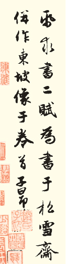
Guidance on writing the "Red Cliff Ode before and after" by Zhao Mengfu
Zhao Mengfu and "Chibi Ode Before and After" Zhao Mengfu (1254-1322), courtesy name Zi'ang, also known as Songxue, also known as Shuijinggong Taoist, was born in Wuxing, Zhejiang, and was a descendant of Zhao Defang, a royal family of the Song Dynasty. Zhao Mengfu was elected to the court in the 23rd year of Yuan Dynasty and served as an official throughout his life. After his death, he was named Duke of Wei and given the posthumous title Wenmin.
Zhao Mengfu was a man of great erudition and extraordinary knowledge. He was good at poetry, calligraphy, painting, and music. He was also familiar with Buddhism. He Liangjun of the Ming Dynasty praised him as a man who "stretched over ten thousand and five hundred years and spanned ten thousand miles". However, he was the royal family of the Song Dynasty, and later surrendered to the "enemy country" and became a traitor. Therefore, some upright people such as Fu Shan and Kang Youwei despised his people, hated his books, and ridiculed him.
Objectively speaking, Zhao Mengfu's calligraphy style has been able to dominate the Yuan, Ming and Qing dynasties, first of all, it should be attributed to his profound artistic attainments and his precise interpretation of tradition. Zhao Mengfu is a very complex figure. We can criticize his character, but we should look at his calligraphy in two parts. The author believes that contemporary Mr. Jiang Qingcheng's evaluation is more accurate: "It was not until Zhao Mengfu that calligraphy finally established its 'graceful' status. The emergence of Zhao Shu is in line with the trend of the times and is not accidental." (See "Chinese Calligraphy Thoughts." history")
As the founder of the sect, Zhao Mengfu studied under Emperor Gaozong of the Song Dynasty in his early years. In his middle age, he specialized in the "Two Kings". Yu Ji called him "Kaifa Tan Luo Shen Fu" and accepted his bid. , as for the cursive writing "Seventeen Posts", it changed its shape." At the same time, Zhao studied painstakingly on seal script, Li, Zhang Cao, etc., and in his later years, he focused on Li Beihai. Therefore, the profound accumulation of tradition has made Zhao Ti's glory.
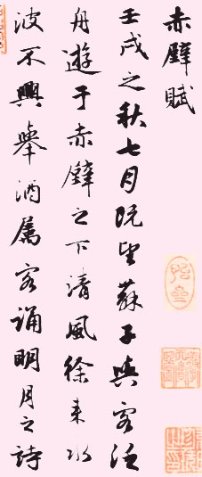
"Ode to and from Chibi" is a famous poem written by Su Dongpo when he was demoted to Huangzhou and was at his most frustrated and gloomy. In 1301 AD, when the 47-year-old Zhao Mengfu reread this article, his inner pain struck his soul. At this time, when "Brother Mingyuan" (recorded in the postscript of this volume) presented a piece of paper asking for a letter, the depression and sadness in his heart flowed with Dongpo's words. His graceful and poignant writing style expresses his feelings calmly and quietly. This is the creative background of Zhao Mengfu's calligraphy work (part of the attached picture).
2. Preparation for writing
Before we start writing, we should be prepared in two aspects: first, accurate thinking, and second, relevant tool selection. "The front and rear Chibi Fu" volume (the attached picture shows part of the work) was written by Zhao Mengfu when he was 47 years old. Artistically, it was at the stage when he was deeply studying the calligraphy style of "Two Kings", and he had already gained a high level of understanding of cursive techniques. In terms of thought, he was proud of his career at this time, but he still felt a little sad in his heart, firstly because of the indifference of his friends, and secondly because of some kind of depression from his heart. He needed a pure land to carry his emotions, and he integrated himself into the world of pen and ink.
The "Euphemistic School" is euphemistic and implicit, so Zhao Mengfu's calligraphy does not have many "emotional ups and downs" (Xiong Bingming's words), and there is no pursuit of ups and downs in dot painting. We should adjust our mentality and be calm before writing. First of all, we should be as close to it as possible mentally.
This scroll is a running script banner with simple paper color and delicate brushwork, which is very elegant. As the small characters (about 1.6 cm square) of the "Er Wang" line, you must choose high-quality langhao pens when writing. You should also know what kind of ink to use. If the ink is too thick, it will easily stagnate the brush and scatter the edge. If the ink is too light, it will bleed and hurt the mind, affecting the freshness of the lines. You can use calligraphy and painting ink to drop an appropriate amount of water. The choice of paper is also very particular. Avoid using raw food and choose something more cooked. When writing, you can use rough paper with rough edges to create the propaganda and sprinkle it with gold. Sprinkling gold can not only show the changes of ink, but also express the subtle lines, which helps to stimulate the desire for creation.
If possible, you can also learn more about Zhao Mengfu's life, read his poems, paintings, and study the development history of the "Four Treasures of the Study" in the Yuan Dynasty. These are all very helpful for us to learn the tradition more accurately.
3. Analysis of the writing style of "Back and Back Chibi Fu"
Regarding the use of pens, Zhao Mengfu has a famous saying: "The characters Gai Jie are passed down from time to time, and the use of pens is not easy through the ages." "Back and Back Chibi Fu" is a long scroll in running script, and his skill and exquisiteness in using the pen can be seen at a glance. The calligraphy of "Zhao" is directly inherited from Youjun. It is mainly smooth, straight and strong, with gentle and concise lines, beautiful on the outside and strong on the inside. The dot painting in running script is full of changes. It is said that "several paintings are applied together, and their shapes are different; all the dots are arranged in line, and the body is consistent with each other." In order to make it easier for beginners to practice, the characteristics of pointillism in this post are classified below.
(1) Horizontal painting
1. long horizontal
As the main character, the long horizontal line should generally be written straight and strong, with the left side low and the right side high, to stabilize the center of gravity of the character.
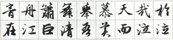
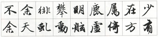
The most common way to write a long horizontal line is to drop the paper with a sharp edge, pause for a moment and then turn your wrist upwards to the right to draw the pen. When you close the pen, turn your wrist slightly upwards to the left, or you can also draw the wire slightly and then turn your wrist outwards, as shown in the picture "Yin" , the word "boat".
Secondly, as shown in the attached picture, the two characters "Xiao" and "Wu" have long horizontal strokes. When starting the pen tip and inserting it into the paper, the wrist should be turned inward quickly and assisted by turning the pen barrel to the left and then upward to the right. Another example is the long horizontal strokes of the two characters "ju" and "mu" in the attached picture. When starting the stroke, it connects with the previous stroke, taking the opposite direction, and then turns to the right.
The above three kinds of long horizontal closing pens only differ in whether they have a pull wire or not, but their starting movements are quite different. Judging from the line effects, one is refreshing and healthy, the other is relaxed and free, and the third is condensed and powerful.
2. short horizontal
The short horizontal stroke is used frequently, which naturally requires its posture to be changeable, but it never deviates from its origin. The sky is not in place, and the writing is closed to make a fuss.
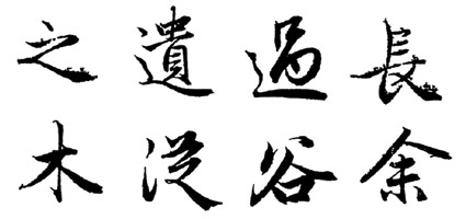
①The difference in starting strokes. For example, in the attached picture, the two characters "天" and "哉" are formed by inserting the sharp edge into the paper and turning the wrist inward, showing an upward posture. The belly of the pen pauses for a moment and then moves up, showing a full and implicit state; "Jiang" and "Ju" enter the paper horizontally and then the wrist quickly turns inwards, making it appear vigorous and vigorous; the two characters "Qing" and "Wu" The lower horizontal line and the upper stroke come out in succession, which can be regarded as the hidden front entering in reverse, making it appear round, vigorous and graceful.
②The difference in closing the pen. For example, in the attached picture, the pen drawn horizontally under the word "美" is lifted up quickly to connect with the breath of the next stroke; the pen drawn horizontally under the word "ER" is against the front, revealing a clear and clear air; the pen drawn horizontally over the word "Cry" is turned horizontally to the front. The next stroke brings out the next stroke smoothly, which looks coordinated and natural; while the other word "cry" is pressed horizontally and gently closed, with a long aftertaste.
(2) Vertical painting
The key to making vertical strokes is to find curves while being straight. At the same time, you need to pay attention to the changes in back and length. Only by gathering the edges of the strokes can you show a strong and straight posture.
1. Long vertical
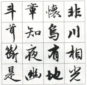
The difference between long vertical hanging needles and hanging dews is very different. In the picture, the two characters "Dou" and "Chang" are written with a hanging needle. The wrist is turned slightly outward when starting the pen, and the pen is turned to the right and then downward. The pen is lifted while walking, and the posture is quickly closed in the air when the front is made. It is generally used at the last stroke of a character, that is, "when the momentum is exhausted, the needle hangs". The two characters "huai" and "fei" are written with hanging dew. When closing the pen, the wrist should be slightly paused, and after a slight pause, the hand should be folded upward to close the pen. Like the character "Rong", the long and expressive character rarely appears in this post. After starting the pen, it rushes down, like an arrow leaving the string. The performance of the long vertical curve is accomplished by raising, pressing and lowering the pen, and must not be deliberately arranged.
2. Short vertical
There are many short vertical shapes. In the picture, the character "Zhi" has a vertical top and a rounded bottom, like jade beads hanging in the air; the character "武" has a thick and square vertical shape, like jade chopsticks painted with gray; the character "Chuan" has a simple, quiet and decisive character. , contrasting with the strokes on both sides; the end of the word "broken" is graceful and dancing, lifelike. The vertical painting of "Ye" is slightly curved to the left, opposite to the right part, and the vertical painting of "You" is slightly curved to the right, opposite to the right part. In the same character, both vertical and horizontal strokes must be facing toward the back, such as "xiang" and "shi". In addition, the short and vertical characters should be randomly changed in specific applications to coordinate with the entire word. For example, the thin and straight vertical strokes of the character "You" contrast with the thick lines next to them, creating a balance; the two vertical strokes of the character "地" are of different lengths, making the character flexible; the vertical strokes of the character "光" are slightly curved, contrasting with the straight lines below. Create contrast.
(3) Skip
Regardless of what the ancients called "a rhinoceros with a broken land", the most common fault is frivolity. The key to writing is to avoid dragging the pen straight into the paper, but with the cooperation of the wrist and fingers.
When starting to write, the wrist finger needs to be turned outward quickly to put down the paper. When writing downward to the left, the wrist finger also needs to be turned outward slowly to cooperate.
1. Changes in writing
Most of the writing methods used in writing are cutting in, stopping and descending. This action of entering the pen helps to adjust the edge of the pen and express the strength of the stroke. For example, in the attached picture, the words "bu", "yu" and "pai" are used. When the orchid leaf is started, the sharp edge is straight, the middle part is full, and the closing of the pen is elegant. There is a wonderful feeling of singing and sighing between the changes of weight and weight. Such as the words "pan" and "ming" in the attached picture.
2. Changes in pen collection
In the attached picture, the two characters "Lu" and "Guzhi" are written in a back-to-front style, and the ending point is turned upward to echo the next stroke; When closing the pen, the wrist fingers are turned outward and the strokes are drawn out quickly, showing a long and lasting meaning; the strokes of the two characters "Yu" and "天" are hidden and front strokes. For changes in skimming, it should be used in conjunction with a specific glyph camera. If there is still some dots on the upper right side after the stroke, you can use a return stroke or a hidden stroke to echo it. If the stroke is the last stroke, it is better to use an outstroke stroke. In addition, the angle changes greatly. It is used for the flat abbreviation of the beginning of a character, with a short, flat and clean stroke, such as the two characters "Qiu" and "Dong" in the attached picture. It is used for the vertical abbreviation of the left side of the character. The shape is vertical and strong, such as " "Board", "Xu", as well as the most widely used oblique writing, with various postures, such as "leaning", "square", and "you" figures.
(4) suppress
We often use twists and turns to describe the form of Na. To be precise, this only summarizes the general characteristics of Na. In fact, Na has other different forms.
The "捺" in the character "Zhao" is generally stretched, and the line and weight of the strokes are very clear, making it suitable for copying and pondering.
1. flatten
Mostly used for walking at the bottom. One is a typical writing method with twists and turns. First, move forward lightly to the upper left, fold the pen backwards, lift it slightly and then move the pen downwards to the right. Gradually increase the pressure. When the corner is reached, the wrist fingers turn outward and come out flat, as shown in the attached picture. "Character. The other type starts with a sharp edge and goes straight in without any pauses. This stroke appears lighter and more elegant, such as the two characters "Yi" and "Dao". There are also those who have turned against the odds in terms of writing style. As shown in the attached picture with the word "Guo", the folded edge is reversed and the pen is drawn upward to the left, and then the pen barrel is turned downward. The paintings written in this way are somewhat graceful.
2. slant
Compared with the flat writing method, the oblique writing method is much richer. There are twists and turns, such as the word "long" in the attached picture; there are light-into-empty, implicit and implicit ones, such as the word "wood"; there are reverse strokes that are astringent. , The character with full official meaning is like the character "cong"; the character with the edge drawn back to the wrist and sharp edge is exposed, such as the character "谷"; the character with the sharp edge reflected in the back and the pen breaking the meaning, such as the character "yu". In cursive script, Na method is also one of the most varied dot paintings. In addition to the different processing methods of the brushwork analyzed above, it also has changes in angle, weight, square and circle, retraction and other aspects. When we are writing, we can first practice classification. After we become proficient in writing, we can then combine it with specific word examples to find out its changing rules so that we can understand it thoroughly. It is worth emphasizing that when pressing the feet, there must be an eversion of the wrist when striking, so that it will appear plump and even when written in this way.
(5) Folding In regular script, folding paintings can be regarded as overlapping horizontal and vertical lines. However, the writing speed of running script is faster, so the accuracy of the movements in writing is higher.
1. Fold horizontally
The horizontal fold changes into square or round when turned down. Fang Zhe requires that when turning the pen, the sharp edge will be straight down, with a strong and sharp energy, as shown in the word "see" in the attached picture. There are few square turns in Zhao Mengfu's "Back and Back Chibi Fu", and round turns are the most common. This also shows Zhao Mengfu's familiarity with wrist and fingering techniques. For example, in the attached picture, the turns of the four characters "yan", "jia", "gao" and "鱼" are invisible and show the skill. When we are writing, we may have a problem that it is difficult to express the energy of roundness in the turns, which requires intensive practice in the coordination of the wrist and fingers. 2. vertical fold
There are less vertical folds in "Back and Back Chibi Fu". When writing, you only need to handle the wrist from vertical outward to horizontal inward rotation, such as the two characters "山" and "夜" in the attached picture.
4. Characteristics of the endings in "Back and Back Chibi Fu"
Here, I would also like to mention Zhao Mengfu's famous saying that "the character Gai Jie is passed down from generation to generation, and the use of pen is difficult to use through the ages." Regarding calligraphy, the ancients had a relatively strict set of rules, and Sun Xiaoyun's book "Calligraphy Has Laws" also made a special discussion on this.
But the knots are all different, and they continue to interpret new points and lines with the development of the times. The meaning of "passed down from time to time" may mean that calligraphy will differ due to different times, customs, personal tastes, hobbies, aesthetics, etc.
As an outstanding representative of artists, Zhao Mengfu certainly has his own understanding of calligraphy. He once said, "The most important thing in writing is to use the pen, and the composition also requires hard work." In the next lecture, we will focus on analyzing the characteristics of the knotting of "Chibi Fu".
1. well-proportioned
How to add a lively and free spirit to the meticulous and even knots, in addition to using the cursive techniques mentioned above, there is also the need to make a fuss about the irregularities. In "Back and Back Chibi Fu", the left and right structure of the characters make the length and height of the characters match each other, as well as the height and pitch of the characters, such as the three characters "Qi", "Gu" and "踞" in the attached picture. Posture , such as "jing", "dream" and "shang". The single-style characters make the stipples uneven and the writing vivid, such as the three characters "Yi", "Ye" and "月".
2. Movement and stillness
This feature of calligraphy injects a bit of agility into the seemingly calm and dignified character Zhao.
The contrast between movement and stillness in this volume includes the mixture of lines and cursives in the composition, as well as the use of calligraphy. "Quiet" simply refers to the calmness of the writing, like lines in regular script; "dynamic" of course refers to the flying movement of the writing, using the style of cursive writing. For example, in the attached picture, the four characters "Shun", "Jing", "舻" and "Ying" are half static and half moving, which enriches the expressiveness of calligraphy.
3. light and heavy
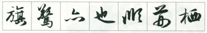
If you focus on the composition, the changes in weight and weight between the lines in this volume are very clear; and if you focus on the calligraphy, the weight and weight of the lines are also everywhere. The weight is achieved by lifting and pressing with a pen, or contrasting left and right, or different up and down, or different inside and outside, as can be seen from the three words "roost", "shield" and "hole" in the attached picture.
Of course, the processing of this kind of calligraphy should be natural and appropriate, and avoid being too mechanical. Generally, a radical should be regarded as a unit, and a stroke should not be regarded as a beat. Each stroke will change in severity .


