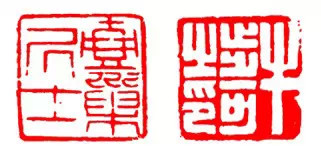
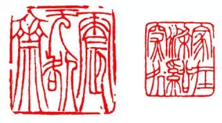
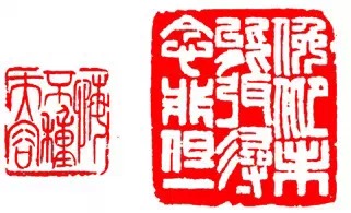
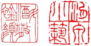
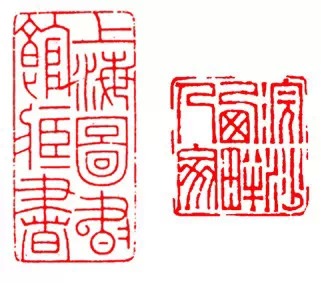
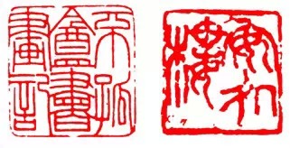
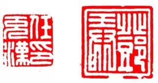
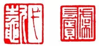
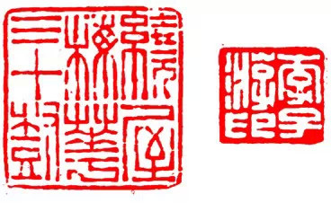
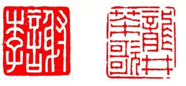
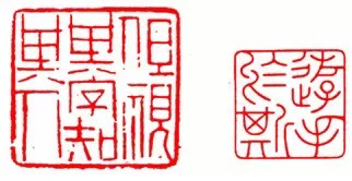
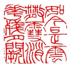
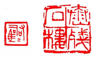
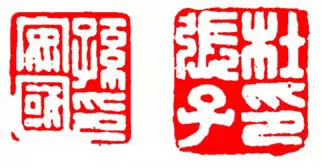
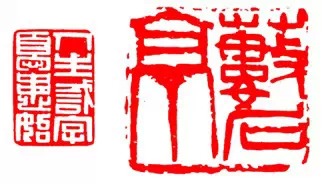
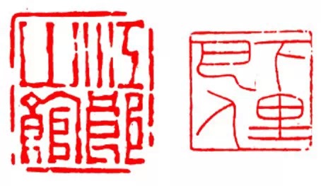
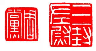
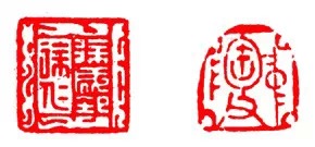
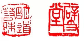
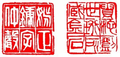
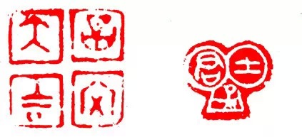
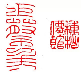
Nineteen beauties of seal cutting - you know how many beauties
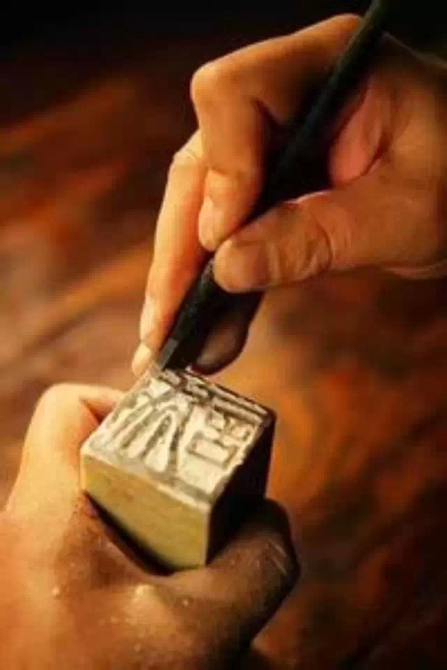
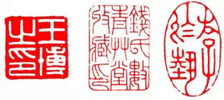
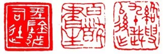
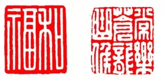
Seal cutting pays attention to "distribution of red and white". The composition can generally be divided into three aspects: layout of printed text, management of virtual and real, and perfecting the whole, which are expressed through layout. The multi-faceted beauty of the seal layout directly determines the level of seal cutting, and also affects the overall artistry of the work.
1. Smooth, regular and beautiful
It is smooth and regular and is not limited by the shape of the seal stone. The position arrangement and stroke arrangement of the seal in the layout are generally neat and not uneven.
2. Complex and indulgent beauty
It is complex and indulgent, and is not limited by the shape of the seal stone. The arrangement of the seal words is free and unrestricted. The positions are often intricate, and the strokes of the characters are interspersed with each other. The text between the lines is often changed according to the variability of the seal calligraphy. Relationship, the layout is extremely flexible, highlighting the interesting writing style of the calligraphy without being rigid.
3. Beautifully proportioned layout
Symmetry refers to the relatively even arrangement of the vertical and horizontal gaps of the seal strokes, which is usually reflected in the smooth and regular layout of the seal, which can make the layout produce a solid and steady aesthetic feeling.
4. Vermilion and white contrast beauty
Contrast is to express the opposition between traditional and simple in strokes or in the gaps between strokes very prominently, so as to produce the beauty of virtuality and reality, and to form the disparity between red and red, white and white. When used appropriately, "sparse can be used to move the horse, and dense can be used." The effect of "airtight" can be achieved in one seal.
5. Symmetrical decorative beauty
Symmetry refers to treating the traditional and simplified characters (strokes and gaps between strokes) on both sides of the center line in a nearly identical manner when laying out printed text, so that the two opposite parts are proportional in terms of Zhu's sense of volume, so as to achieve the effect of mutual adaptation. This adds decorative interest.
6. Rhythm echoes beauty
Echoing refers to the mutual correspondence of the relationship between the red and white parts of the left and right, up and down, or diagonal parts, so that the void and reality of a certain part do not exist in isolation, thereby strengthening the overall rhythm.
7. Harmony and unity
Coordination is to unify the styles of local and local, local and whole aspects during layout, so that everything is in harmony. Firstly, the fonts must be unified, secondly, the strokes must be unified, and thirdly, the stroke styles must be unified, and the styles of the seals and edges must also be unified.
8. Seeking beauty in diversity and change
Seeking differences is to deal with the same problems encountered differently during layout, avoid mechanical duplication, and make the overall change. At the same time, it can also adjust the density problem in the layout of the printed text.
In a seal, any overlapping characters, two connected characters with the same radical or difference, or the same characters adjacent to each other on alternate lines must be changed to achieve differences.
9. Broken natural beauty
The appearance of dilapidation in ancient seals is not the intention of ancient seal makers, but is caused by long-term weathering. It can be used reasonably in the layout, which can balance the virtual reality and center of gravity of the layout, and can also vividly enliven the charm. Where the strokes are dense, appropriate fragmentation can be done to create a sense of liveliness between the vermillion and white; long strokes close to the printed edge and parallel to the printed edge can be fragmented to make them ventilated; if the near-printed edge is too open, a small number of residual points of different sizes can be added. Reality, to balance the virtual reality of the whole.
10. Addition and loss echo beauty
Addition and deletion is one of the important methods used by sealers in the Han Dynasty to deal with the layout of private seals. Adding simplicity and detracting from complexity can narrow the gap between the traditional and simplified seals in the same seal, and make the layout produce symmetry, symmetry, echo and other virtual and real aspects. Beauty.
11. Different beauty
Interspersed means using both red and white text in the layout of a seal. The traditional one is white text, and the simple one is red text. It is used to adjust the relationship between virtual and real and balance the center of gravity. In a seal with alternating vermilion and white, the gaps between the vermilion strokes should be similar to the thickness of the white inscriptions, and the gaps between the white inscriptions should be nearly the same thickness as the vermilion strokes.
12. The beauty of shifting meta combinations
Shifting is a method of moving the original position of the seal radical. Without violating the principle of the Six Books, the position of a certain radical of a character is moved so that the wide and narrow shapes of the seals can adapt to each other.
13. The combination of moving and letting is beautiful
Shifting is to improve the virtual reality and center of gravity of the overall layout by expanding or contracting the area of the seal or moving the position of the seal.
14. The beauty of clever layout
Cleverness is based on the overall perspective of the seal layout, and the strokes of the seal are used in different directions to achieve the purpose of vivid layout. The key point of the skillful method is not to be too charming when using skill, and not to be too wild when using clumsiness.
15. The beauty of telescopic avoidance
Telescopicity refers to the different expansion and contraction of the strokes of the seal according to the needs of the layout of the seal and the management of virtuality and reality, so that the part and the whole are integrated and the momentum is consistent.
16. The beauty of mosaic combination
Inlaid together means to join two characters together, either inlaid or integrated. The two characters integrated into one must be one word in grammar, one is traditional and the other is simplified. The character on top generally surrounds the character below half or fully.
17. Palindrome layout
Palindrome is a layout in which the seal text is rotated in reverse to adjust the virtual and solid effect of the layout. In the Han Dynasty, it was mostly used for four-character name seals. Later, some people also used it in leisure seals.
18. The contradictory beauty of thickness and detail
The different thicknesses of the seals in the same seal, and the different traditional and simplified strokes in the same seal are all contradictory phenomena. Through subjective adjustment, the relationship between the virtual and the real in the seal layout can be perfected and the overall rhythm can be produced.
19. Beautiful sidebar decoration
The sidebar is the printed border and grid in the seal. In the seal layout, the layout of the seal and the management of virtuality and reality are inseparable from its role. Because the presence and thickness of the printed edges and the different forms of the columns are inseparably related to the artistry of the seal layout.
(1) The relationship between Zhu Wenyin’s edge and text: The edges and text are of the same thickness, which is intended to reduce contradictions.
(2) The relationship between the edge and the text of the white text seal: the thickness of the edge is similar to the gap between the strokes of the seal, and the layout is easy to be elegant and harmonious.
(3) Decorative edges: Decorative patterns around the printed text make the printed edges look gorgeous.
(4) Mud sealing edge: different widths and no similarities. They are all natural and not the result of ingenuity.
(5) Column grid: The use of column grid can make the seal layout neat, the center of gravity stable, and obtain a solemn effect.
(6) Combined sides: There are few characters in the seal, and the strokes of the seal are very simple. When laying out, each seal plus a side column can be arranged into a seal, and several seals form a whole, which has a unique feeling.
(7) No borders: In Zhuwen Seal, after the sealing cloth is arranged as a whole, there are certain long lines on the outer edge of each surface, so that the seal shape is clear and perfect. There is no need to print borders, which is simple and interesting.
The art of seal cutting relies on the presence of energy, momentum, emotion, and rhyme, and is ultimately implemented in the word "harmony." Regardless of the number of words or the different shapes, the whole seal must be united and the relationships shown in weight, virtuality and reality, density and density should be appropriate, so that there is density within sparseness, sparseness within density, and reality within emptiness. , There is a void in reality, the energy is gathered but not blocked, the momentum is released but not chaotic, there is change in unity. If you can write a good article based on the four words of virtuality, reality, density, and density, you will basically have the essentials of composition. The composition must be novel and unique , with both the spirit of the times and personal style. This is a higher-level requirement and is worthy of our lifelong efforts to pursue.