The composition of calligraphy works
ConstitutionIt refers to the overall arrangement of a calligraphy work, also known as Dabubai, or chapter structure, which is an important part of the art of calligraphy. For the artistic requirements of a work, it is not only necessary to write every single word well, but also to turn many words into a complete chapter. Regardless of the space between words, between lines, as well as the top and bottom, the title and the seal, an overall design and reasonable layout must be made.
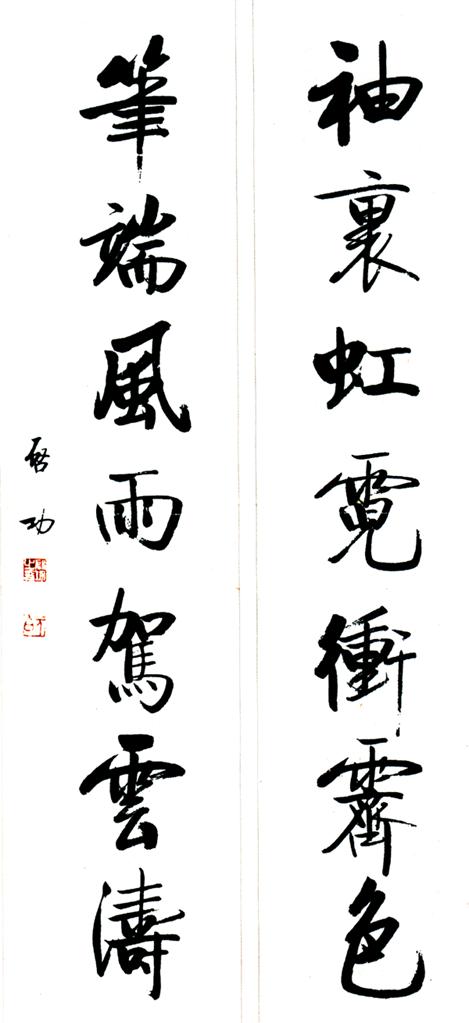
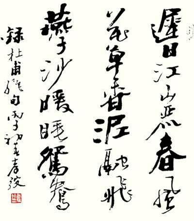
A calligraphy work mostly includes three aspects: text, title and seal.
The main text is the main content to be written and the main body of the work. Articles, poems, aphorisms and other healthy, auspicious and peaceful words can be used as the content of calligraphy works. The title is explanatory text outside the main text. Including the title of the text, the time and place of writing, the name, font size, and postal code of the writer, the title and name of the recipient, etc. Not all of these contents need to be written in every work. The content of the title depends on the specific needs of the work. Some of the contents of the title are written in front of the text, called the upper paragraph; some are written after the text, called the lower paragraph. Contents such as the name and title of the recipient should be written at the front of the text to show respect. The seals stamped on calligraphy works can be divided into name seals and leisure seals according to their contents. Judging from the location of the seals, there are the first chapter and the foot seal.
The seal that is stamped on the top of the work is called the first seal, and the seal that is stamped after the main text and the next paragraph is called the foot seal. Seals mainly play an embellishment role in calligraphy works, so there should not be too many seals in a work, usually one to three.
The text, title and seal are the three major organic components of a work. When creating, it must be coordinated and arranged so that the three elements form a perfect and harmonious whole.
The signature refers to the written content in the calligraphy work other than the main text. The signature includes: the source of the text content, the recipient of the gift, the reason for creation, the time of creation, the author's name and font size, etc.
There are two types of signatures: "double style" and "single style". The double style means that the recipient of the book and the writer are placed above and below respectively. The former is the upper style and the latter is the lower style. The first paragraph states the name, source, and name of the recipient of the work; the second paragraph describes the year and month of creation, the place of creation, the name of the author, etc. Above paragraph: The position should be relatively high to show respect, including name, title, and modest words. Next paragraph: Write the time, place, name, and modest words.
If there is a lower paragraph but no upper paragraph, it is called a single paragraph. A single paragraph may include the contents of the upper paragraph, or it may not include the contents of the upper paragraph. If there is no recipient for the gift of the book, only a single payment will be made.
Single styles are divided into long styles, short styles and poor styles. The long paragraph means writing the time, name, and place before the source of the text, plus the author's thoughts or reasons for creating this work. The text should be sincere and meaningful, making people endlessly pondering. It not only adjusts the focus of the work, but also reflects the author's character and cultivation. The short paragraph only includes the source of the text, time, name, location, etc. If the work has a lot of blank space or is out of composition, you can add a long section; if the content of the work occupies a large area of the screen, you need to add a short or poor section. If there is not much paper left and there is too little blank space, you can just put the author's name on it, which is called "poor money".
When planning the layout of calligraphy works, the location of the signature should be taken into consideration. If the book presents a couplet, the upper paragraph must be written on the upper line and the lower paragraph on the lower line; other works are generally written on the left side. If the inscription is divided into two lines, the upper paragraph should be written on the front line and the lower line should be written on the back line; If the signature is signed on a single line, the upper paragraph should be written in the upper half and the lower paragraph should be written in the lower half as a courtesy. Neither the single paragraph nor the double paragraph should be flush with the main text. They must be uneven to prevent them from being flat. Generally, there should be a few spaces for words at the top and bottom, and the signature should be as close as possible to the top. It is better to be tight up and loose down, rather than tight up and down. The font used for signing is generally official script instead of seal script, regular script without official script, and cursive script without regular script. The signature is usually "ancient style and modern style" and "wenzheng style". If the main text is in oracle bone inscriptions, bronze inscriptions, or large and small seal scripts, the inscription should be in seal script, Zhang cursive, regular script, or running script; if the main text is in official script, regular script, or Wei stele, the inscription can be in regular script or running script; if the inscription is in cursive script, it is difficult to identify unless it is used in cursive script. , generally not used for signature. The most commonly used signature font is running script, which is easy to recognize and lively. The size of the paragraph font should be smaller than the size of the main text font to make the priority clear.
The above signature format is for vertical works. For banner works, generally only the lower part is left and not the upper part. Similar to vertical works, the beginning and end of the signature cannot reach or exceed the top and bottom words of the text of the work.