The structural characteristics of "Lanting Preface"
Looking at "Lanting Preface" from the perspective of structural modeling, it is obvious that it does not seek fairness and emphasizes sideways; it does not seek symmetry but emphasizes yielding; it does not seek uniformity and emphasizes contrast. Of course, the regular script in Guange style is insignificant. Even in running script or regular script, there are many stiff and rigid works that lack vitality and posture. Zhao Mengfu's skills as king were unprecedentedly high, but his self-written inscriptions such as "Dengba Stele" were very mediocre. Using it as the reference system for "Lanting Preface"
You can quite see the clues.
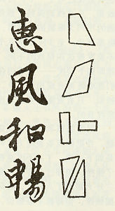
Take the four characters "Hui Feng He Chang" as an example (see picture).
The head of the character "Hui" tilts to the left and the character "心" sinks to the lower right corner, almost causing a dislocation between the structures. The central axis between the parts changes from vertical to tilted. The word "wind" uses the upper right corner of the horizontal painting to rise up, creating a sideways effect in the opposite direction to the word "hui". The character "和" is divided into two parts, the left and right parts. The side of "禾" is elongated into a vertical shape, while the "口" is flattened into a horizontal shape, resulting in a vertical and horizontal cross in one character. As for the word "Chang", it is an oblique cross between the head and the tail. The two parts "Shen" and "Yi" just form the counterpoint of two triangles, but according to the standard writing method, it should originally be between two rectangles. Simple combination. As a result, we see that the body shapes and structures of these four characters are completely different - a contrasting effect throughout the entire main axis.
It’s hard to say that there would be such complex ideas and ingenious management at that time. Maybe it’s just my personal love at first sight. But I think this is an excellent analysis method: I use a combination of axis and plate analysis for the structure. Calligraphy is a visual art. If we cannot find and summarize the mainstream lines among various intricate and intersecting lines, we will be at a loss or unable to start with some ancient famous calligraphy. Naturally, we cannot guarantee the efficiency of learning.
The structure of Chinese characters is originally a stable standard form. Each word is rich in an architectural connotation, and the structure and arrangement of the space are completely similar to the architectural principles. However, it is inappropriate to just view the structural beauty of calligraphy dramas such as "Lanting Preface" in this way. The charm of calligraphy structure lies in its ability to break this standard shape in a controlled manner and infiltrate the personal characteristics of each artist within the standard norms. Create meaning. This leads to the principle of calligraphy structure from straightness to balance - in the former we see stability, uniformity and neatness; while in the latter we see a kind of tension and tension that seeks to achieve balance amid unevenness. The word balance itself means that it is not straight, only it is tilted, so it must be balanced. To make the most common metaphor: fairness is similar to a scale, while balance is close to a scale.
Pursuing artistic form among standard forms is the fundamental purpose of calligraphy. From the above-mentioned four characters "Huifeng Hechang", it seems that our copying will be meaningful only if we truly observe and understand the "changes" of different structural treatments of these four characters. Meticulous. And once this understanding of artistic structure and the understanding of line beauty are combined to form the overall feeling and grasp of "Lanting Preface", the efficiency of learning is self-evident.