
"Seventeen Posts" is one of Wang Xizhi's masterpieces in cursive script. It is named after the word "Seventeen" at the beginning of the volume. The original calligraphy was lost long ago, and the "Seventeen Tie" handed down to us today is the engraving. Zhang Yanyuan of the Tang Dynasty recorded the situation of the original ink ink in the "Seventeen Tie" in his "Book of Dharma": "The "Seventeen Tie" is one foot and two feet long, which is the Zhenguan Zhongnei version, with one hundred seven lines and nine hundred and forty-three characters. This is Xuanhe's famous calligraphy. Emperor Taizong purchased the two kings' books, and the king's book contained three thousand pieces of paper. He made a roll of one foot and two feet, and took the handwriting and words of the two kings to form a scroll."
This post is a set of letters. According to research, it was written to his friend Zhou Fu, the governor of Yizhou. It was written over a period of fourteen years from the third year of Yonghe to the fifth year of Shengping (AD 347-361). It is an important material for studying Wang Xizhi's life and the development of calligraphy. Bao Shichen, a native of the Qing Dynasty, has an article called "Seventeen Tie Shu Zheng" for reference.
"Seventeen Posts" is a collection of posts, named after the first two characters of the first post, "Seventeen". There are 27 posts, 134 lines, and 1166 words. Some of these posts are still copied and handed down in ink, such as "Yuanhuan Tie", "Youmu Tie", etc. According to records, Emperor Taizong of the Tang Dynasty was fond of Youjun's books and collected three thousand pieces of Wang Shufan, all of which were divided into one volume of one foot and two feet. "Seventeen Posts" is one of the volumes. Zhang Yanyuan of the Tang Dynasty's "Book of Dharma" says: ""Seventeen Tie" is one and two feet long, which is the inner version of Zhenguan, with 17 lines and 943 words. It is also a famous Tie." This record is slightly different from today's. The original version is different. There are many imitations, among which the most famous rubbings handed down include the Ming Xing and Dong collections, Wen Zhengming Zhu Shi editions, Wu Kuan editions, Jiang Chenying collections, etc. Cai Xizong of the Tang Dynasty said in "Lun of Dharma Calligraphy": "The right army of the Jin Dynasty stood out from the rest. It understood the Tao and eliminated complexity and saved things, and created a system. It is called a new grass. This is the "Seventeen Posts" handed down today." Tang Dynasty Since the Song Dynasty, "Seventeen Tie" has been used as the supreme model for learning cursive script, and is regarded as the "dragon and elephant in the book" by calligraphers. Its status in cursive script can be equivalent to "Huairen Ji Wang Xizhi's Book of Holy Preface" in running script.
The style of "Seventeen Posts" is harmonious and elegant, neither exciting nor harsh, but the style is far away from the wind. There is absolutely no crazy and angry habit of ordinary cursive scripts, and it reveals a calm and peaceful atmosphere. Zhu Xi of the Southern Song Dynasty said: "He plays with the meaning of his brushwork, calmly and generously, and has a detached atmosphere. He is not tied to the law, and does not seek to escape from the law. His words flow out from his own mind one by one." The lines of the whole post are clear, but the words on the left and right are related to each other. ; There are occasional ties between characters, but they are mainly broken. The shape is broken and the spirit is continuous, and the movement of Qi is connected; the size and density of the characters are well-proportioned. It is true that "the shape is like being broken but still connected, and the momentum is like slanting but straight." .
"Seventeen Posts" uses a combination of square and round strokes, integrating the square into the circle and hiding the fold in the turn. The round turn contains strength in gracefulness, and the strength in movement is in gracefulness. The outer mark is blended and the inner mark is clear and strong. Concise, sophisticated and appropriate in movement and stillness, these can be said to be the realm and method that grass practitioners must understand.
The writing style of "Seventeen Posts" is:
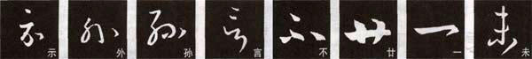
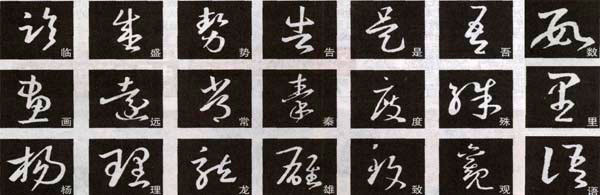
1. Single point.The single point is usually the upper point of the character, or on the outline of the character. Start the pen with the tip of the paper and press down to the right to close the pen. Or it can be closed in the air, like the word "show"; or it can be turned to the lower left after pressing down, and it can be closed in the direction of the trend, like the word "外".
2. Two o'clock.This kind of point is horizontal, such as the two points on the right side of the character "Sun", which echo left and right. The closing stroke of the former point should be consistent with the starting stroke of the latter point; or it can be vertical, such as the two points on the character "yan", which are not Emphasize the echo relationship, but the independent mood, but avoid duplication or too much difference.
3. More.Some characters in cursive script have more than three points. The upper point of the word "bu" is independent, and the two lower points form a corresponding relationship. The writing requirements are consistent with the two horizontal points mentioned above.
4. Long and horizontal.There are relatively few long horizontal lines in cursive script. The long and horizontal strokes are very eye-catching, but if they are used more often, they will conflict with the flow and harmony of the entire cursive script. The long horizontal strokes in Wang Xizhi's cursive script generally show the edge, and the strokes may change from thick to thin, or from thin to thick, with a natural transition. To retract the pen or empty it, or press down while changing the tip, and then retract the pen to the lower left. Such as "twenty" and "one".
5. short horizontal. There are many short and horizontal strokes in "Seventeen Tie", and the writing method should be determined according to the needs of the font.
6. How horizontal.Many horizontal lines are connected together, and the general posture and length vary. Some horizontal lines are connected, such as the word "Wei".
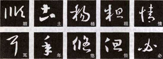
7. short vertical. There are also various ways of writing short vertical lines in "Seventeen Posts". For example, the lengths of the three vertical strokes of the character "Shun" are very different, but the stroke of the middle vertical stroke is square, which is different from the left and right vertical strokes. The short and vertical strokes have variable starting strokes, and sometimes there are also curved strokes, such as the character "Tu".
8. The dew hangs vertically.This kind of vertical painting is not a uniform form. For example, the vertical painting of the character "Yang" forms a curved head, and the vertical painting of the character "Chu" is written vigorously and powerfully, with the ending stroke being round and square.
9. Hanging needle vertically. The vertical paintings in "Seventeen Posts" are also in various forms. For example, the long vertical part on the left side of the word "情" is arc-shaped, with a circle at the top and a lower part, and gradually becomes thicker. The vertical middle section of the word "EAR" begins to tilt to the left, and the stroke ends in a needle-like shape. shape.
10. Shorthand. In "Seventeen Posts", there are two forms of short strokes: one starts with a square cut and ends with a sharp edge, such as the character "年"; the other starts with a sharp edge and ends with a square shape, such as "You" "Character. Short strokes should be written neatly and without hesitation.
11. long. The long strokes in "Seventeen Posts" have different shapes. For example, the stroke of the character "Dan" starts from the side and enters the paper with the center stroke, and the stroke ends implicitly; the stroke of the character "Bi" is in an arc shape, from thin to thick, light and flowing.
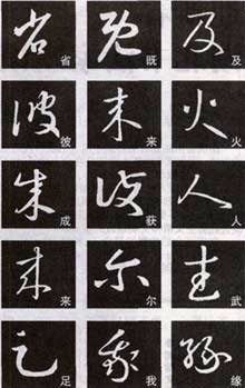
12. straight. Straight writing often appears in Wang Xizhi's cursive script, and the shape is generally the same, but there are some differences. Some are called "victory" by being strong, such as the word " province "; some are tall and straight, such as the word "ji"; some are soft and strong, such as the word "ji".
13. Short press.Its shape is like a long point, and the tip must be pointed when starting and closing the pen, forming the characteristic of sharp points at both ends. In the attached picture, the short stroke of the character "BI" has an arc on the upper side and a smaller curvature on the lower side; the stroke of the character "LAI" is gradually strengthened when closing the pen; the stroke of the character "火" has no curvature, is thick in the middle, and has a thick stroke at both ends. Thin, shaped like a spindle.
14. Waves and waves.For example, the character "cheng" has the characteristics of Zhangcao's painting, that is, it has a certain degree of ripples.
15. With hook. Some of the strokes in "Seventeen Posts" show the hook technique brought about by the turning point, and form a joint relationship with the strokes of the next character. For example, for the word "hui", when turning, wrap the tip of the pen and then bring it out to the left; for the word "人", pause and press when turning, and then bring it out to the left.
16. Short hook.The turning points of these hooks are often light and flexible, such as the word "lai". When turning, lift the pen and draw the tip slightly, and then draw it gently to the left. Do not write a heavy hook like regular script. The hook of the word "er" does not need to be lifted when turning. Instead, it is wrapped with the tip of the pen, and then the hook is drawn to the left by taking advantage of the momentum.
17. Pick hook.These hooks are traces of the Zhangcao glyphs. When writing the word "武" to pick up the hook, there is a pause, press down and then pick up the front, which makes it look heavy and calm. The hook of the word "foot" does not need to pause, but is lifted up when changing directions.
18. Curved hook.The arc hook has a larger arc. For example, the word "I" has a certain turning point when writing the hook, that is, stopping for a moment while gradually changing the direction of the stroke. The word "Yuan" only turns, not folds. At the turning point, the tip of the pen must be closed and not let the tip of the pen spread out.
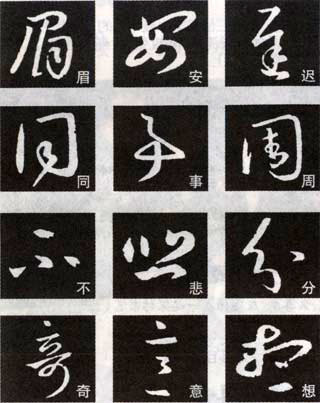
19. Circle.Zhizhuan is the most common writing technique in cursive script, and it can be divided into two types: circular zhuan and square zhuan. The first corner of the word "eyebrow" is a round turn. When writing, you should close the tip of the pen and slow down the writing speed when writing. The Ping Baogai in the character "An" is also a round pen, but the angle is larger when turning.
20. Square fold.The ancients used both Yuanzhuan and Fangxin in cursive script. For example, the two turns at the beginning of "Chi" Yu are typical square folds. This writing technique requires you to change the direction of the pen at a corner and start writing again, then press down and then move forward. When turning, you must pay attention to the connection of strokes to prevent disconnection.
twenty one. Turn.Turns and turns are not completely separate. Some words have both turns and turns. For example, the upper right corner of the character "Tong" seems to be square but rounded; the character "Shi" has many turns without revealing the corner; the corners of the character "Zhou" are also round with a square.
The calligraphy structure of "Seventeen Posts":
1. Pointillism
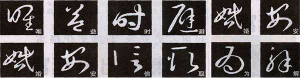
When using cursive characters with dots as the main characters, attention should be paid to the correspondence between the dots. Sun Guoting said: "If all the points are aligned, the whole body behaves well to each other." This means that there are more words. Don't write these points in the same form. For example, the words "no" and "sad" handle the relationship between the points well. Sometimes, dots need to form a certain relationship with other strokes. For example, the dots of the characters "fen" and "qi" are the eyebrows of the characters, which play the role of expressive portrayal; the dots of the character "fen" are the weights to ensure the balance of the characters; the upper dots of the character "qi" are like the brains of the characters. , whose direction determines the posture of the character. The midpoints of some cursive characters echo each other with other strokes, making the structure of the characters come alive. For example, the dots in the word "Yi" are sparsely spaced, not emphasizing connection, but very natural; the two dots under the word "思" seem to be disconnected and connected with the strokes above, which is very interesting.
2. Balanced and correct
The words "Shu" and "Li" in "Seventeen Posts" are all compact and upright. Zhongzheng is only a relative concept. If it is completely fair, it will inevitably appear dull. The overall characteristics of the characters with left and right structures such as "Yu" and "Lin" appear to be relatively balanced. The characters on the left side of the character "Yu" are written very heavily and are evenly matched with the characters on the right side; the character "I Lin" is wider on the left side and narrower on the right side. Some characters with upper and lower structures often have sloping horizontal lines, but a neutral effect needs to be achieved through vertical drawing, such as the character "SHENG"; or balance can be achieved through local matching, such as the character "SHENG".
3. Positive combination
The characters such as "gao" and "shi" in "Seventeen Posts" all have a common feature, that is, the upper part of the character is relatively straight, while the lower part is very flexible. The overall effect of each character is heavy, but also There is no lack of agility, reaching the state of the combination of Zheng and Nian. The characters "wu", "hua" and "yuan" appear graceful and twists and turns. This is an artistic effect achieved by moving the middle part. For example, the middle part of the character "wu" is tilted to the left; the character "hua" is just the opposite. ; The middle part of the character "Yuan" swings left and right, making it look very vivid. Some characters combine the above methods, such as the character "Chang", which is slightly upright at the top and inclined below; the middle part of the character "Qin" swings left and right; the character "Du" The top is more upright, and the bottom is open to the left and right.
4. Left and right in harmony
For example, the left and right parts of the character "Shu" in the post have an outward-looking attitude, and are connected together through continuous strokes; the character "Yang" is small on the left and large on the right, which contrast with each other; the character "Li" is wider on the left and wider on the bottom. Narrow, the opposite is true on the right. The words "dragon" and "xiong" are long on the left and short on the right or heavy on the left and light on the right, forming a layout with a big one and a small one, which is their unity. However, the processing methods of each character are different, which shows Wang Xizhi's superb skills in processing glyphs. The processing method of words such as "Zhi" and "Guan" is mainly based on the staggered position. The counter text on the right side of the word "Zhi" is placed very low; the part on the right side of the word "Guan" is placed at the lower right, almost forming an up-and-down structure.
5. Zoom fit
The words "wei" and "yi" in the post are all typical of the up and down style. The "mouth" part on the left side of the character "WEI" and the upper part on the right side are very open, while the lower part on the right side is very narrow and the strokes are thin. The word "Yi" is also open at the top and contracted at the bottom, making it look very majestic and straight. Some characters use certain local contractions to make the font look very compact. For example, the "日" part on the left side of the character "Shi" appears very tight, and the strokes in the middle part of the character "Avoid" are very light, visually creating a pattern of shrinking and expanding. The characters such as "marriage" and "安" are arranged meaningfully through the exaggeration of certain strokes and the contraction of certain parts, which are not easy to handle. At this time, you should pay attention to the position of the exaggerated strokes, and also appreciate the ingenuity of the contraction parts.
6. virtual reality opening and closing
For example, there is the word "信" in the post, with no consecutive strokes between the left and right, and the distance seems too large individually. However, the structure of "Seventeen Posts" is actually very harmonious in the whole article. When writing this kind of characters, you should pay attention to the positional relationship between the left and right characters and the ratio of length to short. —Some words are scattered to win. For example, the two parts of the word "take" are arranged very far apart; the four parts of the word "salt" are close to each other. When forming characters that encircle a shape, attention should be paid to the treatment of internal and external space. For example, the middle part of the word "目" is very small, making it appear that there is a large space within the character; the dot under the word "WE" is close to the edge, leaving the middle blank; the wrapping part on the right side of the word "Jie" is placed lower and the lines are very thin.
7. Taking advantage of the situation
In the post, the upper and lower parts of the characters "tang" and "gao" are slanted, making the entire font look dangerous. Some words with left-right structure in the post are also not balanced between left and right. For example, the character "Han" not only has a difference in height, but also tilts to the left, and is wider at the top and narrower at the right, making it very dynamic; the beauty of the character "说" is on the right side, tilting to the right one after another, making it appear very vivid. The most taboo thing about cursive writing is rigidity. If it is written evenly, it will cause difficulty in processing the entire article, so a certain degree of tilt is necessary.
8. video clips
The connected strokes in "Seventeen Posts" are ups and downs and full of rhythm. There are many connections between some calligraphy and stipples. The connections are lifted and pressed, and sometimes they seem to be connected and broken. Pay attention to the changes in the thickness of the connecting strokes and the change in the direction of the strokes. Some characters have large arcs of connected strokes, forming a circular shape. For such characters, you need to pay special attention to the ups and downs of the lines. Don't write too fast, as it is easier to draw circles if you write faster. The words "Xian" and "Xing" have more reflections, especially in some parts. Its circular movement contains lifting and pressing, and the writing style appears powerful and smooth.
Analysis of the composition of "Seventeen Posts":
"Seventeen Posts" is a representative work of Xiaocao script, and its composition is also of typical significance. According to Emperor Taizong of the Tang Dynasty, its composition is "a knot of smoke and thunder, which looks like it is broken but still connected; it looks like a phoenix and a dragon, and its momentum is like an oblique but straight line". Analysis of the composition of "Seventeen Posts" The common composition problems of cursive writing refer to the layout of the work, which is the final result of gathering points and lines to form characters, and gathering characters to form rows and columns to form a chapter. Regarding the collection of dots and lines into characters, we have previously given a preliminary explanation of some typical character shapes. Here we focus on the problem of collecting characters into rows and columns into articles in "Seventeen Tie".
The method of gathering characters into lines in "Seventeen Calligraphy" is not like the later Dacao and Kuangcao calligraphy, which rely on the connection between characters to strengthen the overall sense. Instead, it relies on the size of the font, the oblique matching of single character postures, and the thickness of the strokes. Change to achieve Qi channel penetration. For example, the picture on the far left is the first post in "Seventeen Posts", with three lines in total. Each word is independent and belongs to the pattern of Zhang Cao. However, Wang Xizhi transformed this pattern, making it more flexible. The strokes of the word "seventeen" in the first line of this post are very thick, setting the tone for the entire work. Other characters are either upright or sideways, such as "郗" in side posture, "Si" in side posture, "Ma" in tilt, "Wei" in upright posture again, and "Qu" in side posture. , so the whole line looks like each word is independent, but the strokes are connected with each other. In addition to this concept, the other two lines also have changes in the width of the font.
Another way to combine characters into lines is to connect upper and lower characters. As shown in the picture, the characters in the first line are still independent, and the strokes of the two characters "xiangfu" in the second line are connected. This is a way to strengthen the relationship between characters, but it still does not occupy the main place in "Seventeen Posts" ingredients, and the implications must make sense. "Seventeen Posts" handles this aspect very well, and the implicated words play a refreshing role in the entire composition without being entangled. Some characters pay more attention to the connection of meaning, that is, the connection in the strokes. For example, in the word "颐阳" at the beginning of the third line, the closing stroke of the upper character and the starting shape of the lower character break the connection of meaning, which also has the effect of implication.
The method of arranging "Seventeen Posts" into a chapter is to keep a certain distance between each line, but the moods between the left and right should take care of each other. Since the size, width, and front side of each row of fonts are different, they are very harmonious when put together. Adding some involved combinations makes the composition more flexible. It should be noted that "Seventeen Posts" is a small collection of posts, not written at one time, so the composition of each post has its own characteristics.
The calligraphy status of "Seventeen Posts":
This post has been highly praised by previous readers. For example, Huang Bosi of the Song Dynasty said: "This post is about the dragon in Shao Yi's book." Zhu Xi said, "He plays with the meaning of his brushwork, calmly expresses it, and has a detached atmosphere. He is not tied to the law and does not seek to be free from the law. The so-called one flows out from his own mind one by one." Some people think that this post "the brushwork has an ancient quality and has the legacy of seal script" meaning". These reviews are very fair. In particular, they are written calmly and without the constraints of the law, as if they flow naturally from one's own chest, which is the most profound and accurate. Sun Guoting once said: "Now that Zijing (Wang Xianzhi) has passed away, everyone must work hard to mark the form." That is to say, Wang Xizhi and others deliberately used force when writing to show that they have their own artistic style. In this way On the contrary, the natural beauty of writing is lost. This kind of contrastive comment is very enlightening for calligraphy appreciation.
Cursive script is one of the calligraphy styles that Wang Xizhi is good at. Before Wang Xizhi, Zhang Cao was already very mature. Judging from some unearthed materials handed down from the Wei and Jin Dynasties, Jincao has developed to a certain extent during this period, and of course it has not been completely separated from Zhangcao. Wang Xizhi summarized the achievements of his predecessors, and based on learning from Zhang Zhi and other calligraphers before the Eastern Jin Dynasty, he changed the simple calligraphy style of the Han and Wei dynasties and created Yanmei Liuben's cursive calligraphy, which established a basic standard for modern cursive calligraphy. This makes the boundary between Jincao and Zhangcao clear, and they become two calligraphy styles. The structure of his modern cursive script becomes free and flexible according to the writing style, which fully embodies the characteristics of cursive script of "deleting out the difficult and saving the complex, and losing and restoring to the simple". From a practical point of view, this makes it easier to increase the speed of writing, make the writing more continuous, the strokes broken and the meaning connected, and the artistry of writing is also enhanced. Its shape is vertical and horizontal, the hooks and loops are coiled, the expression is calm, and it has the beauty of endless changes. The strokes have transformed Zhang Hui's "suppressing the left and raising the right" style of waves, and replaced them with smooth and natural strokes that rise and fall. brush strokes.
Because Wang Xizhi made great contributions to calligraphy, his handwriting was regarded as a treasure by all generations after his death. Therefore, among the calligraphers of the Eastern Jin Dynasty, he left the most works. The cursive scripts we can see now include "July 1 Tie", "Hanqie Tie", "Chu Yue Tie", "Yuanhuan Tie", "Shangyu Tie", "Changfeng Tie", "You" "Mule Tie", "Shi Shi Tie", "Da Dao Tie", "Xing Rang Tie", etc. are all copies from the Tang and Song Dynasties. Judging from these copies, which are closest to the originals, the styles vary. Among them, "Hanqie Tie" and "Yuanhuan Tie" still have the meaning of Zhang Cao, and the stipples are clumsy and mostly irrelevant; "Chu Yue Tie", "Shangyu Tie", "Youmu Tie" and "Xing Rang Tie" are written briskly. , flows beautifully and naturally; while "Dao Tie" is unrestrained and galloping, flickering like the wind. Most of Wang Xizhi's cursive calligraphy works are handed down to this day in the form of engraved calligraphy. Among them, the cursive scripts in "Seventeen Calligraphies" and "Chunhua Pavilion Calligraphy" have greater influence.


