
"Yan Qinli Monument" is a tombstone erected by Yan Zhenqing for his great-grandfather Yan Qinli, referred to as "Qinli Monument".
Yan Zhenqing (709785), courtesy name Qingchen, was born in Jingzhao Wannian (now Xi'an, Shaanxi). His ancestral home was Linyi, Shandong, so some people say that he was from Langxie. In Kaiyuan of Tang Dynasty, he was appointed as censor. Because he was rejected by Yang Guozhong, he was appointed as the prefect of Pingyuan. When An Lushan rebelled, Yan launched an army to attack and was promoted as the leader of the alliance. Afterwards, he entered Beijing and held various official positions, including Shangshu of the Ministry of History, Crown Prince and Grand Master, and was granted the title of Duke of Lu. Later generations respectfully called him "Pingyuan" or "Lu Gong" based on his official name. During Dezong's reign, Li Xilie rebelled, and he was ordered to go to persuade him. Li Xilie threatened to surrender, but he refused and was killed.
Yan Zhenqing has been fond of calligraphy since he was a child. He often practices calligraphy on the wall with loess. He was taught by Zhang Xu and Xu Hao, and combined the calligraphy styles of seal script and Wei stele to create his own style. He is erudite, good at calligraphy, good at writing in straight, running and cursive style, with elegant and neat writing style and strong and firm handwriting. When he and Huai Su were discussing calligraphy, they said, "Writing should be done with the hairpin-folding technique," which means that the pen should be as powerful as a gold hairpin. "Xuanhe Shupu" says that his calligraphy "dots are like falling stones, paintings are like summer clouds, hooks are like bending iron, and spears are like crossbows. They are ever-changing and each has its own identity." His fonts had a great influence on later generations. Many calligraphers after the Tang Dynasty had practiced Yan calligraphy.
"Qinli Stele" was written and written by Yan Zhenqing. The calligraphy is vigorous and powerful and is a mature work in his later years. Yan Zhenqing wrote many steles throughout his life, all of which were inscribed with all of his official titles at that time. The only inscription on this stele is "Great-grandson, Founding Duke of Lu County". This was written when he lost his official position and was demoted to Sima of Jizhou.
This stele was unearthed in 1922 on Sheshe Road in present-day Xi'an. It has a square base and is 268 centimeters high and 92 centimeters wide. There are inscriptions on all four sides, with 19 lines of yang script and 20 yin lines, each line containing 38 characters. There are 5 lines of writing on the left side of the stele, with 37 characters in each line. The inscription on the right has been worn away. In 1948, the "Qinli Stele" was moved to Xi'an Forest of Steles. Most of the Yan steles hidden in the Forest of Steles have been worn out due to long-term beating and rubbing. However, this stele was unearthed late and has little wear and tear, and the handwriting has not lost its original charm. It is a rare and famous stele.
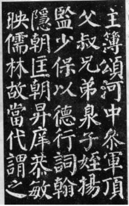
Rubbing of "Qinli Stele" (Part)
The main features of "Qinli Monument"
"The Monument of Qinli" is Yan Zhenqing's representative work. It is "a majestic text that illuminates the soul" and is extraordinary. Many calligraphers after the Tang Dynasty had studied this stele. Let's talk a little bit about its brushwork, structure and other aspects.
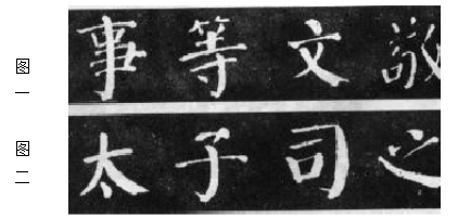
(1) Use the pen in the right direction, taking advantage of both the square and the round.Yan's calligraphy is very clumsy, and he pays attention to "hiding the head" when starting the pen, vigorous and powerful strokes in the center, and "protecting the tail" when finishing the pen. Yan Zhenqing advocated "using the brush like a cone to paint sand, so that the edge is hidden. The painting is calm" as well as "breaking hairpin strands", "house leak marks", etc., emphasizing the "center" and "round and powerful". For example, "Zhechai" means that the gold hairpin is folded like a bow, which shows its strength compared with its straightness. The strokes in "Qinli Stele" "turn straight into curves" to enhance the strength of the stipples. As shown in Figure 1, the words "Shi", "Waiting", "Wen", "Jing" and so on. "Qinli Stele" pays attention to the roundness of the strokes, such as closing the brush and pressing it again for horizontal strokes, and first closing and then releasing the hook and stroke strokes. Sometimes when the pen is folded, it becomes square at the top, sometimes when the pen is held up, it becomes rounded, or it may be square on the inside and round on the outside. In short, "Qinli Stele" is both strong and soft, and it is worthy of being a "solemn and majestic" work. Picture 2 of the female mouth contains the characters "Tai", "Zi", "Si" and "Zhi".
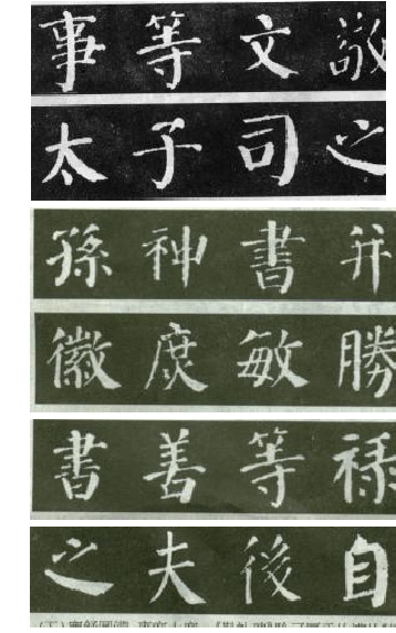
(2) The main content should be clearly defined and the main content should be highlighted.First, the main strokes of the same type of strokes are thick and heavy, that is, thick and complex (multiple turns), and the secondary strokes are light and simple (light turns). There are primary and secondary strokes, and the primary and secondary are clear, giving people a bright feeling. For example, the characters "Sun", "Shen", "Book", "Bing", etc. are pictured. Second, there is a large contrast between strokes in a character, such as thin horizontal strokes and thick vertical strokes, light strokes and heavy strokes, etc. The characters in Figure 1 all have this feature. The third is a character composed of multiple "parts", sparse, heavy, dense and light, eye-catching and admirable, such as the characters "Hui", "庶", "Min", "Sheng", etc. in Figure 2. Because "the guest and the host are distinct, and the master and the slave are different", the characters appear thin but strong, fat but not stupid.
(3) Use clumsiness as skill and become brilliant.When you have a shallow understanding of "Qinli Stele", you will be surprised by the "clumsy" character in Yan; as you deepen your study, you will find that "great wisdom seems to be foolish". As shown in Figure 3, the words "book", "shan", "etc.", "lu", etc. From a macro perspective, Yan characters are informal, distinct, and broad in structure; from a micro perspective, Yan characters are unique, flexible, and changeable. For example, the repeated strokes in each character are almost different in starting, moving and finishing. As far as horizontal and vertical paintings are concerned, their shapes may be square or round, pointed or bald, straight or curved, thick or thin, long or short, etc. They are extremely clever, avoiding duplication, and appear simple and delicate. .
(4) Gather the strengths of others and create a style of its own.In addition to being taught by Zhang Xu and Xu Hao, Yan Zhenqing also accepted the writing styles of Chu Suiliang, Wang Xizhi, seal script and Wei stele. For example, "Silkworm head and swallow tail" is not only used in the Ning method, but also reflected in the horizontal painting, such as the characters "Zhi", "Husband", "Hou", "Zi", etc. in Figure 4. At first glance, it seems to be random and easy to follow. It is not difficult to see that the Yan calligraphy is not entirely his original creation, but was influenced by many calligraphers, which shows his eagerness to learn. Although his calligraphy is different, it is "unconventional and consistent with the Tao" and is more aesthetically pleasing.
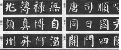
(5) Comfortable, complete, graceful and magnanimous. 《In addition to the thick and full characteristics of "Qinli Stele", the structure of "Qinli Stele" is contrary to the "convergence in characters" characteristics of regular script in the early Tang Dynasty. It takes "balance" as the principle of structure. The body is proportional, the momentum is open, the characters support the grid, and the center of gravity is stable. Good appearance. As shown in Figure 5, the characters "wen", "tong", "gui", "zuo", etc. In short, its knots are symmetrical and stable, the writing style is broad, majestic, broad but not loose, and full of energy, which is really amazing.
2. The specific techniques of stipple painting on "Qinli Stele"
The previous introduction is the overall appearance characteristics of "Qinli Monument". In order to grasp the internal laws of "Qinli Stele", it is also necessary to master its stipple brushwork methods, such as hidden exposure, middle side, lift and press, square and circle, speed, straightness, pen strength, etc. Only in this way can the problem be fundamentally solved, its specific characteristics more accurately grasped, and greater gains achieved. Here is a brief introduction to the writing techniques of pointillism in "Qinli Stele" as follows:
(a little,When writing, "there is something hidden and something exposed", turn the front and press the pen to spread the hair, lift the pen while walking, and return to the front to close the pen. Every point must be on the side, and the front will go and come back. Although there are many changes in the direction and shape of points, they can basically be divided into four types: light up and heavy down, heavy up and light down, horizontal points (with horizontal points instead of points) and front points. The dots of Yan characters are as numerous as dewdrops, the roundness is larger, and the shape is thicker than other forms. There are many ways to write dots, which can reflect the echo and flexibility of words. Therefore, under the premise of being stable, attention should be paid to coherence and echo. As shown in Figure 1, the characters " Zhao", "Book", "Lu", "无", etc.
(2) Horizontal,There are mainly long horizontal, short horizontal, pointed horizontal (pointed at one end or both ends) and swallow-tailed horizontal. When writing, use the exposed edge to go forward or the hidden edge to go in reverse, either square or round, with the center of the writing stroke and the pen lifted and withdrawn (the swallow tail is drawn horizontally and the pen is stagnant and empty). The horizontal painting of "Qinli Stele" is slender, and sometimes the brush strokes fail to realize it, as if it were inadvertent, but the form is disconnected and the meaning is connected, beautiful and free. As shown in Figure 2, the characters "frequency", "zhen", "bo", "zi", etc., show the front without floating, hide the front without falling, the short horizontals are mostly concave horizontals, straight horizontals and swallow-tailed horizontals, and the long horizontals are mostly thin waist-shaped. It is arched upward, and the long and horizontal ends are slightly heavier than the short horizontal ones. The landing point is basically on a horizontal line. Although it is thin, it is not soft, thin and powerful, and quite charming.
(3) vertical,There are mainly hanging vertical ones, hanging pin vertical ones, upper pointed vertical ones, short vertical ones and oblique short vertical ones. Vertically thicker than horizontally, often many times thicker, the contrast is obvious. The vertical shape of Yan Shu is like an iron pillar, which has the power to break hairpins. As shown in Figure 3, the characters "zhou", "sheng", "he", "wen", etc. The pen strokes of "Dou Lu" are lighter than those of "Duobao Pagoda Stele". When the needle is hanging, the strokes should be steady, slow and gradually lifted, with a long and sharp tip. The tip of the pen is raised lightly. The short vertical and oblique strokes have many bends when raising the pen, and there is no pause when closing the pen. Short and vertical, although short, it is thick and powerful. Slanted, short and vertical, short and delicate, delicate and neat. The vertical paintings of "Qinli Stele" are full of curves, showing their strength. For example, if two vertical strokes are arranged side by side, the left vertical stroke is thin and short, and the right vertical stroke is thick and long, usually in the posture of embracing each other. When writing, you must control the speed and increase the strength of the pen.
(4) fold,There are mainly two types. First, at the turning point, the pen is raised and raised again, and the pen stroke on the lower right side comes out of the shoulder, higher than the horizontal line, forming an oblique angle (some people call it "re-rising and rising to the top"), as shown in Figure 4, "Tang", "Si", "Shun", "Shun" , sing, etc., especially the word "口" in "SI", has been broken into four strokes. Second, there is no movement of lifting the pen at the horizontal tail or slight lifting in a circle, and the shoulder is directly pressed down. The angle between the diagonal line and the horizontal line is large, the shoulder is lower than the horizontal line, and the inside is square and the outside is round, which is full of interest. For example, in Figure 5, the characters "tong", "日", "国", "Yin", etc. Other folding methods are not difficult, as long as the size and slope of the shoulder change with the direction and position of the strokes. Some of the folds and breaks in "Qinli Stele" are "randomly" broken, which is really surprising. However, if you look closely, you can feel its antiquity and majesty. In addition, the short folds on the left and right are also special strokes, and the folds are rounded and formed accordingly, such as the characters "kai", "men", "four", "ling", etc. in Figure 6. In this way, Yan characters avoid the traces of carving and add a sense of agility.
3. Structural characteristics
"Qinli Stele" is a Shinto stele written by Tang Yan Zhenqing for his great-grandfather Yan Qinli when he was 71 years old. This stele is written with calm connotation, broad structure, graceful and upright, and the brush strokes are directed towards each other and contain many connotations, giving people a solemn and vigorous feeling. It is not as square, rigorous, beautiful and elegant as "Duobao Pagoda", nor is it as crude and domineering as "Magu Immortal Altar" (Xia Changxian Yu). It is one of Yan's representative regular script works in his later years.
The structural characteristics of "Qinli Stele" can be summarized as follows:
1. Light horizontally and heavy vertically, the contrast is obvious.Many Chinese characters are composed of horizontal or vertical drawings, or mainly horizontal and vertical drawings. Regarding these words, the structural treatment of "Qinli Stele" is basically horizontal and vertical, light and vertical, with sharp contrast and beautiful form, which reminds people of a pine tree with a thick trunk and thin branches. Such as the word "shi".
2. Take advantage of the situation, tighten it internally and loosen it externally. 《The posture of "Qinli Stele" is mostly vertical, so that each character looks very close. However, through the use of interspersed, yielding, avoiding, virtual and actual techniques within the characters, the entire character shape is dignified, steady, and has a temple atmosphere. Such as the word "que"
3. The font is square, open-minded and dignified.The character Yan changed the structure of the side and was written with straighter strokes. The left and right sides are also basically symmetrical, and the characters are square. It absorbs ancient seal and official calligraphy and adopts a positive approach to make people feel solemn and upright, with magnificent connotation. Such as the word "古".
4. Graceful and magnanimous, broad-minded and broad-minded.Gracefulness, magnanimity and broadness are the artistic features of Yan Ti, as well as its structural features. The strokes of the round pen in the center; the juxtaposed two vertical strokes facing each other create a kind of outward tension, strong and dynamic; and the thickness of the strokes are all important conditions for the formation of this feature. Such as the word "four".
In short, "Qinli Monument" also has other characteristics. The above points embody the majestic and dignified style. The words are straight and powerful, and the momentum is compelling. It is one of the excellent models for learning beauty.
Let’s take a look at how to write other strokes:
1. How to write Nahua
The strokes of the Yan style play a supporting role in the characters. They are often written thickly and have the look of a silkworm's head and a swallow's tail, that is, starting from the front, with twists and turns. It generally has three forms: oblique, horizontal and reverse.
Slant:The brush strokes have many hidden edges, and the head is rounded and curved, like a silkworm's head, with strong, tough and strong tendons. Then slowly move the fold to the lower right and gradually intensify, open the posture, and move to the lower half of the foot with a slight curling effect. When you press the foot to close the pen, you should press the pen hard to spread the edge. Stop for a while, and lift the pen while walking. , the foot is slightly larger, making it have the potential to fall from the peak and rush down the rapids. For example, the word "文" is used in painting.
horizontally:Also called Ping Na. This painting should be written in the shape of water waves. The specific writing method is: start the pen against the front, fold it to the lower right, use light to heavy force, then suddenly lift the pen to expand the front, and then lift the pen to strike out. This 捺 is often used below the word to play the role of loading. Such as the Chinese character "Zhi". When writing this Nana, the pen should be tied tightly, the collar should be lifted, and the Nana's feet should be fully spread and spread out, like a loaded boat, giving people the feeling that it can bear the weight of the objects on it.
Counterattack:The writing method of this kind of Ninghua is similar to that of Changdian. Such as the word "英" in the painting. If there are two nip in a word, we must change one of the nip to nip to increase the vividness and sense of change of the word. The needle is vertical. When there are left and right vertical characters in a word, the left vertical character should be shorter and the right vertical character should be longer. Moreover, the two uprights should not be level with their heads and feet, but should be facing each other.
2. How to write vertical paintings
Vertical painting plays a pillar role in the structure of Chinese characters. It should be written straight and powerful, like a person standing at attention. Writing slanted vertically will cause the characters to lose their center of gravity. The ancients said: "It is as vertical as a long-lived withered vine." This means that vertical paintings should be written vigorously and powerfully. The vertical paintings in "Qinli Stele" are generally thick and thick, but if you look closely, you can find that they have various shapes and rich changes. They mainly include vertical dew, vertical needle, curved head, thick waist, and waist. Thin and vertical, etc.
Drooping dew:This is a kind of vertical painting with a hidden edge when starting and ending the pen. When writing, the head should be hidden and the tail should be protected without hanging or shrinking. The specific writing method is: start the pen up and to the left, then fold the pen and stroke it sideways to the right, then turn the pen and stroke down the center. It is worth noting that during the writing process, you should lift the pen while writing, press the pen while writing when you reach two-thirds of the way, and finally pause the pen, then return to the front and close the pen. The strokes should be started and closed slowly, the strokes should be slightly faster, the head should be slightly square and the tail should be slightly rounded, the middle section should be slightly thin and slightly bow-shaped, giving people a majestic and powerful feeling. Such as the vertical painting of the word "下".
Hanging needle vertically:This is a vertical painting that hides its head and reveals its tail. The specific writing method is: start the pen upward to the left, then fold the pen and stroke it sideways to the right, then turn the pen and stroke downward. When you reach two-thirds of the way, lift the pen while writing until the end of the pen is pulled away from the paper. Focus on the sharp edge. When writing this vertical line, it should be straight and strong, without curvature, and more indulgent to show its free and easy attitude. Such as the vertical character of "flat".
Curved head:This is a kind of vertical painting that starts with the pendant method but zigzags to the left. The specific method of writing is: go straight to the left against the front, then move upward, turn right to pause, and then move downward. This kind of vertical painting appears strong and strong in the characters. For example, the left side of the two mouths of the character "宫" is vertical.
Thick and vertical waist:This is a shorter vertical painting, straight and thick, like an iron pillar. This kind of vertical painting is thicker in the middle and contains strong bones. For example, the word "山" is vertical on the right.
Thin waist:This kind of vertical painting has a slender figure, like a graceful girl, with her head raised and her chest held high. For example, the word "shirt" is left vertical.
Arc vertical:This type of vertical strokes is mainly used on the left and right sides of characters to make them open-minded. The method of using the brush is the same as that of the vertical stroke, except that the posture is slightly arced to the left or right, like the vertical stroke of the word "xiu". In short, when writing vertical paintings, you must pay attention: if the vertical painting is on the left side of the character, you must use "hanging dew", and it must be written thick and powerful to prevent the overall character from deflecting. When vertical stroke is the last stroke, use hanging needle vertical stroke. When there are left and right vertical characters in a word, the left vertical character should be shorter and the right vertical character should be longer. Moreover, the two uprights should not be level with their heads and feet, but should be facing each other.
"Qinli Stele" is the representative work of Yan calligraphy and has been cherished by calligraphers of all ages. It is a good example for learning Yan by hand. The above characteristics are only its main obvious features. If you broaden the angle of observation and consider it carefully, you will definitely find more. In practice, we can continue to study, experience carefully, deepen our understanding, and strive to follow the law with pen and practice it appropriately.


