Among the four great regular script writers, Ou, Yan, Liu and Zhao, who is the most popular?
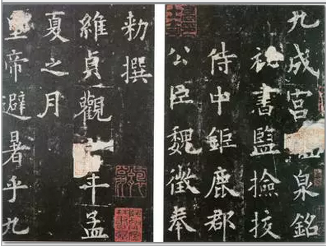
Ouyang Xun (557-641), courtesy name Xinben, was born in Linxiang, Tanzhou (now Changsha, Hunan). His regular script is rigorous and powerful, and he is known as "the best regular script in the Tang Dynasty". His representative work is "Jiucheng Palace Liquan Ming".
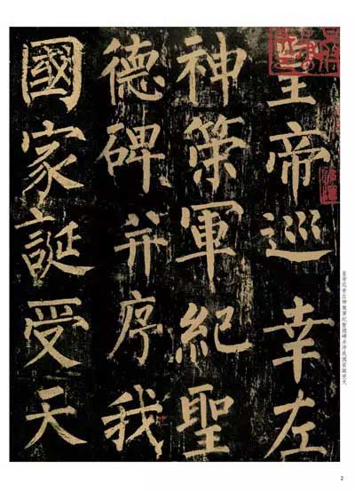
Yan Zhenqing (709--785), courtesy name Qingchen, was born in Jingzhao ten thousand years ago. His ancestral home is Linyi, Langya, Tang Dynasty. He is the most accomplished and influential calligrapher after the two kings. He changed the ancient method and reversed the calligraphy style of the early Tang Dynasty, transforming the thin and stiff into plump and powerful, with a broad and majestic structure, which is consistent with his noble personality. It is a perfect example of the perfect combination of the beauty of calligraphy and the beauty of personality. The representative work "Yan Qin Li Monument".
Liu Gongquan (778-865), courtesy name Chengxuan, was a native of Jingzhaohua in the Tang Dynasty. He rose to the rank of Crown Prince and Grand Master, and was known as Liu Shaoshi in the world. The calligraphy is strong, rigorous and meticulous. The style of regular script is powerful and charming, and the bones and muscles are strong. Running script and regular script are the most exquisite. His representative works are "Mysterious Tower Stele" and "Shence Military Stele".
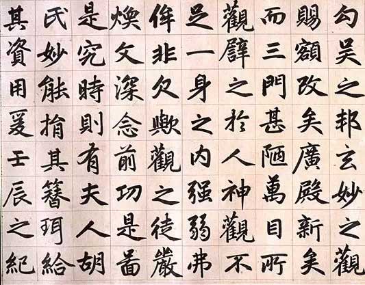
Zhao Mengfu (1254-1322), whose courtesy name was Zi'ang and whose name was Songxue, was a Taoist from Songxue and was a native of Wuxing, Zhejiang Province today. He is good at seal script, official script, Zhen script, Xing script and cursive script. His calligraphy style is charming and graceful, with neat structure and perfect writing skills. The regular script is round and delicate, upright and rigorous, yet does not lose the elegance and elegance of the running script. It is known as "Zhao style" in the world, and his representative work is "Xuanmiao Guan Reconstruction of the Three Gates".
The four major regular scripts are distinct in their strictness, subtlety and handsomeness. Today, we will focus on the differences and comparison of the characteristics of the four major fonts.
European body:The font is based on the "Two Kings", blending the lingering charm of Han, Li, Wei and Jin calligraphy, absorbing the strengths of various calligraphy schools, seeking to find dangers in the ordinary, creating original ideas, and becoming unique. In terms of pens and stipples, square pens are mainly used, and round pens are occasionally used. The strokes are relaxed and natural, clean and neat, the strokes are slow and implicit, there are pauses without squatting, and the closing of the strokes is meticulous. Point painting pays attention to echoing the spirit of coherence, and pursues changes in strokes. The dots are like triangles. Square pens are mostly used for horizontal and vertical strokes, and round pens are mostly used for side strokes. The strokes are flexible and vivid. The method of hook painting is based on Li, with full posture and unfolding momentum. The turning points are mostly square with round momentum, which shows both square strength and vigorousness. The structure should be long and slender, evenly positioned on all sides, tight on the side, with more prominent peaks and edges, tightened on the left and stretched on the right. The vertical trunk is the main body, and the horizontal pattern is formed. The rules are strict, and the dangerous strength is sought in the middle. The middle is evenly concentrated (the middle palace is tighter), and most of them expand to the right, while the center of the characters is generally slightly to the left. It is dangerous and clever, calm and rigorous, and impeccable.
Face and body:It widely absorbs the techniques of calligraphers of the Six Dynasties, Sui Dynasty and Tang Dynasty, and integrates them into one pot. It follows the predecessors' new ideas and creates a new style. The strokes are strong and thick, the frames are smooth and dense, the momentum is majestic and changeable, dense at the top and sparse at the bottom, like Thailand. The mountains are towering. The strokes are strong and vigorous, the strokes are rounded when the stroke is started, the strokes are centered, and the ink is used horizontally and lightly vertically. The brush has a "silkworm head and swallow tail" state. The length of the stroke is determined by how long it is, and the stroke is rounded and straight down, without folding the pen. The turning points are often square on the inside and round on the outside. The hook brush strokes are mostly in the shape of a bird's beak. The glyph structure is broad, square and full, the left and right sides are basically symmetrical, dignified and stable, showing a grand, open and majestic style. Yan Kai especially strengthened the role of the wrist in writing and made more use of the hidden edge, forming the characteristics of richness, richness and strength. The strokes of the body are generally symmetrical, but the vertical strokes tend to be inward and slightly arc-shaped. The shape of the official calligraphy is full of meaning. The whole character has a round and deep appearance, a powerful connotation, and a profound artistic effect.
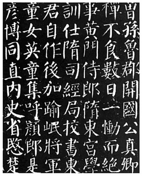
Willow body:Famous calligraphy in the late Tang Dynasty. He first studied the "Two Kings", and then studied the brushwork of various schools of Sui and Tang Dynasties. Later, he further changed the use of facial expressions and styles, and found a new way to innovate and become unique. The calligraphy has a rigorous structure, is clear and open, the layout is square, strong and straight, the bones are deep and the spirit is handsome, so it has become a model for future generations. His stippling is strong, vigorous and flexible, with horizontal and vertical strokes extending in all directions, and the general situation is open. The "vertical hook" and "slanted hook" are often written with appropriate upward and downward extensions, making the characters stand tall and majestic. fill. Horizontal paintings usually use square starting and rounding, vertical painting usually uses reverse peak writing, and then draws the peak downward, and hanging needle or hanging dew calligraphy is used to close the writing. Painaido has a certain arc. Although he is forward and straight, he has internal strength. The strokes of the pen are used to lift and press the strokes in a powerful and focused manner. Based on the face and body, the knots are compact, sparse, bold and unrestrained, the middle palace is tightened, and the four sides are open, tight but not rigid, sparse but not scattered, regular and full of changes, and even and sometimes dangerous.
Zhao Ti:The art of regular script has the highest achievement. The regular script he writes is smooth and smooth with a central pen. The structure is well-proportioned, resulting in fullness, elegance, elegance, and beauty. It is obviously different from the styles of Ou, Yan, and Liuzi. His representative work is the "Danba Stele". The character Zhao is characterized by numerous gestures, vivid and lively, looking, looking, and echoing, but actually coherent, drawing horizontally and vertically, lifting the pen slightly in the middle to walk, then retracting the pen and returning to the front. The entire stroke is steady and decisive, generally moving upward to the right. Vertical paintings are mostly vertical, often slightly curved to the left according to the needs of the structure, and the arc surrounds the center of the characters. The folding method is at the intersection of horizontal and vertical lines. After a moment's pause, the strokes will go straight down. It is neither angular nor smooth, and there is no disadvantage of exposing the bones. This is different from Yan Liu's writing method of starting a new pen and gaining momentum to expand abroad. Bi Nai's writing is faster, the strokes are sharp, and most of the edges are not exposed. The structure is well-proportioned and comfortable, the strokes are sparse and dense, and the side parts are coordinated and blended. However, it should be important to note that Zhao style characters are smooth and round, but the writing is faster. When writing, be sure to avoid being smooth and weak in writing, and showing sharp edges. Don't just focus on the round and sweet appearance without checking the connotation of bone strength.