
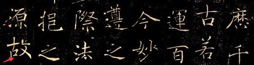
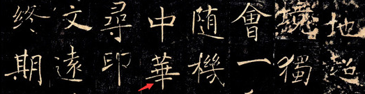
The stele "Preface to the Holy Religion of the Wild Goose Pagoda" was built under the Big Wild Goose Pagoda in Ci'en Temple, Chang'an in the fourth year of Yonghui in the Tang Dynasty (653). The first part, "Preface to the Sacred Teachings of the Tripitaka of the Tang Dynasty" was written by Emperor Taizong of the Tang Dynasty, commending Master Xuanzang for going to India to obtain Buddhist scriptures, spending 17 years traveling back and forth, and translating important Buddhist Tripitaka texts after returning to Chang'an. The latter part, "Preface to the Tripitaka Sacred Religion", was written by Gaozong. The calligraphy on this stele is vigorous and elegant. It was written by Chu Suiliang when he was 58 years old, and best represents his unique style. The grass in the mind is sparse and thin, strong and refined, graceful and graceful, full of manners, and full of spirit. Therefore, Zhang Huaiguan praised: "The beauty Chanjuan seems to be no less important than Luo Qi; she is graceful and graceful, and has a lot of grace."
The writing style and structural characteristics of "Yanta Sacred Preface"
Author Hongwenguan
1. Characteristics of brushwork:
1. stippling. The pen is flexible and versatile, and can be used in both directions and directions, integrating center, side, exposed and hidden fronts into one. Hook painting. This stele hook method is based on the laws of the Six Dynasties. Its shape is changeable, simple and full, and it should be avoided to be frivolous. Folding paintings. There are two types: square fold and round fold. The transition between lifting and pressing, and changing the tip and pen must be natural and consistent. Stipple. There are oblique points, round points, vertical points, vertical points, pick points and various combination points. When writing, fully express various point gestures. The oblique points are like falling rocks from a peak; the dots are dignified and complete; the vertical points are made with many bends to gain momentum, giving a unique posture; the vertical points are like water drops, lively and agile; the picked points have a coherent momentum and are very interesting in running script.
2. Draw horizontally.Horizontal paintings are divided into long and short. The long horizontal stroke is reversed, astringent, tight, and the middle section is bulged, forming an arc shape, which is elastic; the short horizontal stroke is used to cut the pen into the paper, spread out the brush strokes, and tighten lightly, with concise lines. Vertical painting. There are various types of uprights, including long and short, straight and curved, and hanging, all of which need to be straight, strong, and powerful. Lift the painting. Lifting a painting is an extension of picking a point. You must control your strength and not be weak. Sketch. For long strokes, the stroke should not be too heavy when starting the stroke. Press the stroke slightly and force the stroke to the end; for short strokes, the stroke should be heavy and sharp, with clear edges and corners, short and powerful. Nahua. It is full of ancient meaning and fully displays the legacy of Han Dynasty, from light to heavy, with twists and turns.
2. Calligraphy structure
The biggest feature of Chu Suiliang's calligraphy structure is the flat square, which paved the way for the evolution of later calligraphy styles. It changes from long to flat, wide and sparse. Structural characteristics: Although its regular script writing style and structure also have certain rules to follow, it is not rigid in formula. Its structure is correct, flexible, generous and beautiful. In the development process of regular script, the "laws" of Tang Kai script were beyond the reach of later generations, but there was one exception, and that was Chu Suiliang. The main character is Yanmei, and the body shape is changeable.
It is expressed in both the use of the brush and the structure. It is said that the use of the brush creates the structure. The flexibility of the strokes, turns and fronts of the brush lead to the graceful and graceful structure. In regular script, the lines echo and are coherent. The infiltration of cursive calligraphy strengthens the inner connection between the dots and paintings. Through connections, remote connections, and interruptions, the isolated dots and paintings interact with each other and are full of vitality.
Misunderstandings in learning the calligraphy of Yanta Sacred Preface: Too much femininity and not enough strength. When practicing, if you follow the pattern of drawing a gourd and write lines and characters, the lines will have no strength. There are too many weak arcs and a lack of rigid straight lines. There are more round pens and fewer square pens, which is one of the reasons for this disadvantage. There is more than enough symmetry, but not enough variation. This is caused by improper use of the strokes of the pen. The lines are in an intermediate state. There is a misunderstanding of the aesthetic meaning of "neutral". It is believed that "neutral" means no ups and downs. If there are no changes in strokes and distinctions between primary and secondary, the characters will not be at all. Spiritless, mediocre and dull. More than thin and hard, not enough plump. The lines in "The Preface to the Sacred Teachings of the Wild Goose Pagoda" are mainly thin, which can easily lead to misunderstanding. If you only focus on drawing thin lines when writing, and press more and press less, the lines you write will be skinny and lack elasticity.
Let’s talk about what should you pay attention to when writing?
Author: Xu Chengshang
1. Grasp the beauty of pointillism
Calligraphy is the abstract world of pointillism. The reason why calligraphy pointillism has such rich expressive power is that pointillism has extremely complex characteristics, such as texture, strength, three-dimensionality, etc.
Texture refers to the true degree of people's feelings and associations with the surface texture (such as hard, soft, smooth, rough, delicate, soft) and measurement of the object during the aesthetic process. All calligraphy stipples have a certain texture. The stipples in "The Preface to the Sacred Teachings of the Wild Goose Pagoda" are delicate and moist. Some places are as thin as cicada wings, and some places are as heavy as running stones, forming a sharp contrast. This brings certain difficulties to our writing, but the exquisiteness of Chu Shu is also reflected in this. So, how do we practice?
First of all, we know that due to different performance of writing tools, different brushwork, and different ink colors, different textures of stipple effects will be produced. When practicing Chu Kai script at ordinary times, you usually use thick ink (but not thick but not sluggish) in the front, and the strokes should be crisp and smooth, so that it is easy to write solid and deep ink, the strokes are round and strong, the bones and flesh are proportional, the strokes are strong and have strong texture, so It will give people a rich and subtle feeling. Texture is directly related to the strength of writing and the thickness of ink. It has weight and strength, that is, it has texture. Generally speaking, textured strokes can evoke aesthetic associations. "The Preface to the Sacred Teaching of the Wild Goose Pagoda" has many thin strokes, but they give people a strong feeling, like slightly bent steel wires. After the thin strokes, there will also be thick strokes that are pleasing to the eye. In short, the strokes should be applied with strength, the ink is thick and full, and the strokes are steady. The resulting strokes, whether thick or thin, will give people a certain feeling of thickness. In addition, paper selection is very important.For a model calligraphy such as "The Preface to the Sacred Teaching of the Wild Goose Pagoda" with very delicate brushwork, it is actually suitable to use relatively familiar paper to copy it, which is more conducive to expressing the delicate brushwork.If the paper used is relatively raw, it will have a certain impact on the writing effect.
Regarding strength requirements, whether it is Chu Kai script or others, you need to concentrate and meditate when writing, so that the strength reaches the tip of the pen and pours it into the stipples, so that it presents powerful strokes and the fonts appear strong and strong. Therefore, strength training is very important in calligraphy teaching. So how to write powerful strokes? It is related to holding the pen, using the pen, and using ink.
"The pen is important in writing, and the person who uses it depends on the person. Therefore, those who are good at calligraphy use the pen, and those who are not good at calligraphy use the pen." The ancients attached great importance to writing. Combining with daily teaching practice, I think I can combine "the finger is strong and the palm is empty" and "the palm is empty" "Wrists are flat and palms are erect", "Straight center circle", "Void hanging straight and tight", "Wrists alive and hands pointing dead", etc. can be integrated and flexibly understood to meet the requirements.
What kind of strokes are powerful? Generally speaking, sharp lines, rigid lines, thick and rounded lines, and thin and flexible lines are easy to produce a sense of force; while bubbly lines, bulging lines, floating and light lines, and thick and soft lines are difficult to produce a sense of force.
Therefore, when we are writing the "Preface to the Sacred Teaching of the Wild Goose Pagoda", we must be "accurate" at the beginning of the writing, that is, the writing must be clean and accurate. The writing must be "ruthless ", that is, decisive. The pen must be closed "steadily" and neatly. Sometimes you can also make an "empty return" movement in the air when you close the pen, instead of returning on paper.
If you can meet the above three requirements with your pen, the strength of your strokes will naturally be reflected.
Among the aesthetic factors of Chinese calligraphy, in addition to the cloth and white structure, the most important is pointillism. In addition to the sense of strength, the three-dimensional sense of strokes is a very important aesthetic criterion. Critics of calligraphy have always praised Yuan Jin. Jin refers to the sense of strength, while the circle refers to the sense of three-dimensionality. Although the paper used in Chinese calligraphy is different from raw to cooked, it is very rare to use completely non-bleeding paper. The so-called strength through the back of the paper actually refers to the penetration when writing. Use depth to express the thickness of the strokes. The strokes that penetrate the back of the paper can use the translucency of the paper to create a three- dimensional feeling of thickness at the edge of the strokes; while the paper surface is swept across, and the ink color does not reach the depth of the paper, there is no such feeling of thickness at all. Simply relying on "power through the paper back" will only create a three-dimensional effect in terms of thickness. To achieve the state of a circle, it must be expressed through a high degree of pen-writing skills, so in the study of Chu Kai, we must gradually make good use of the center.
The reason why it is easy for center strokes to form round and strong strokes is due to the pressure distribution when the pen is touching the paper. The pressure is maximum along the center line of the stroke, and gradually decreases towards the two sides, resulting in different degrees of penetration and moistening. There will be subtle differences in thickness in the middle and thin edges or silky edges in the middle, showing the "round" three-dimensional feel of the strokes. You can feel this roundness in some words in Zhou Yihua's works. For example, the characters such as "Gu" and "Hua" have strong strokes and full of tension, showing the feeling of Chu Suiliang's calligraphy and iron painting with silver hooks.
To maintain the center position, we must be able to skillfully change pens. Pen change is also called reversal. It means that during the stroke process, when encountering a turning point in the strokes, you must lift the pen and change the direction (that is, lift the pen slightly, pause it repeatedly, and reverse the direction). That is to say, try to keep the pen in the center.
2. Master the rhythm of writing
The development and changes of all things in the world all have a certain rhythm, and the art of calligraphy is also the same. Calligraphers of all ages have attached great importance to this. The rhythm of calligraphy art is inseparable from the time, space, pen, ink, paper, as well as issues such as brushwork, ink use, composition, and structure.
My understanding of the rhythm in "The Preface to the Sacred Teachings of the Wild Goose Pagoda" is to appreciate the importance of speed and slowness through comparison. In the early stages of writing, a common mistake we make is that we write flatly. What is "flat"? It can be understood as less change. Although regular script is a relatively neat calligraphy style, it pursues changes in subtle places. If you have been writing the "Preface to the Holy Religion of the Wild Goose Pagoda" for several months, your deep feeling is that regular script should be precise, surprising and varied.
The first contrast in "Yanta Sacred Preface" is the contrast of stroke thickness, obliqueness and pitch in a single character. There are many horizontal strokes in a word, but their postures and pitches are sometimes different, and their starting strokes are also different. Some are cut at right angles, some are only at an angle of 30 degrees, and some are started against the front. This also requires us to have a lot of skills. Strong ability to read posts. In the teaching of regular script, the eight basic strokes have a simple movement rhythm in the beginning, line and ending. When completing a turn or changing the direction of the pen, there is also a certain rhythm, which mainly depends on the flexibility of the wrist. Zang Feng and Lu Feng also have movement rhythms; Zang Feng needs to make aerial movements against the direction of writing before writing, while Lu Feng just puts down the pen. When using the pen, try to find the rhythm of these movements. In calligraphy training, understanding of rhythm is an important criterion for judging the basic quality of calligraphy. Therefore, when we copy "The Preface to the Sacred Teachings of the Wild Goose Pagoda", we must first write the strokes successfully. The second step is to further write the strokes to the right position. If we understand the structure as a simple stacking of basic strokes, this is superficial and superficial, and it is "writing".
The second is that the size and contrast of the fonts also reflect the sense of rhythm. The glyph structure of "The Preface to the Sacred Teachings of the Wild Goose Pagoda" is relatively compact, but when they first started writing it, many people would write it rigidly and not be able to let it go. Although the characters of "The Preface to the Holy Religion of the Wild Goose Pagoda" are not large, its momentum is broad and can give people a shocking feeling. Moreover, some words have more strokes, and some have fewer strokes. Putting many words together will naturally form a sense of size and weight. If you deal with this size and weight effectively and reasonably, you will grasp the rhythm of the entire line of the work. feel.
Expressing the beauty of change on the basis of overall coordination is the effect produced by rhythm. As long as we think more and practice more, each of us can write Chu well.


