
Wu Xizai (1799-1870), formerly known as Tingyang, was called Xizai, and later he used the word to go, changed the word to let it, and also to humiliate it, named Rang Weng, Wan Xue layman, Fang Zhuzhang, etc. A native of Yangzhou, Jiangsu. The disciple of Bao Shichen. Good calligraphy and calligraphy, especially fine seal cutting. When he was young, he traced the Qin and Han seals, and then directly took Deng Shiru to obtain the essence, and integrated his own knowledge to develop and perfect the "Deng School" seal cutting art, which has a pivotal position in the history of seal cutting of the Ming and Qing genres. Wu Changshuo commented: "Let Weng Pingsheng have a solid life, and the seals of the Qin and Han Dynasties have been thoroughly discussed. Therefore, the sword is rounded, there is no fiber and grace, the weather is steady, and the quality is not stagnant. Bai Buruo takes the path to Rangweng." Wu Rangzhi's prints can quite understand Deng Shiru's principle of "printing out of the book". The knife is like a pen, it turns quickly, is blissful, straightforward and unrestrained. . His body is vigorous, stretched and elegant, graceful and graceful, showing the euphemistic and smooth style of his seal script. No matter Zhu Wenbai's writing is proficient and handy, he is technically as good as a slapstick. Let Weng create something on the basis of inheriting Deng Wanbai, especially the kind of relaxed and indifferent charm, which directly reaches the spiritual realm of the unity of calligraphy and printing. Wu Feng praised and said: "The ancient charm of the charm is irresistible, the cover is guarded but not muddled, and can let go without overstepping its rules."
In terms of expressing the brushwork with the meaning of a knife, Wu Rangzhi's Zhu and Baiwen seals all have many exemplary works. We can observe from the details of the knife and strokes.
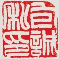
Picture 1 "Bao Xingyan Calligraphy and Calligraphy" One seal, use a knife to take the momentum, follow the writing direction of the strokes, especially the turning points of the strokes, such as "yan", "note" and other words. This printed text is densely arranged, and the knife is moved quickly and quickly, but every stroke is changed, and this should be paid attention to when moving the knife.
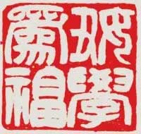
The four characters in the "Baocheng Private Printing" in Figure 2 are evenly distributed. In particular, the two characters "Private" and "Yin", the strokes are curved into a certain arc, which makes the form of the seal more lively. Copy this seal, and be careful with the knife. For example, the "[Note 1]" in the word "Yin" has changed with great care at the turning point of the strokes. Pay attention to this when writing the printed manuscript. In particular, the three-stroke arc drawing in the word "yin" should not be passed by a knife to cause similarities.
Compared with the previous two seals, the strokes of the "Educational for Blessing" seal in Figure 3 are thicker and thicker. Most of the strokes are thick in the middle and thin at the ends, with a slight curvature, which looks full and powerful. The word "Fu" in the turning point is especially focused on expressing the intention of circulation, and should be carefully understood when copying.
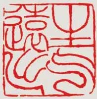
Figure 4 "Being angry far away" is a stamp with a strong brushstroke. The thickness of the strokes of "qi" and "out" change naturally. Use a knife to cut this seal shallowly, but avoid floating and slippery. There must be a rapid rhythm between the fingers, so as to produce rhythmic changes in the lines of the seal. There are subtle changes in the many arcs in the word "qi", so be careful to compare them. The word "out" is not placed in the normal direction, but takes the momentum diagonally. The four-character all-print, the upper two characters sit on the front, and the lower two characters take the momentum diagonally, which echoes each other and unites opposites.
The stamp of "Twelve Inkstone Studios" in Figure 5 is very interesting in terms of form and composition, and the constitution is worth learning. "Zhai" has a large font and is placed on its own line. There are many vertical strokes, but each is different. Don't copy the same. The horizontal paintings of "ten" and "two" are slightly curved to make the seal surface flow.
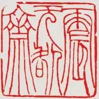
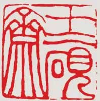
Figure 6 "Zhen Wu Jiao Zhai" is a seal with a strong pen and a prominent sense of form, which should be copied repeatedly. From the point of view of the arrangement, the two-character "treme" and "zhai" are elongated, with many vertical strokes, symmetrical in form, and different in substance. Leave a blank under the word "No" to echo with the words "tremor" and "blame". The structure of each character conforms to the characteristics of the common Wu's seal script, with the top tight and the loose bottom, the pen is slender, and the posture is graceful. There are a few broken parts of this print that can be experienced carefully. The broken sidebar on the left side of the word "Zhai" may be due to the stone quality. It can be broken or not broken when copying, and the impact is not great; the upper left corner is indispensable because it forms a triangular block surface, which should be broken. In addition, there are horizontal paintings above the words "None" and "震", and the sidebar can be broken.
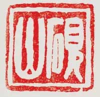
Figure 7 The "Yanshan" ink-stroke drawing is sturdy, but thick and not bloated, full and powerful. Red is left on the upper and lower sides of the printed surface, and the processing of the red surface is arbitrary. For example, the red noodles in the "stone" part of the word "yan" are almost completely absent, forming a thin line, vaguely and uniformly; the three vertical paintings of the word "mountain" are left in red between the three vertical paintings, which contrasts with the strokes. When copying, the arrangement of strokes should be natural, without even distribution. Many beginners tend to divide the stroke spacing geometrically at the beginning of learning seals, which will make the interest lost. Wu Rangzhi's sword-handling skills in his later years have been perfect, unconventional, and brilliant, and we should focus on understanding it.
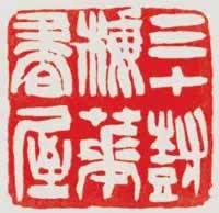
Picture 8 "Thirty Tree Plum Blossom Book House" is printed, the seven characters of the seal are arranged in six-character space, and the horizontal middle seam of the printing surface is red and the red under the printing surface is echoed. This seal has twists and turns with a knife, and the brushwork is very strong. When copying, the quickness and ingenuity of the knife technique can be illustrated.
Wu Rangzhi likes to explain his artistic ideas in the seal margins, so if we want to deepen our understanding of Wu Rangzhi's pursuit of seal cutting, we might as well read more of his seal margins. The scripts on the side of the official script are stable and beautiful, gentle and elegant.


