Chinese characters have their own specific forms. The length and density of strokes and the size of radicals are all arranged in a certain way, which is called the frame structure. The so-called structure refers to the combination rules of Chinese character strokes; the so-called frame refers to the proportion of each part of the character. Although each Chinese character in our country has one character, there are countless shapes; the same character also has different calligraphy styles and different styles of calligraphers, which makes the structure of Chinese characters unpredictable. But no matter how it changes, it is always inseparable from a law (that is, the basic law of structure), and there are always rules to be found. Therefore, Ouyang Xun in the Tang Dynasty, Li Chunjin in the Ming Dynasty, and Huang Ziyuan in the Qing Dynasty respectively summarized the "Thirty-six Methods for Knotting Characters", "Eighty-four Methods for Large Character Structure" and "Ninety-two Methods for Interval Structure".
1. Horizontal and vertical: What we usually talk about as "horizontal and vertical" refers to horizontal drawings that are stable, not horizontal. The horizontal direction is 5-10 degrees upward to the right, which is called "oblique posture" in calligraphy. "Vertical" means that the vertical painting is strong, not vertical. According to the font shape, it can be inclined, straight, curved or straight.
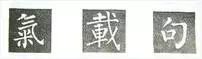
2. Tight at the top and loose at the bottom: The strokes in the upper part of the glyph are more compact and the lower part is sparse.
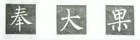
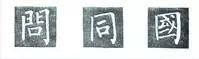
3. Open at the top and close at the bottom: Kou characters, or characters with a flat mouth, such as Shan at the base, Cao at the beginning, etc., should be slightly wider at the top and narrower at the bottom.
![]()
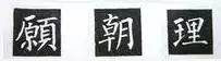
4. Tighten up and put down: When the lower part of the character has stretched strokes such as yin, niao, long horizontal strokes, etc., the upper structural unit should be tightened; the lower part should be stretched left and right to support it, which is called "ground support".
5. Up, down, and down: When there are stretching strokes in the upper part of the character, the lower structural unit should be tightened; the upper part should be stretched left and right to cover the lower part, which is called "Tian Fu".
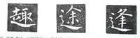
6. Extend the left to give way to the right: To make way for the right, the horizontal drawing on the left side of the word is divided into two sections by the vertical drawing, the left is longer and the right is shorter.
7. Thin on the left and thick on the right: When multiple vertical lines are arranged in a character, the left vertical is thinner and the right vertical is thicker.
8. Short on the left and long on the right: For any part with a long mouth frame, the left vertical part is short and small, and the right vertical part is long and thick.
9. Left broken and right connected: The mouth frame or the small horizontal line between two vertical strokes is usually connected to the left vertical stroke, but not the right vertical stroke. If there is a middle vertical line passing through a small horizontal line, the small horizontal line is usually suspended between the left and right vertical lines.
10. Lift up the small left: In the left-right structure, when the left is small and the right is large, the small left should be slightly above the middle of the large right.
11. Where the small right person falls: In the left-right structure, when the right person is small and the left person is large, the person with the small right part should live slightly lower in the middle than the person with the large left part.
12. Narrow on the left and wide on the right: The left ear is narrow and slightly shorter to match the right; the right ear is slightly wider and the hanging needle is vertically long to match the left.
13. Hanging on the left and hanging on the right: When there are multiple vertical strokes in the character, the vertical on the left cannot be written as a hanging needle.
14. Look left and right: Pay attention to the structural units and small strokes on the left and right to make them vivid and closely connected.
15. Left and right symmetry: Take the center vertical as the standard, and coordinate the length, height, width and width of the left and right strokes to achieve balance.
16. Surrounded by the lower left or upper left, the interior is slightly to the right: When surrounded by the upper left or lower left, the internal structure should be written slightly to the right, so that the center of gravity of the whole word is in the center of the grid.
17. Surrounded by the upper right, the interior is slightly to the left: Surrounded by the upper right, the internal structural units should be written slightly to the left, so that the center of gravity of the whole word is in the center of the grid.
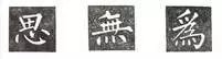
18. Turn low and hold high: The line connecting the top and bottom is a diagonal line (the other two points on the left and right cannot be written the same as it), which is also related to the diagonal trend.
19. Even gaps: When there are multiple horizontal or vertical arrangements, try to make the upper and lower or left and right gaps even.
20. Hook to center: For curved hooks and horizontal folded oblique hooks, it is better that the pen position of the hook tip is aligned with or close to the center line of the structural unit or the character.
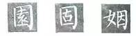
21. Smooth surroundings: For words with a square frame, the outer frame should be stable and square, and should not be tilted into a parallelogram shape.
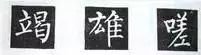
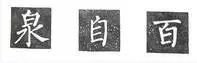
22. The interior is full and skewed to the left: The structural units in the box should occupy the entire internal space and be slightly skewed to the left.
23. When there are no strokes in the mouth, the lower right corner of the mouth frame extends horizontally to cover the vertical lines.
24. When there are strokes in the mouth, the lower right corner of the mouth frame extends vertically to cover the horizontal strokes.
![]()
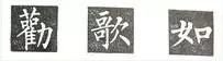
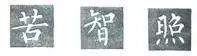
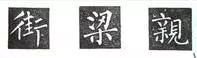
25. Intersection and centering: The intersection point should be on the center line of the structural unit or the character.
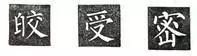
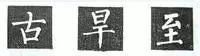
26. Do not repeat the strokes: When there are more than two strokes, you only need to extend one stroke and change the other points.
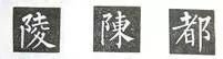
27. The strokes are disconnected from the meaning: Although the strokes are independent, the movement path between the upper stroke and the lower stroke must be natural and there is an internal connection.
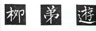
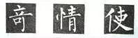
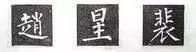
28. Put the tip into the frame: When the willow style characters are composed of an upper frame and a lower frame, the tip is usually inserted into the frame.
29. Tuck in and spread out: Liu type characters are gathered in the middle, and the periphery of the characters are spread out, which is the opposite of Yan type characters.
30. Zui Qi vertical right: In characters with vertical and Zui connected, the starting position of Zui is usually on the right side of vertical.