
Chinese characters have their own specific forms. The length and density of the strokes and the size of the radicals are all arranged in a certain way, which is called the shelf structure. Although there are many forms of calligraphy and calligraphers have different styles, they are always inseparable from a standard and there are always rules to be found.
The beauty of unevenness refers to the formal beauty produced by the unevenness between the strokes of characters. The beauty of jaggedness is generally shown on the outside of characters. It has a premise that the jagged strokes must be basically uniform internally, either vertically, horizontally, or diagonally, before the beauty of jaggedness on the outside can be achieved.
There are: upper staggered, lower staggered, left staggered, right staggered, inner staggered, multi-directional staggered, etc. like:
The word "this" has the beauty of uniformity in the vertical direction and unevenness in the top.
The word "Jian" has the beauty of uniformity in the horizontal and vertical directions and jagged bottoms.
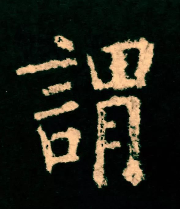
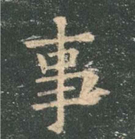
The word "predicate" has horizontal and vertical uniformity.
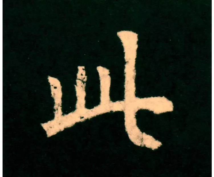
The beauty of left astigmatism and inferior and internal astigmatism
The word "诼" has horizontal and vertical uniformity.
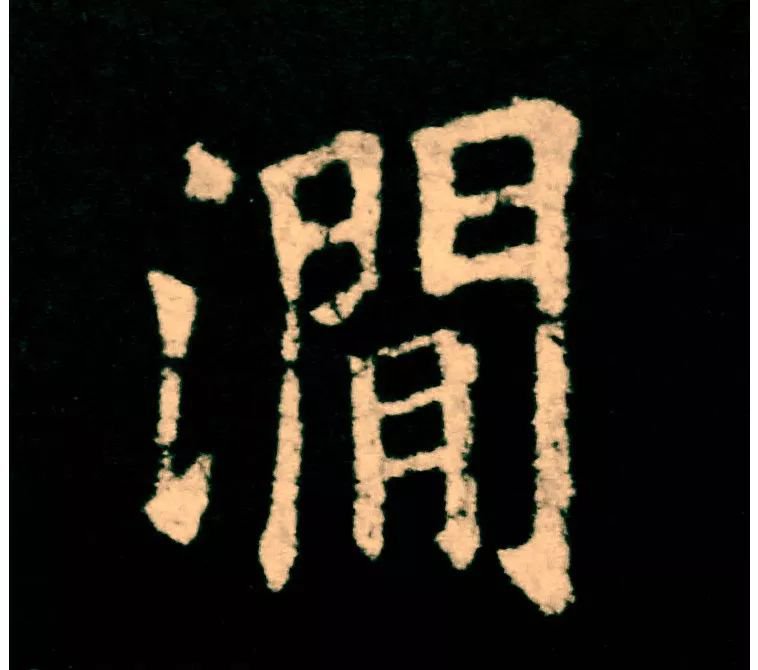
The beauty of right astigmatism and inferior and internal astigmatism
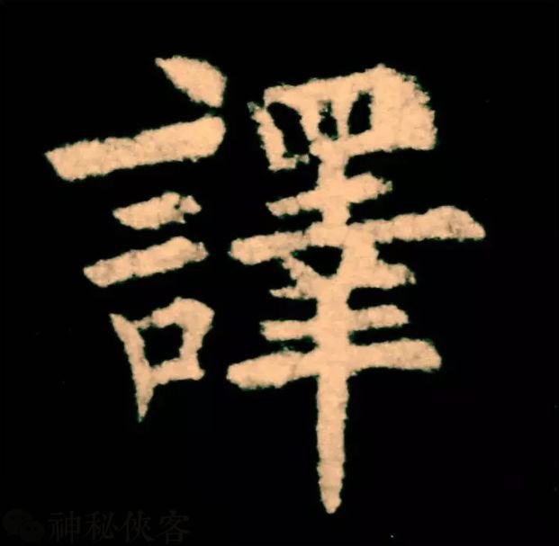
The word "translation" has horizontal and vertical uniformity.
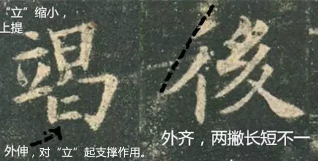
The beauty of left, right, inner and lower
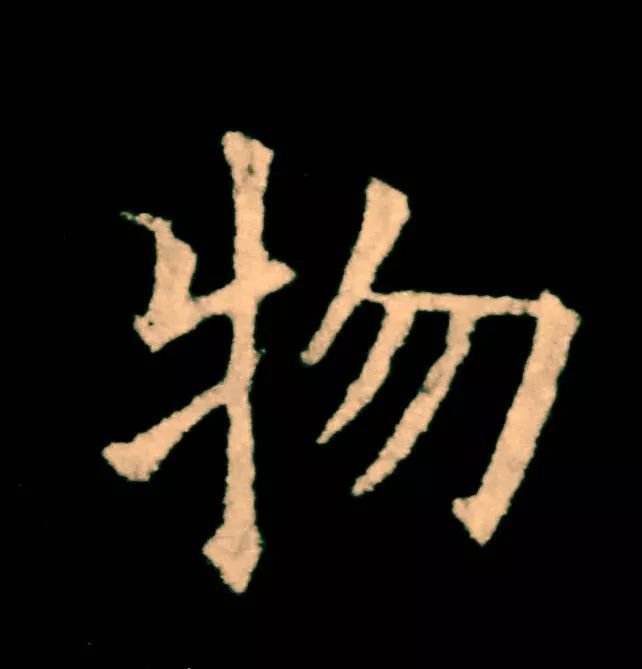
The word "wu" has the beauty of unity of oblique potential and internal differences.
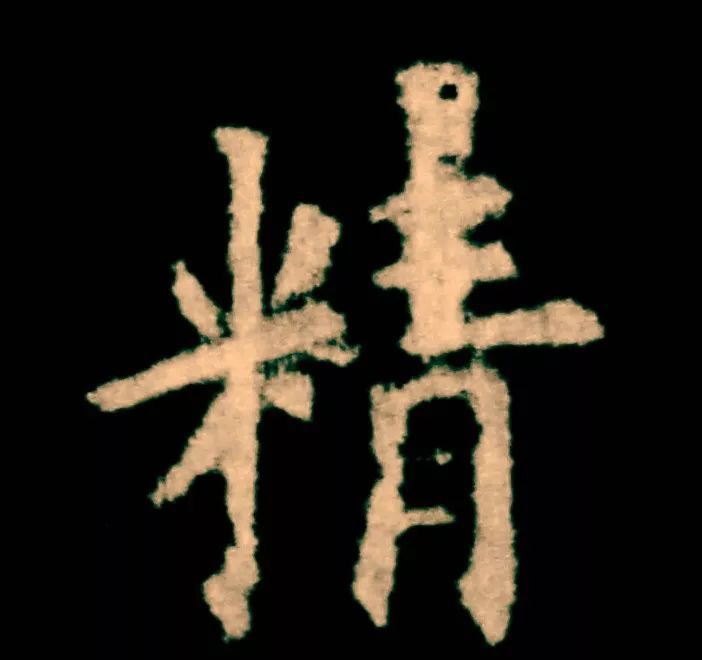
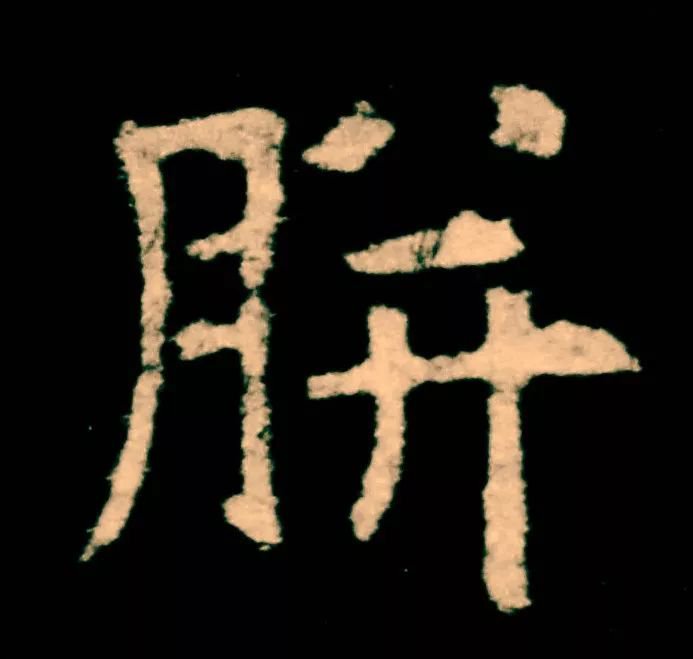
The word "fine" means horizontal and vertical uniformity
The beauty of differences between up, down, left, right, and inside
Ou style is a regular script font created by Ouyang Xun, a great calligrapher in the Tang Dynasty. It is characterized by using both square and round shapes, with squares as the main focus, strong stipples and concentrated strokes. It is both steep and steep, yet rigorous and neat. It remains steady on the side, compact yet sparse.
Sun Guoting's "Shu Pu" on calligraphy says: "Beginners learn distribution, but strive for fairness and justice. Now that you know fairness and justice, you should pursue dangers and dangers. Once you can danger dangers, return to peace and justice." He also said, "In the beginning, it is said that it has not been reached, and in the middle, it is exceeded." Later, there was a Tonghui. By the time of the Tonghui, everyone was old. "
Some scholars lack the "beginner's distribution", but seek fairness, and go straight to "danger". Starting from danger, it is difficult to "return to fairness" in the end; there are also some people who only seek fairness, without "knowing fairness, and pursuing danger" The consciousness of "excellence" makes mediocre mediocrity; these two kinds of bigotry are taboos for scholars.
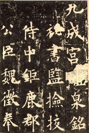
Part of Ouyang Xun's "Jiucheng Palace Liquan Inscription"
The great thing about the works of calligraphy masters is that their skills are not exposed, just like a martial arts master who never shows his teeth or claws. This is the aesthetic characteristic of Chinese art: a gentleman hides his weapons and pays attention to subtlety. Many people think that the neatness of the European style is suitable for beginners. In fact, the European style is not only neat, but also more powerful. The beauty of the European style needs to be savored carefully.
Please see the picture▼
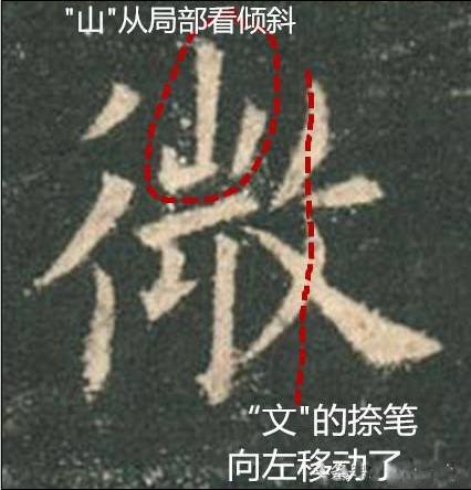
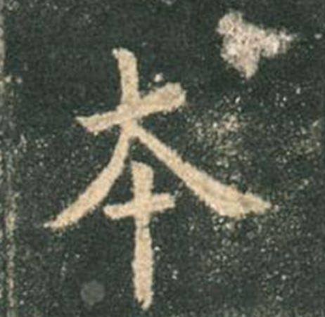
The slanted text next to "微" is because the stroke of the pen has been moved to the left, and the upper and lower parts are not completely aligned. It is a slanted hat, a bit like a second-rate man. Don't think because Ouyang Xun writes seriously, sometimes he is quite humorous. There are also the words "本" and so on.
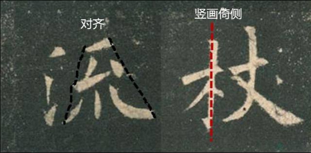
The vertical painting of "Shi" does not divide the horizontal painting and the mouth equally.
The two "fires" on the upper part of "Lao" are of different sizes, both tilting to the left.
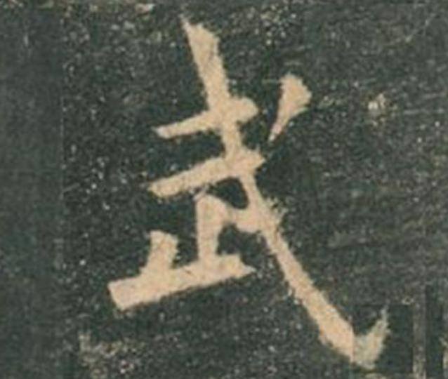
"Wu" points to looking within, putting away the pen and taking the lead
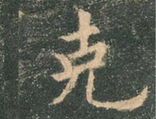
The mouth of "Ke" is flattened and tilted, and the lower part is retracted to the left and placed to the right.
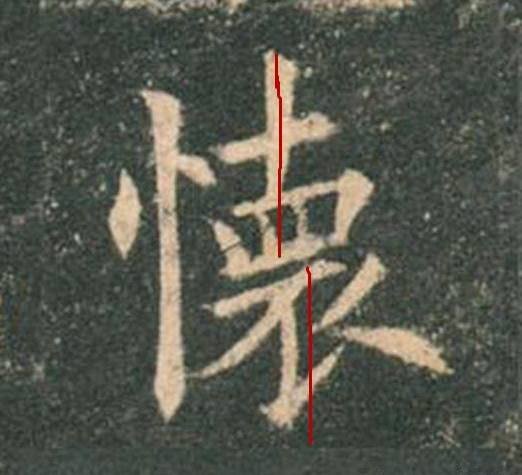
The right side of the pregnancy is dislocated up and down
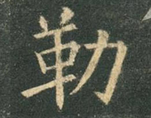
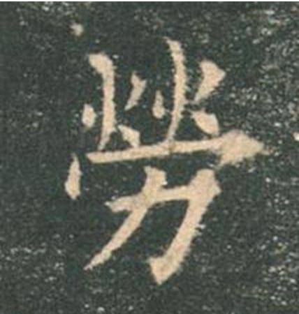
The left part of the character "Le" leans left and the right part leans right, the overall balance
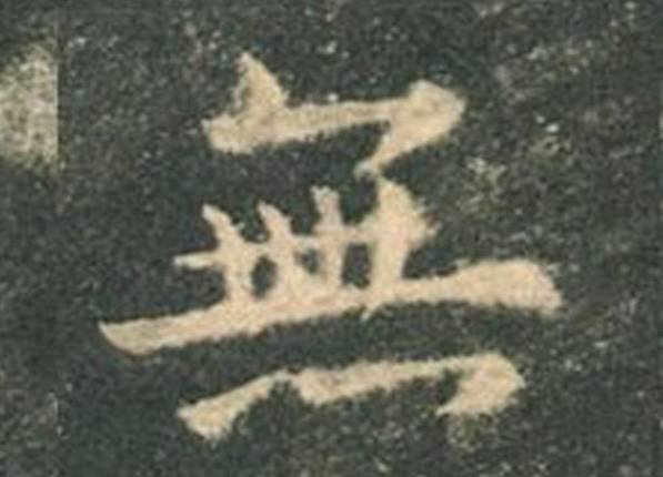
The four dots in the lower part of "无" are changed to three dots, which is a cursive calligraphy and adds liveliness.
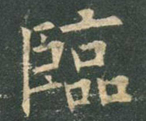
"Lin" leans to the right and leans to the left, leaning on each other like people
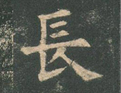
The lower part of the "long" part is consciously moved to the right, facing up and down, which is unexpected.
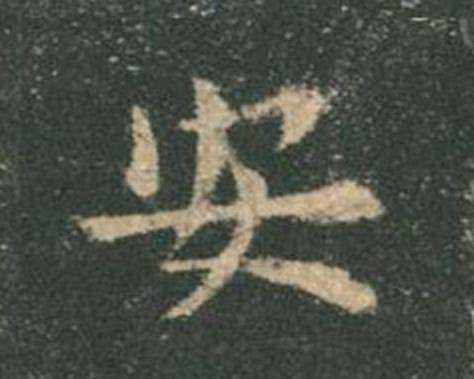
"An" is written too dangerously, leaning to the left


