
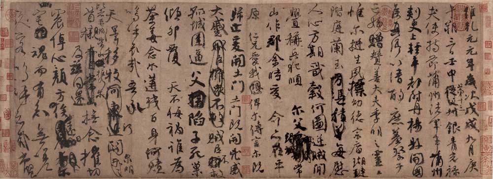
1. Some characters are written in cursive style
Neat regular script basically does not reduce strokes, such as "Lanting Shu". There are also many words in the "Nephew Sacrifice Manuscript" that retain the strokes of regular script. For example, "Yuan", "Nian", "Ci", "戍", "Wu", "Ji", "Geng", etc. in one line. Generally speaking, "The Manuscript of Sacrifice to My Nephew" contains more words with omitted strokes than "Lanting Shu". The writing speed is faster and there are more connected words. It also adopts some cursive omission methods and uses some cursive characters.
1. Reduce strokes. Some characters in "The Manuscript of Sacrifice to My Nephew" retain every stroke of regular script, while some characters just retain the framework of regular script, connecting two adjacent strokes into one stroke. Such as "dimensional", "year" and "month" in the first line. Some obviously omit a certain stroke, such as a little omission on the left side of "朔" in the second line, and several strokes in the middle frame on the right side of "Shi" in the second line. In line 21, the vertical line is omitted on the right side of "stroke". Sparing strokes is the basic method of forming cursive characters. Among other cursive methods, this basic method of sparing strokes is also inseparable.
2. Borrow a pen. The word "ze" in line 19 is replaced by the middle part in the upper right corner. The borrowed strokes are both part of this radical and part of another radical. There is me in you and you in me. The right side of "shift" in line 19 is borrowed silk.
3. Take half. For "ze" in line 19, the lower part is crossed horizontally and vertically, so take half of the horizontal and vertical parts. The frame on the right side of "Qian" in line 16 is drawn in half. Some characters have half of their radicals omitted, such as the upper right corner of "county" in line 4.
4. Replace radicals with strokes or cursive symbols. In the fourth line, a dot is used in the lower left corner of "Du" to replace "日"; in "Qing" and "Che", strokes are used to replace the frames; in the fourth line, a "factory character" is used in the upper left corner of "Wei". The "日" under "人" in the 20th line uses the "口 character", and more often uses the "一字", that is, a horizontal line is used to replace the radical, such as the "口" in the middle of "Ai" in the 18th line.
2. Use cursive characters or half-line and half-cursive writing.
In this post, some cursive characters are used, and there are more half-line and half-cursive characters (half-line and half-cursive characters are acceptable for cursive script, but inappropriate for cursive script).
The word "干" in line 1
"日" in line 2 is the cursive character.
The word "make" in the third line uses a horizontal line instead of a frame, which is half a line and half a grass. "Zhi" is a cursive character and is written in cursive writing. The "zu" character is used on the left side of "Zhu". The "zu character" and the empty pick are often mixed in cursive script. A horizontal line is used in the lower right corner instead of the frame. This character is a cursive character.
The fourth line of "Qing, Che" is a cursive character written in running script. "Du", "Wei", and "County" are half-line and half-cursive. They have more strokes than standard cursive characters and save a lot of strokes compared to regular script. The lower left side of "Du" is replaced by a dot, the upper left side of "Wei" is the "factory character", two horizontal lines are omitted in the middle, and the two lower dots are written in the same way as in cursive script.
"Hou" in line 5 is a cursive character, which is closer to the cursive character in writing. "Zhen, Qing" omits the strokes, and the connotation is the same as cursive writing. "Yi" is a cursive character. The strokes on the left and lower right of "Qing" are merged. "Zhuo" is a cursive character. "Sacrifice" is written in cursive script, with all round strokes. It is written in cursive script.
"Nephew" in line 6 is a cursive character.
The "virtue" in line 7 is a habitual saving stroke. "Tiao" may be a variant of the character at that time.
The "comfort" in line 8 omits the strokes in the upper left corner, and the dots seem to be there or not.
"Valley" in line 9 is a traditional Chinese character.
The word "provoke" in line 10 is half a line and half a straw.
The word "shou" in line 11 is half a line and half a cursive word.
The two "er" characters in line 12 are both cursive characters. This cursive character is the same as the simplified character, and many simplified characters are determined based on the cursive character.
The word "lone" in line 15 is half line and half cursive; "die" is written in cursive.
In line 16, the page on the right of the word "tilt" resembles grass. The "egg" is half row and half grass. "Disaster" saves more pens.
For "redemption" in line 17, the cursive method is used to replace the flat eye next to the middle right corner with a horizontal line.
"Ming Hu Ai" in line 18 is a cursive character; "wu" is half a line and half a cursive character, and a horizontal line is used below to replace "口".
The word "river" in line 19 is a cursive character, which is more intentional than pen.
The word "Zai" in line 20 is a cursive character, with one vertical line omitted. The lower right part of "trap" is the grass method.
For "care" in line 21, the vertical character is omitted.
The word "tong" in line 22 is the cursive character.
The word "Zhen" in line 23 is similar to the word "Cao".
For "knowledge" in line 24, replace the "口" on the right side with a dot.
Line 25 is basically cursive.
When writing running script, we should pay attention to the unity of style. That is to say, when using regular script in the same work, we should make more turns. When writing cursive script, we should pay attention to the closeness between running script and regular script, so as not to form a large miscellany of different calligraphy styles. Yan Zhenqing's "Nephew Memorial Manuscript" handles this very well.
3. Mainly use round pens and use various methods
Yan Zhenqing's calligraphy has his unique style and brushwork. Introducing seal script into the art, the round pen is the center, the dry pen is used well, the style is vigorous and textured, and the round pen is used to gain muscle strength, which is called "Yan Jin" by later generations.
Some characters in this post are all written with round strokes, which is in sharp contrast with Wang Xizhi's good use of square strokes: 1 "Sui", "Nine", 4 "Yang", 5 "Ji", 9 "Xian", 13 "Ji" ". In addition, 3 "hold, festival", 4 "kai, guo", 7 "su" and so on.
The square and circle in calligraphy are a pair of contradictions derived from the ancients' abstraction of all things in the universe. Li Yangbing of the Tang Dynasty said: "From the heaven, earth, mountains and rivers, we get the shape of square and circle." The ancients often believed that the sky is round, the earth is square, and the square circle covers the universe. Under this kind of thinking, the spirit of the universe and nature is integrated into calligraphy. middle.
Squares and circles are used not only in strokes, but also in the structure and organization of characters. Kang Youwei gave a good explanation in "Guangyi Zhou Shuang Ji" (Jiu is an oar), "The square pen is convenient for writing the main script, and the round pen is convenient for the cursive writing. However, this statement is quite different. If there is no round pen for the main script, then There is no hesitation (pronunciation: Dang, meaning: procrastination), and there is no square pen in the writing, so there is no strong and powerful spirit, and then they are used together." "The wonderful thing is that the square and the circle are used together, neither square nor round, but also round and square, or the body is square and the circle is used, or the body is round and the body is square, or the pen is square but the method is round, the spirit is clear, and it exists in the person." Zong Jiang Baishi "Sequel Book of Records" says: "For square shapes, it is best to make them round; for round shapes, it is best to make them square." It is also said that "it comes out from time to time" and "it cannot be revealed, it must be hidden and swim, it comes from nature."
Yan Ti's brushwork benefited from his experience with calligraphy and inscriptions. Wang Xizhi left behind only letters and other works, but no monument. There was no need to erect monuments at that time. And Yan Zhenqing has a lot of calligraphy tablets (according to statistics , he wrote 40 tablets between the ages of 57 and 70). He has rich experience in writing tablets. Yan once said in "Qi Yu Shu Tian Xia Fang Sheng Chi Tablets" that "if the stipples are slightly thin, I'm afraid the It cannot endure for a long time, so I would like to keep a copy of the Big Book in the Stone Crane Nest...". The Broken Nest Book was pioneered by him. When writing the Broken Nest Book, it is necessary to make the words support the square grid, the middle palace is sparse, and the spaces between the rows are also changed. The writing style is broad and grand, which is similar to seal script. Therefore, Mi Fu Pingyan's cursive script "has the spirit of seal script", which is related to this. The calligraphy stone should be circulated for a long time, and the strokes should be full and full. It is thick and thick. The writing is made with thick seal script and official script. It takes the style of seal script and is dense on the outside and sparse on the inside. Only in this way can the stele carved in this way be preserved for a long time and withstand the erosion of wind and rain. Yan has integrated the character of the book inscribed on the stone into the calligraphy. The painting has a majestic and upright atmosphere with sonorous metal and stone, and natural and simple things flow at the bottom of the pen.
Yan Zhenqing is good at using round pens, which are not just round, but also have the characteristics of fangyuan.
Characters with square strokes: 1 "Wei" on the left, 1 "Geng", 15 "Gu" are the most obvious.
The hard folds are mostly in places with small angles. 13 "Ji" and 16 "No" are unintentionally square; the same is true for the hard folds at the end of 17 "Tu".
It's difficult to write without frustration: the first stroke of 6 "season", 15 "lone", and the second stroke will become square 16 "regret"
The strokes are mainly composed of curves and direct changes. The two "Tumen" in No. 13 have obvious changes in the use of brushes. This obvious change caused by unconscious pursuit of change shows that the author of the book has a deep skill and is somewhere between conscious and unconscious under the control of the subconscious.
The square pen is used to fold, and the strokes are broken and then resumed; the round pen is used to turn, and the strokes are continued and continuous. The square pen gives people strong strength, while the round pen gives people energy. has its own characteristics. Yan Zhenqing's calligraphy is just like the person he is. He uses straight lines from beginning to end, and occasionally uses other brushwork. When entering the pen, the pen edge is straight down, with no intention of hiding the edge , but the effect of hiding the edge, such as the first strokes of "father" and "son" in 15 and "Qing" in 16, just like the starting stroke of seal script, as if you want to go down first, In fact, there is no hidden front.
The brush is not like Wang Xizhi's straight extension. Some of Yan Zhenqing's strokes are rolled with a brush, 4 "History", which has a strong sense of astringency. The "house leak marks" mentioned by Yan Zhenqing are not obvious in this post , but they are sharp and powerful. They have the same effect as the "house leak marks" and are more dynamic. Yan Zhenqing is good at using the three "states", "militaries" and "things" with a brush, and there are twists and turns in the straight lines. There is no obvious horizontal and straight paintings in the whole article ("too many paintings will make you crazy"). He vigorously combined the "leakage marks in the house" The organic combination with the elasticity of the hairpin strands is really wonderful.
4. The spirit runs through
In "The Manuscript of Sacrifice to My Nephew", there is a kind of Qi, a kind of anger, which runs through the whole article, making the muscles and blood vessels of the work smooth and full of energy. The ancients said that " the overall situation of a book is dominated by Qi." If Qi is achieved, the form will follow the trend, and the stipples will be dependent on it. Therefore, the stipples in the work echo each other, the words look at the trend one by one, and the lines reflect each other. The energy is vibrant and full of vitality, allowing the viewer to appreciate the rhythm of life from the solidified and still paper. Chen Shen said in "Guangzhou Book Postscript" that "the writing in this post is so bold that it flows thousands of miles...the wonderful solution is almost made by heaven." Technique provides technical support.
Running script can be continuous or not, but in terms of technique, the whole text must have a coherent rhythm. Only when the rhythm is consistent can the characters be alive, create artistic conception, and express temperament. The continuity of spirit and rhyme is not only expressed by connecting. For example, the two "doors" in line 13 have no meaning of connecting with the following characters. The coherence of spirit and rhyme is also reflected in the coordination throughout the text and the progressive relationship in ink colors. In the joint situation, there are intentional connection, pen connection, flying crossing and other situations:
Most of them are Italian: Between the strokes of the character, 2 "三", 10 " Er"; between characters: 23 " Mourning Heart ", 16 " Qing egg".
Bibi Lian:Between the strokes of the characters, 6 "nephew", 15 "death"; between the characters: 3 "Shizhi", 5 "Zhenqing", 6 "gift from deceased nephew", "Ji Ming" 18 "Wu Hu Ai" between .
Flying:Between the strokes of the character: 1, between the last two strokes of "元", 6, between the second horizontal stroke on the upper right of "Like" and the left stroke, 12, between the left and right strokes of "我", 8, the last stroke of "囧", 6, "大" ", between the horizontal and vertical strokes of "husband", and the strokes and strokes of "husband"; between characters: 15. The strokes between "death" nest".
Back to pen connection:Between the strokes of the character, 10 means "criminal", 13 means "Ji", and 14 means "诙".
Pull the thread and take the outside line:6 "gift", 21 "榇"; and the joint trend goes outside: "ji". Most of the horizontal lines going up are from the outside, and most of the downward lines are from the inside. For example, in 24 " Zhai", the first horizontal line is connected down, and the second horizontal line is connected up. There are also special cases, that is, when connecting horizontally to the upper Feidu, take the inner line (kaikai), and when connecting horizontally to the lower Feidu, take the outer line, such as the word with the prefix "factory".
Take the inner thread of the string, 13 "ji" between the left and right sides, 10 "wei".
Retrograde thread: 10 "Shun" and 21 "Nian" are at the end of the middle.
Pull wire to adjust the structure: 6 "nephews".
Drawing threads instead of strokes: 15 "die", 16 "lean".
Adjust the density of the wire pull: 16 "tilts"
It also changes the gestures of the strokes, such as the stroke of the 9 "人" from counterclockwise to clockwise. This also caused the hook to change its direction: 24 "house".
5. Pay attention to the white cloth
1. Between a word: The space between the words is intentionally changed. The space between the words 4 "开,国", 9 "图", 13 "开", 8 "ting" and other words all have changes in density. Most numbers have obvious changes in density, while the sparseness of small numbers is uniform. This uniformity is a change in variability, which is to seek change with invariance. This is a dialectical method. For example, 8 "lan" is evenly distributed in white. Yan also pays attention to the small blanks: 23 "Yan", 5 "Zhen, Qing", 7 "Temple", 8 "Stage", 9 "Phase", 17 "Hundred".
Where there is ink is important, but where there is no pen is equally important. Wang Xizhiyun: "The actual part is the law, and the empty part hides the spirit. The outward tension of the facial structure is mainly due to the sufficient space in the palace, which gives people a powerful and masculine beauty. The white cloth has a great influence on the style. Its regular script is especially obvious.
2. Between the lines: including upper and lower words, such as 5 "with clear discretion" is sparse. In some places, lines 10.11 and 16.18 are deliberately left blank. This may be to leave room for modification and achieve good results. Between lines, Yan Zhenqing's consciousness of change is not obvious, but because some words are added between the lines, some places between the lines are denser. This unintentional density makes the density more natural.
6. Rich ink color changes
In this post, you can clearly see the changes in weight and shade, and the thirsty strokes can be clearly seen. It allows people to see the process of writing and the subtle changes of the strokes, which is of great benefit to learn cursive writing .
7. The structure is dignified and full of variety.
(1) Yan’s running script has the meaning of seal script.
Mi Fu Ping Yan's cursive script has the spirit of seal script, which is reflected in two aspects:
1. It is solid on the outside and empty on the inside: 1 "Wei", "Qian", 2 "Shuo", 3 "Zhi", 5 "Yi, Qing, Zui". The left and right structure of the characters makes the middle palace spacious, the left and right are not connected, and the shape Separation brings together the gods. This is more conducive to reflect the broad-mindedness and magnanimity of the writer. The character Yan is spread horizontally, tight on the outside and loose on the inside, which is especially obvious in regular script, and its running script also has this feature.
2. The strokes are circular.
(2) Pay attention to word endings
Paying attention to the knotting of characters does not mean that Yan Zhenqing paid attention to the knotting of characters when writing this post. The structure of the characters is the main content of the style, and the style has a certain degree of stability. Yan usually pays attention to the beautiful knotting of characters and seeks changes in the unevenness. The whole text is relatively straight, with occasional side changes, such as 5 "Zhen Qing". Some words are structured in a unique way. 6. The cursing under " like" is unique. Left down left Tan 14 "thief", 17 "redemption". The angle of the final horizontal stroke drops 24 "soul" in the final stroke. Overall it's fair, but there are a lot of changes in the details . This is the same as Wang Xizhi's, manifested in blank spaces, horizontal and vertical intersections, and angles.
Knotting is a basic skill accumulated over a long period of time. Yan Zhenqing was born into a distinguished family. The first few generations of the Yan family were the most famous calligraphy family in the Tang Dynasty, as well as a philology family. The great -grandfather Yan Shigu was the minister of the Zhongshu of Emperor Taizong of the Tang Dynasty, and his father Yan Weizhen also had a literary and book name. His father died when he was three years old, and his family was left in the cold. He used loess to sweep the walls to learn calligraphy. He was taught by his mother, the Yin family, and had a good family education. He also benefited from the great master Zhang Xu, and the strong cultural atmosphere of the Tang Dynasty. With deep savings, excellent conditions, and Yan Zhenqing's intelligence in writing, he was able to stand out as a master in the history of calligraphy who was able to create "Yan style". His "Nephew Memorial Manuscript" became the second running script in the world. His achievements are inseparable from the above-mentioned objective factors.
He had a solid foundation in his youth. He wrote the "Stele of Yin Luzhi's Wife Yan" at the age of 29, the "Duobao Pagoda" at the age of 44, and the "Stele in Praise of Dongfang Shuo's Paintings" at the age of 45. These monuments show that He has profound regular script skills, but the style of these early regular script works has not yet been finalized and has changed greatly. From the "Magushan Immortal Altar" and "Ode to the Zhongxing of the Tang Dynasty" written at the age of 62, to the "Stele of Yan Qin Li" written at the age of 71, the style was determined and the often mentioned "Yan Jin" was revealed. Regular script is a late bloomer. This unstable style shows his constant pursuit in art. This constant pursuit is reflected in his constant absorption of new nutrients and constant denial of himself, thus step by step towards the pinnacle of his art. This is the fundamental reason why he was able to become everyone in the Tang Dynasty. reason. His regular script could have matured earlier, but he did not mature until his later years, which is related to his calligraphy practice. He has very solid basic skills, so he can write so many monuments. However, he was engaged in government affairs in his middle age, so it was impossible for him to devote a lot of time to calligraphy, especially because he wrote less regular script after all. Therefore, his regular script matured relatively late.
In running script, Yan Zhenqing wrote the glorious chapter "Manuscript of Sacrifice to Nephew" at the age of forty-nine, which marks that his running script has matured. His running script was precocious than his regular script, which illustrates two problems: first , running script is a calligraphy style that is easy to use and has many writing opportunities; second, regular script is the basis of running script, but as a calligraphy practice, it is not necessary to practice regular script well. Just went to practice cursive writing. The two calligraphy styles can promote each other and develop alternately.
(3) Dignified and generous
The characters are horizontal and stable. Natural and unmodified. The writing and finishing of words are straightforward and decisive, simple and innocent, down-to-earth and upright. Words are like people.
Yan Zhenqing's style is related to his character. Yan Zhenqing was influenced by Confucianism, which formed his character of being upright, not caring about trivial matters, and loyal and down-to-earth. He would not indulge in carving and decoration, and his movements would rise and fall straight, pressing like driving piles and lifting like driving nails, which increased his strength. The strokes are drawn in the air, with sharp edges hidden in the dots. They are clean and neat. Although not as graceful as Erwang , it greatly enhances the thickness, simplicity and simplicity of the brush strokes. The simplicity, simplicity and simplicity are the simplest, most natural and most convenient techniques. , but shows the deepest connotation. In regular script and running script, he created an unprecedented rich and profound artistic style. Pay attention to dignity, be broad-minded and majestic, use clumsiness as beauty, and simplicity as splendor.


